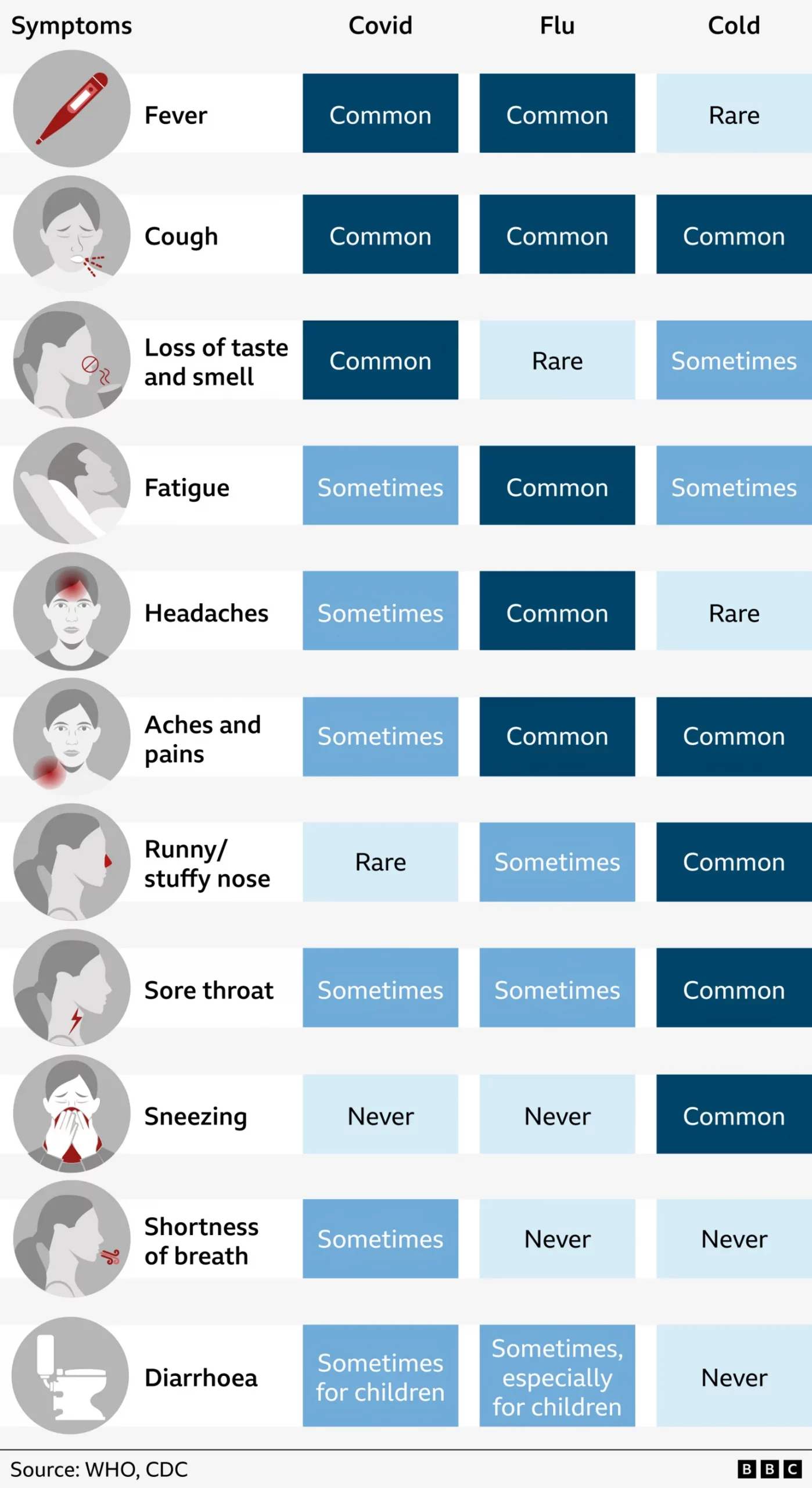
More on Those Million Covid-19 Deaths

Yesterday I focused on the big graphic from the New York Times that crossed the full spread of the front/back page. But the graphic was merely the lead graphic for a larger piece. I linked to the online version of the article, but for this post I’m going to stick with the print edition. The article consists of a full-page open then an entire interior spread, all in limited colour. The remainder of the extensive coverage consists of photo essays and interviews that understandably attempt to humanise the data points, after all, each dot from yesterday represented one individual, solitary, human being. That is an important element of a story like this and other national and international tragedies, but we also need to focus on the data and not let the emotion of the story overwhelm our rational and logical analysis.

Sometimes it’s hard to realise we’re in the third year of this pandemic.

From a data visualisation standpoint the first page begins simply enough with a long timeline of the Covid-19 pandemic charting the number of absolute deaths each day. As we looked at yesterday, the absolute deaths tell part of the story. But if we were to have looked at the number of absolute cases in conjunction with the deaths, we could also see how the virus has thus far evolved to be more transmissible but less lethal. Here the number of daily deaths from Omicron surpassed Delta, but fell short of the winter peak in early 2021. But the number of cases exploded with Omicron, making its mortality rate lower. In other words, far more people were getting sick, but as far fewer were dying.

An interesting note is that if you take a look at the online version, there the designers chose a more stylised approach to presenting the data.

All the dots

Here they kept the dot approach and simply stacked and reordered the dots. However, I presume for aesthetic reasons, they kept the stacking loose dots and dropped all the axis lines because it does make for a nice transition from the map to this chart. But they also dropped all headings and descriptors that tell the reader just what they are looking at. These decisions make the chart far less useful as a tool to tell the data-driven element of the story.

There are three annotations that label the number of deaths in New York, the Northeast, and the rest of the United States. But what does the chart say? When are the endpoints for those annotations? And then you can compare the scale of the y-axis of this chart and compare it to the printed version above. A more dramatic scale leads to a more dramatic narrative.

This sort of visual style of flash and fancy transitions over the clear communication of the data is why I find the print piece more compelling and more trustworthy. I find the online version, still useful, but far more lacking and wanting in terms of information design.

The interior spread is where this article shines.

Just a fantastic spread.

From an editorial design standpoint, the symmetry works very well here. It’s a clear presentation and the white space around the graphic blocks lets that content shine as it should in this type of story. Collectively these pieces do a great job telling the story of the pandemic thus far across the nation. The graphics do not need a lot of colour and make do with sparse flash. Annotations call the reader’s attention to salient points and outliers.

Very nice work here.

From a content standpoint, I would be particularly curious if we have robust data for deaths by education level. Earlier this year I recall reading news about a study that said education best correlated to Covid cases, and I would be curious to see if that held true for deaths. Of course these charts do a great job of showing just how effective the vaccines were and remain. They are the best preventative measure we have available to us.

More really nice graphics

Here I disagree with the design decision of how to break down the states into regions. The Census Bureau breaks down the United States into four regions using the same names as in the graphic above. However, if you look closely at the inset map, you will see that Delaware, Maryland, and West Virginia in particular are included as part of the Northeast. (I cannot tell if the District of Columbia is included as part of the Northeast or South.)

Now compare that to the Census Bureau’s definition:

How the government defines US geography

If you ask me to include Delaware and Maryland as part of the Northeast, well, if you’re selling it, I’ll buy it. After all, just because the Census Bureau defines the United States this way does not mean the New York Times has to. Both are connected to the Northeast Corridor via Amtrak and I-95 and are plugged into the Megalopolis economy. Maybe the Potomac should be the demarcation between Northeast and South. But I struggle to understand West Virginia. Before you go and connect it to the Northeast, I would argue that West Virginia has far more in common with the Midwest geographically, economically, and culturally.

More critically, given this issue, it strikes me as a serious problem when the online version of the chart—with the aforementioned issues—does not even include the little inset to highlight this at best unusual regional definition.

Where would you place West Virginia?

And so while I have reservations about the data—how would the data have looked if the states were realigned?—the design of the line charts overall is good.

Again, I am talking about the print version, not that online graphic. I would argue that the above screenshot is barely even a chart and more “data art” or an illustration of data. Consider here, for example, that for the South we have that muted slate blue for the dots, but the spacing and density of the dots leads to areas of lighter slate and darker slate. But a lighter slate means more space between stacked dots and darker slate means a more compact design. A lighter colour therefore pushes the “edge” of the line further up the y-axis and artificially inflates its value, not that we can understand what that value is as the “chart” lacks any sort of y-axis.

Finally the print piece has a set of small multiples breaking down deaths by income in the three largest American cities: New York, Los Angeles, and Chicago. These are just great little charts showing the correlation between income and death from Covid, organised by Zip code.

But this also serves as a stark reminder of just how much better the print piece is over the online version. Because if we take a look at a screenshot from the online article, we have a graphic that addresses all the issues I pointed out earlier.

Why couldn’t the online article kept to this style?

I am left to wonder why the reader of the online version does not have access to this clearer and more accurate representation of the data throughout the piece?

To me this article is a great example of when the print piece far exceeds that of the online version. Content-wise this is a great story that needed to be told this weekend, but design wise we see a significant gap in quality from print to online. Suffice it to say that on Sunday I was very glad I received the print version.

Credit for the piece goes to Sarah Almukhtar, Amy Harmon, Danielle Ivory, Lauren Leatherby, Albert Sun, and Jeremy White.

One Million Covid-19 Deaths

This past weekend the United States surpassed one million deaths due to Covid-19. To put that in other terms, imagine the entire city of San Jose, California simply dead. Or just a little bit more than the entire city of Austin, Texas. Estimates place the number of those infected at about 80 million. Back of the envelope maths puts that fatality rate at 1.25%. That’s certainly lower than earlier versions of the virus, which has evolved to be more transmissible, but thankfully less lethal than its original form.

Sunday morning I opened the door to my flat and found the Sunday edition of the New York Times waiting for me with a sobering graphic not just above the fold, nor across the front page. No, the graphic—a map where each dot represents one Covid-19 death—wrapped around the entire paper.

Above the fold
Full page
Full spread

You don’t need to do much more here. Black and white colour sets the tone simply enough. Of course, a bit more critically, these maps mask one of the big issues with the geographic spread of not just this virus but many other things: relatively few people live west of the Mississippi River.

Enormous swathes of the plains and Rocky Mountains have but few farmers and ranchers living there. Most of the nation’s populous cities are along the coast, particularly the East Coast, or along rivers or somewhat arbitrary transport hubs. You can see those because this map does not actually plot the locations of individual deaths, but rather fills county borders with dots to represent the deaths that occurred within those limits. That’s why, particularly west of the Mississippi, you see square-shaped concentrations of deaths.

A choropleth map that explores deaths per capita, that is after adjusting for population, shows a different story. (This screenshot comes from the New York Times‘ data centre for Covid-19.

A somewhat different story

The story here is literally less black and white as here we see colours in yellows to deep burnt crimsons. Whilst the big map yesterday morning concentrated deaths in the Northeast, West Coast, and around Chicago we see here that, relative to the counties’ populations, those same areas fared much better than counties in the plains, Midwest, and Deep South.

A quick scan of the Northeast and Mid-Atlantic states shows that only one county, Juniata in Pennsylvania, fell into the two worst deaths per capita bins—the deeper reds. Juniata County sits squarely in the middle of Pennsyltucky or Trumpsylvania, where Covid countermeasures were not terribly popular. No other county in the region shares that deep red.

Look to the southeast and south, however, and you see lots of deep and burnt crimsons dotting the landscape. This doesn’t mean people didn’t die in the Northeast, because of course they did. Rather, a greater percentage of the population died elsewhere when, as the policies enacted by the Northeast and West Coast show, they didn’t need to.

After all, injecting bleach was never a good idea.

Credit for the piece goes to Jeremy White.

Covid Update: 29 September

Last week when I wrote my update on Covid-19, we had seen a few signs for optimism, but in other states the news was hard to interpret or, in the case of Pennsylvania, not going the right way at all. So where are we this week? In some ways, not a lot has changed over the last seven days.

New case curves for PA, NJ, DE, VA, & IL.

Last week, we had positive developments in both New Jersey and Illinois. There cases had begun to noticeably and consistently fall with clear peaks in this fourth wave of infections. Their seven-day averages were decidedly below their recent peaks. That trend continued last week. In fact, in Illinois the seven-day average is now also below the peak from not just this fourth wave, but also the third wave. That’s good.

New Jersey’s fourth wave was nowhere near as impactful as its first three. It helps to have one of the highest vaccination rates in the United States. But the Garden State’s seven-day average is also falling, though not as quickly as in Illinois. You could even make the argument that over the last week cases have really remained flat, though the last few days I would contend are evidence of a slow slowdown.

Delaware had been a tricky state to judge given some recent volatility in its average. But as we can see over the last week the new case curve clearly has flattened. The flat line, however, remains just that, a flat line. This is more of a plateau shape than a descending hill shape. That means that cases are continuing to spread, but at a steady rate of about 450 new cases per day. This isn’t uncommon, but hopefully it precedes a fall in new cases rather than serving as a respite on an ever upward climb.

In Virginia I had mentioned some early indications of a potential flattening, the first step towards a decline in the average. That flattening appears to be taking hold. In the chart above you can clearly see a sharp decline beginning to take root in Old Dominion. The curve here most closely resembles Illinois in what, at least for now, is a fairly symmetrical increase and decrease.

Finally we have Pennsylvania. I was pretty short in my analysis last week, the state was headed in the wrong direction. The latest data shows that the Commonwealth may just be beginning to turn the corner and flatten the curve. However, after the pre-Labour Day slowdown that then erupted into a full-blown outbreak, I’m wary of saying anything definitive about Pennsylvania. All we can do is hope that these early trends hold true.

So what about deaths? Are we seeing any progress on that front? Last week I noted that it was almost all bad news. In all but Illinois we had death rates continuing to climb.

Death curves for PA, NJ, DE, VA, & IL.

That story, sadly, remains largely the same. Illinois, unfortunately has actually seen its seven-day average resume ticking upwards, although not by a significant degree. It’s enough that I think it fair to say deaths have largely plateaued and not necessarily begun to climb. And as I keep saying, that would track for a state where we have seen new cases falling for the last few weeks now.

Unfortunately, that’s about it. Deaths in New Jersey have remained fairly stable, though the average has moved from 19.3 to 17.4 as of yesterday. Perhaps that could be an indication of a falling death rate. But just a few days ago it was still nearer 19 than 18. I would want to see more data showing a consistent and persistent decline before saying New Jersey is headed the right way.

And in Pennsylvania, Delaware, and Virginia, deaths are headed the wrong way, plain and simple. At the beginning of the sample set, Delaware reported 14 deaths in one day, the most in a month. Consequently the average has jumped from 2.6 last week to 3.4 today. In Virginia we had seen deaths jump from 20 to 34. Well this week they jumped again, though by half the amount, to 41 deaths per day. Pennsylvania performed the worst, however. Deaths here climbed from 43 to 57 per day.

While we have seen new cases plateau in Delaware and begin to fall in Virginia, which should mean declining death rates in a few weeks, in Pennsylvania the numbers of new cases may only be beginning to flatten. Consequently, unless we begin to see a sharp decline in new cases, we will likely continue to see rising deaths in the Commonwealth. At least for a little while longer.

Credit for the piece is mine.

Covid Vaccination and Political Polarisation

I will try to get to my weekly Covid-19 post tomorrow, but today I want to take a brief look at a graphic from the New York Times that sat above the fold outside my door yesterday morning. And those who have been following the blog know that I love print graphics above the fold.

On my proverbial stoop this morning.

Of the six-column layout, you can see that this graphic gets three, in other words half-a-page width, and the accompany column of text for the article brings this to nearly 2/3 the front page.

When we look more closely at the graphic, you can see it consists of two separate parts, a scatter plot and a line chart. And that’s where it begins to fall apart for me.

Pennsylvania is thankfully on the more vaccinated side of things

The scatter plot uses colour to indicate the vote share that went to Trump. My issue with this is that the colour isn’t necessary. If you look at the top for the x-axis labelling, you will see that the axis represents that same data. If, however, the designer chose to use colour to show the range of the state vote, well that’s what the axis labelling should be for…except there is none.

If the scatter plot used proper x-axis labels, you could easily read the range on either side of the political spectrum, and colour would no longer be necessary. I don’t entirely understand the lack of labelling here, because on the y-axis the scatter plot does use labelling.

On a side note, I would probably have added a US unvaccination rate for a benchmark, to see which states are above and below the US average.

Now if we look at the second part of the graphic, the line chart, we do see labelling for the axis here. But what I’m not fond of here is that the line for counties with large Trump shares, the line significantly exceeds the the maximum range of the chart. And then for the 0.5 deaths per 100,000 line, the dots mysteriously end short of the end of the chart. It’s not as if the line would have overlapped with the data series. And even if it did, that’s the point of an axis line, so the user can know when the data has exceeded an interval.

I really wanted to like this piece, because it is a graphic above the fold. But the more I looked at it in detail, the more issues I found with the graphic. A couple of tweaks, however, would quickly bring it up to speed.

Credit for the piece goes to Ashley Wu.

An Animated Approach to Understanding Vaccines…

…courtesy of Family Guy.

In the last 18 months of looking at the data behind Covid-19 and the vaccines, I’ve had a lot of conversations with people, maybe even some of you, about the pandemic and the vaccines we’re using to combat it. Unfortunately, I’m just one person. Seth MacFarlane, however, has himself and the crew behind Family Guy to produce an advert for the Ad Council. The advert explains how vaccines work, why you should get them, and does so with some really nice animation. Animation that tops any illustrations I could do.

So enjoy their animated short.

It’s like Schoolhouse Rock…without the rock.

Credit for the piece goes to Seth MacFarlane and the crew behind Family Guy.

Covid Update: 22 September

It’s been a little over a week now since my last update on Covid-19 in Pennsylvania, New Jersey, Delaware, Virginia, and Illinois. So where do we stand now, especially since last week we had seen a split with some good news and some not so good news?

Well let’s start with where we had good news last week: Illinois and New Jersey. In those two states we had the clearest evidence of the fourth wave peaking and beginning a slow descent.

New case curves for PA, NJ, DE, VA, & IL.

This week we can see that in Illinois the peak really does appear to have been reached as the seven-day average for new cases has been heading down slowly over the last week or so. In New Jersey we saw a sort of false peak, because new cases began to rise again not long after I posted. And with it the seven-day average did as well. However, in the last few days, the seven-day average has flattened ever so slightly, though it is still increasing.

Delaware is a bit harder to judge. When I last posted the seven-day average sat at 457 new cases per day. Yesterday? 454 new cases per day. If you look at the chart, you can see there was a brief spike that I had noted as a potential indicator of a peak for Delaware. After that brief decline however, you can see how the curve shot back up again, exceeding the earlier peak with an average of 470 new cases per day before cooling off slightly. New cases have been increasing for the last four days, but they are still below that 470 new cases number.

Virginia’s fourth wave long looked the worst. You can see some aberrant declines and spikes due to the extra day holiday in reporting—recall Virginia does not publish its weekend data. Since then however, there are some initial indications that Old Dominion may have peaked. Consider that when I last posted, the seven-day average sat at 4700 new cases per day. But over the last nine days, the average dropped to the 3600s for six days, then the 3500s for two days, and yesterday the average fell into the 3400s. That is the kind of flattening we want to see if there is a real peak.

Finally we have Pennsylvania. Right before Labour Day we had evidence of a slowing outbreak. But then after the holiday, new cases began to climb sharply. There was then a quick slowdown, but ever since we’ve continued to see rising numbers of new cases in the Commonwealth. At the time of my last post we had an average of 4100 new cases per day. Yesterday that was at 4700.

Pennsylvania looks like the only state we cover here that is clearly moving in the wrong direction.

But what about deaths?

Death curves for PA, NJ, DE, VA, & IL.

Well, here it’s almost all bad news. Before we can reasonably expect deaths to begin to slowdown, we need to see the spread of new cases slowdown. Remember that deaths are a lagging indicator as it can take weeks from infection to hospitalisation to death. And if most of our states have not yet clearly peaked, we shouldn’t really expect deaths to have peaked yet.

Here the only good news is Illinois where deaths peaked at 41 per day, but have since fallen to 31. Compare that to the shape of the curve in the new cases chart. We can clearly see the peak in new cases being followed by sometime by the peak in deaths.

In all the other states, however, we continue to see climbing numbers of deaths. In Pennsylvania over the last nine days we’ve seen the average climb from 24 deaths per day to 43. New Jersey increased a bit more slowly, from 13 to 19. And Delaware, again due to its small size, climbed, but only from 1.1 to 2.6. And in Virginia, we’ve seen the average number of deaths climb from 20 to 34.

If we are nearing peaks in New Jersey and Virginia, we should begin to see deaths cool down in the near future. The same holds true for Delaware, but there we have less evidence of a peaking outbreak.

Credit for the piece is mine.

Covid Update: 13 September

It’s been a little less than a week since our last Covid-19 update for Pennsylvania, New Jersey, Delaware, Virginia, and Illinois. At the time we had just come back from the Labour Day holiday here in the United States and that left us with two big questions. First, what would the data show after we began to process the tests after the extra time off? Second, would the holiday itself cause any increase in the numbers of new cases?

We also need to remember that last week we had seen some positive signs in some states. And we can start with those states today.

New case curves for PA, NJ, DE, VA, & IL

In New Jersey and Illinois we had the clearest evidence of this fourth wave peaking and new cases, whilst still climbing, slowing down with the seven-day average beginning to fall. The good news continues to be that both states continue to show signs their fourth waves have peaked. In fact, Illinois appears to be beginning a downward trajectory. New Jersey has flattened the curve, in other words exhibiting steady numbers of new cases each day.

Delaware appeared to have peaked, but after a brief dip following the holiday, the numbers have begun to shoot back up again. The seven-day average as of yesterday hit 457 new cases per day, exceeding that spike just prior to Labour Day. In other words, it appears that the fear of the holiday increasing rates of new cases, just as they appeared to be peaking came true in Delaware.

What about Virginia and Pennsylvania? Well in the former we had some indications prior to Labour Day that Virginia may have been approaching a peak of new cases. And now you can throw that out the window. Over the three-day holiday weekend, Virginia added just under 11,000 new cases. This past weekend, only two days, Old Dominion added just over 9,200. Not surprisingly the seven-day average spiked upward yesterday to 4,700 new cases per day. If the fourth wave continues at that pace, it will soon surpass the rates we saw last winter.

And in Pennsylvania the data is also not great. We had seen perhaps the beginning of a decline after a peak prior to Labour Day. In the week since? Well, the numbers of new cases have started climbing once again. In fact, yesterday the seven-day average climbed to just under 4,100 new cases per day. That is still below the spring peak and well below winter, but surpasses the numbers we saw just before Labour Day.

In other words, the fear of Labour Day creating new cases appears to have come true.

So then what about deaths? We know that deaths from any increase in cases won’t manifest in the data for a few weeks.

Death curves for PA, NJ, DE, VA, & IL.

Starting with good news, let’s look at Pennsylvania. Two days after Labour Day the Commonwealth’s seven-day average for deaths reached 30.1 deaths per day. In the almost week since that rate has steadily dropped to 24.3 per day. Ideally we would want to see that trend extend beyond five days. Because if the Labour Day surge persists, it wouldn’t be beyond belief to imagine deaths rising again in coming days.

But that’s also about it for good news. True, Delaware went from 0.9 deaths per day to just 1.0. But that’s more of a stable rate than anything. All the other states have seen their death rates continue to climb of late. Although, we would also expect deaths to peak sometime after the peak in new cases, so this trend makes sense.

In New Jersey deaths climbed from 12.4 to 13.1 per day. Not terrible, but again still an increase in deaths. The worst increases were in Illinois and Virginia. In Illinois deaths have continued to climb, rising from 30.7 last time we wrote to 34.7. But Virginia has seen the worst, despite an apparent dip around Labour Day. Instead people are dying at increasing rates, climbing from 16.7 deaths per day to 27.1 as of yesterday.

Unfortunately, until we see new cases truly peak in Virginia those numbers are likely to continue climbing in coming days and possibly weeks.

Covid Update: 8 September

Last time we looked at the state of the Covid-19 pandemic in Pennsylvania, New Jersey, Delaware, Virginia, and Illinois we had some encouraging signs. In particular we had evidence of a potential slowdown in New Jersey, Delaware, and Illinois and I wrote that I would not be surprised if we saw a peak in new cases. Virginia was the only state where things were bad and getting worse, though the rate at which they were getting bad had begun to slow. Finally, Pennsylvania had some conflicting data with its new cases and I wanted to see another week’s worth of evidence.

So a week or later, where are we?

First, the obvious caveat that the Labour Day holiday may affect these numbers in both the short term collection of data and the medium term potential for a surge of new cases from gatherings and parties.

New case curves for PA, NJ, DE, VA, & IL.

If we look to last week’s good news states of New Jersey, Delaware, and Illinois, we do indeed see what we’ve long been waiting for since this summer: potential peaks in this fourth wave. New Jersey and Illinois. We can see the trend most clearly in New Jersey and Illinois where the beginnings of a decline from the peak appear as a slight dip from what we hope was the peak of the fourth wave. In Delaware that peak is still apparent, but the decline is less so.

Additionally for Delaware, over the last week the numbers rose above those of the third wave, i.e. in terms of cases the fourth wave is worse than the third wave of the spring. We had already seen Illinois reached that unfortunate milestone and fortunately for New Jersey the Garden State peaked at a point nearly half of the third wave’s peak.

What about last week’s bad news state? Well, Virginia, which does not report data on weekends, had an additional day of zero earlier this week. You can see that with the peak on Tuesday, which exceeded 10,000 new cases in one day. Of course, that’s really over three days and so we are talking about 3,000 per day. Unfortunately that extra holiday affected the seven-day average and caused a sudden fall. If we look closely at the data we can see that the trend probably points to a situation that continues to worsen. Two weeks ago the seven-day average was generally about 2800; last week it was about 3100; and heading into this week—excluding the Labour Day aberration—it looks to be about 3300. The very rough differences of 300 to 200 could point to a slowing rise in new cases, the necessary precursor to a peak, but we’d need to see how the rest of this week plays out before we can make any determination. But I’d probably say we are beginning to see the first signs of arriving at a peak in the coming weeks, maybe not next but perhaps in two or so.

And then we have Pennsylvania, where we had conflicting data and I wanted another week’s worth before making comment. I think the Commonwealth has indeed peaked, but unlike in New Jersey, Delaware, and Illinois, this peak looks more complicated. Note how we do have the recent spike I alluded to last week, but subsequent to that spike the numbers have been lower. I say complicated because in the aftermath of the holiday weekend we are seeing a slight tick upwards in the number of new cases, but it’s still below that spike. Consequently I’m reasonably confident we’ve just begun to peak here in Pennsylvania, but I’ll clearly want another week’s data before saying that with more authority.

What about deaths? How have those progressed over the last week?

Here too I’d be remiss if I failed to reiterate the caveats above that Labour Day can skew with the seven-day average—as we saw with Virginia—though any clustering of a surge of deaths would likely be weeks away given death’s status as a lagging indicator.

Death curves for PA, NJ, DE, VA, & IL.

Here, unfortunately, we have not reached peak deaths for the fourth wave, at least not for all five states.

Starting with the bad news, we have two states where the numbers continue to climb. In Pennsylvania and Illinois, the two largest states in the data set, we have deaths continuing to climb. Both states’ averages exceeded 30 deaths per day yesterday. For Pennsylvania that is the first time since early June. We need not go much further back for Illinois, which had last recorded an average of 30 deaths per day in late May.

In fact, Illinois yesterday reached an average of 30.7 deaths per day. The state’s peak during the third wave was not much higher, 31.7. Given that we are seeing higher numbers of new cases in the fourth wave than we saw in the third, I would expect the deaths to continue climbing and exceed the third wave’s death rate in coming days.

Pennsylvania’s seven-day average peaked at 51 deaths per day earlier this summer and the Commonwealth’s average of 30.1 yesterday is still far below that level. Given that this fourth wave appears to be less severe in terms of new cases than the third wave, I doubt we reach the level of 51 per day, but I wouldn’t put a level in the 40s out of reach.

Next we have three states where we probably have some good news. Delaware is probably the easiest to report. Since the state has so few people with which to begin, we can expect to see fewer deaths. Indeed, this fourth wave may have peaked and did so at only 3.4 deaths per day. But yesterday that number fell to 0.9. However, I wonder if that is due to the Labour Day holiday. I would want to see more data before saying with more authority that Delaware may have peaked in terms of deaths.

Virginia and New Jersey both present cases where the seven-day averages are now down from some high numbers about two weeks ago. In late August, New Jersey reached a level of 14.3 deaths per day and Virginia hit 21.4. Yesterday’s averages had each state at 12.4 and 16.6, respectively. That looks good. But we can also see that in the last two days both states reported their highest number of daily increases since the beginning of the fourth wave. Yesterday New Jersey reported an additional 29 deaths. Virginia reported 30 yesterday, not the highest, but for that we need look only to the day before when it reported 48.

In other words, I want to see if these recent high numbers of new deaths are the result of delays from Labour Day or if we are beginning to see an actual reversal in the trend. Both at this point appear plausible. I would suspect, however, that New Jersey, given its peaked number of new cases, is more likely to be on actual downward trend in deaths. That said, given the recentness of that peak, I would still expect deaths to rise. I want another week’s worth of data to better evaluate the Garden State.

Virginia seems pretty clear to me, the most likely cause in the dip in deaths of late relates to the holiday. With the numbers of new cases continuing to climb and a peak appearing to be at least a few weeks away, Virginia probably can expect deaths to resume climbing for a bit more time. And of course this wave is already worse, in terms of deaths, than the third wave. Unfortunately I think that story line will only get stronger.

Credit for the piece is mine.

Covid Update: 31 August

A brief bit of housekeeping, your author will be taking a brief holiday during which I won’t be posting. But I should return to posting next week.

Last week we looked at some relatively good news in terms of the spread of Covid-19 in the states of Pennsylvania, New Jersey, Delaware, Virginia, and Illinois. We had been watching some recent data that suggested some of the five states had begun to see a real and measurable slowdown in the rate of increase of new cases.

Where are we this week? Did those trends continue?

Kind of…

New case curves for PA, NJ, DE, VA, & IL.

Starting with the bad news, we have Virginia. Old Dominion is now in the throes of a Covid wave worse than what it saw back in the Spring, and fast nearing the heights—maybe depths—of the winter wave. That wave peaked just under 6,200 new cases per day. (And fell to as low as 129 per day in mid-June.) Presently Virginia reports just under 3,200 new cases per day, or nearly half that previous peak. Unfortunately, we do not yet see any significant decline in the rate at which those case numbers have increased. The line in the graphic above is no longer curving upwards, instead you can describe it as more a straight line.

Somewhere below Virginia in that it’s not bad news, but it’s also not great news, we have Delaware and Illinois. In both states the unfortunate news remains that new cases continue to increase. But at present we can also see that new cases have begun to slow. In these states the curves have begun to flatten out, though they still tilt positive.

Contrast that to New Jersey, where we have good news. The Garden State looks similar to Delaware and Illinois, but the difference is the curve in New Jersey may have peaked. The line is now tilted negative. Of course, this is a very recent development and we would want to see this trend continue for a week or so before we begin to speak of New Jersey’s wave cresting.

But between New Jersey, Delaware, and Illinois, I would not be surprised if by the end of next week we begin to see new cases peaking and beginning to decline.

But what about Pennsylvania? Initially I would have placed the Commonwealth with Delaware and Illinois as it clearly had not peaked, but it did exhibit evidence that its curve was beginning to flatten. In recent days, however, as one can clearly see in the chart, the average has begun to shoot back up again. But as I cautioned last week, that’s not uncommon. Consequently, I want to see another week’s worth of data before we begin to talk about what direction Pennsylvania is taking.

In all this though, we do have one wildcard. This weekend we in the United States begin our Labour Day holiday. Will Labour Day gatherings and parties lead to increased spread of the virus? Will we have super-spreader events? Unfortunately we will not know for about a week or week and a half after the holiday.

As all this has been happening, we also have the death rate.

Death curves for PA, NJ, DE, VA, & IL.

Last week I noted that we had begun to see rising numbers of deaths. This made sense given that deaths lag behind new cases. Early in the pandemic it often—not always—took a few weeks before people needed hospitalisation. Then a few weeks later is often—not always—when people would die. So a few weeks after the fourth wave began to take hold we continue to see rising numbers of deaths in all five states.

In Virginia and Illinois we see two of the most significant increases. In fact in the third wave, Illinois peaked at just under an average of 32 deaths per day. As of Tuesday the seven-day average was at just over 25. And with the current trend pointing towards increasing death, it’s possible we could see the fourth wave be more lethal in Illinois than the third.

Compare that to Virginia. Old Dominion saw a smaller death rate in the third wave, peaking at 18 deaths per day. However, just yesterday the state reached an average of 21 deaths per day. In other words, Virginia’s fourth wave has become more lethal than its third wave. Unfortunately, like in Illinois we continue to see deaths climbing and there is no evidence yet that deaths are slowing down.

In the tri-state area we see some slightly better news by comparison. In Pennsylvania and New Jersey deaths remain below their third wave peak. For example, in the third wave, Pennsylvania peaked at nearly 50 deaths per day. Yesterday the average was just below 20. Despite both states being below their third wave peaks, however, deaths do continue to climb.

Delaware is the exception here. With such a small population, it reached a third wave peak of about two deaths per day. At present it’s just reached three. But I would not say that three is significantly greater than two.

Overall, however, I expect to see deaths continue to climb over the next week or two until these slowing rates of new cases begin to create slowing death rates. And so I am hopeful that in the coming few weeks we will begin to see the new case rates slow, peak, and begin to decline by about mid-September. That’s more likely in places like New Jersey, Delaware, and Illinois, but if we’re lucky those patterns or similar will soon begin to emerge in Pennsylvania and Virginia.

Credit for the piece is mine.

Covid Update: 23 August

Last week I mentioned how there was some initial evidence showing the rapid, near-exponential spread of the virus was beginning to slow down. One week later, where are we?

The good news is that those initial signals do appear to be true, i.e. not noise. You can see it if you look at the very end of the charts for all but Virginia.

New case curves for PA, NJ, DE, VA, & IL.

We can see the slowing spread rate most easily in Illinois and New Jersey. The shape of the curve now resembles more like the top of a hill rather than the beginning of a roller coaster. To be clear, this doesn’t mean Covid-19 is no longer spread—that is not the case at all. Rather, just the speed at which people are spreading the virus has slowed from that initial rapid acceleration.

In the last week, however, despite the good news for Illinois, we can also see that this fourth wave, driven by the Delta variant, has now exceeded the third wave we saw earlier this spring. Virginia still remains the only other state joining Illinois in that auspicious category, but Delaware is edging ever closer.

However, Delaware as well as Pennsylvania can both join Illinois and New Jersey in seeing slowing rates, though it’s not nearly as evident as in the other two states. Delaware continues to approach its third wave peak.

Virginia is the one state where we might just now be seeing the beginning of a slowdown. Though it’s probably the hardest state in which to see it. Yesterday, after a weekend of no data updates, the state reported over 7,000 new cases. That’s bad. But jumping from 5,900 new cases last Monday to yesterday’s 7,100 is comparatively good. Compare Monday to Monday, four weeks ago the increase was 91%. Three weeks ago it was 88.8%. Three weeks ago it fell to 30.9%. And then two weeks ago it was 26.8%. Yesterday’s increase was only 20%. Again, not great, but that’s a slowdown.

The hope in all five states is that we can begin to actually peak perhaps in early- to mid-September before the seven-day average begins to decline. The question then will be what do things look like as begin to head into flu season, which is when last winter’s deadly surge began in earnest.

What about deaths though?

Death curves for PA, NJ, DE, VA, & IL.

Last week I discussed how we were seeing death rates hold fairly steady with only small increases to the seven-day averages. Unfortunately this past week we saw more significant increases. Nothing too dramatic, to be clear, but increases all the same.

Take Pennsylvania, for example. Two weeks ago we went from an average of 7 deaths per day due to Covid-19 to just 9 last week. But yesterday that number jumped up to 16. Illinois, which had went from 12 to 13, climbed from 13 to 20 as of yesterday.

This is also not terribly surprising. As we are now several weeks into this wave, we would expect to see hospitalisations increase, which we had been seeing, before, sadly, deaths followed suit. We may now be entering that phase where deaths, again, a lagging indicator, begin to rise.

I do not think, however, that we will see numbers near to the extremes we saw this past winter. Even to reach levels we saw this past spring will be difficult. However, I’d be remiss if I didn’t point out that Illinois has reached nearly half its third wave peak number of deaths.

We will need to continue observing these death rates over the coming week to see if they continue to increase. I suspect they will before, like new cases, they begin to slow down before then peaking.

Credit for the piece is mine.