Apologies for the lack of posting yesterday, but I wasn’t feeling well. I had some other things planned for today, but then some other things happened this weekend and then I took ill. But it’s still important to look at what’s going on with the pandemic, especially in the United States where it’s been disastrously handled by the White House.
As we approach 200,000 dead Americans, we still look at what’s going on in the tristate region alongside Virginia and Illinois. Specifically we compare last week’s post to this week’s post. Note that normally we look at Sunday data on Monday morning and today we’ll be looking at Monday data on a Tuesday. Both Sunday and Monday are reports from their preceding days, and so we are still looking at weekend reporting of figures. So we can expect them to be lower than workweek data.
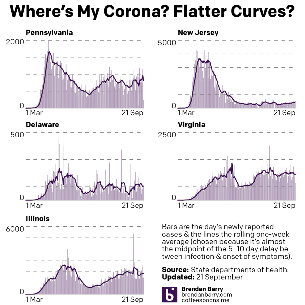
If we compare the above chart to last week’s, we can see that Pennsylvania has decidedly reversed course. Whereas things had been headed down in terms of averages, I was worried about the days of daily new cases exceeding the average. Sure enough the average has caught up to the new cases and we’re seeing a rise in the average to levels not really seen since the summer.
New Jersey remains on the path of slowly increasing its numbers of new cases. Delaware looks to be heading back down after a small bump. We might be seeing the beginning of a decline in cases in Virginia, down from its long-running plateau of nearly 1000 new cases per day. And finally in Illinois, it’s not quite clear where things are headed at present. But for the one-day spike that raised the average, it seemed as if new cases had been in decline, but the end of that otherwise decline might have been an inflection point as the average may be trending back upwards again.

Then when we look at deaths, well we see no real significant change in four of the states. But last week, we were saying Virginia was at a good spot with its latest surge cycle coming to an end. Well now look at that spike and deaths that are higher now than they were in the spring. If you follow my daily posts on social media, you’ll know that there’s a reason for this.
For the last week Virginia has been working through a backlog of deaths that were not entered into its electronic database. And so these deaths happened over the last several months. Consequently the rise, if there even is one, is not nearly as high as shown. But it also means that the earlier peaks may have been far higher than reported at the time.
Credit for the pieces is mine.
Leave a Reply
You must be logged in to post a comment.