For the last two days Philadelphia and much of the East Coast suffered from a heavy haze of smoke that blanketed the region. This wasn’t just any smoke, however, but smoke from the wildfires on the West Coast. This post isn’t about the wildfires, but rather something that exacerbated them. We are talking about the heat domes that formed earlier this summer. The ones that melted trolley cables in Portland.
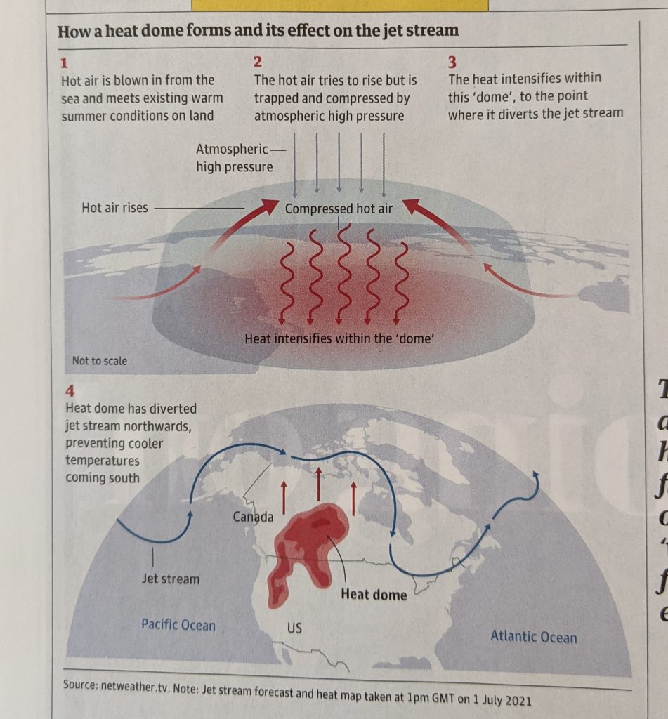
This was a nice print graphic in the Guardian Weekly, a magazine to such I subscribe that had several articles about the domes.

It does a nice job of showing the main components of the story and sufficiently simplifying them to make them digestible. One quibble, however, is how in the second map how oddly specific the heat dome is depicted.
The first graphic in particular is more of an abstraction and simplified illustration. But here we have contours and shapes that seem to speak with precision about the location of this heat dome. It also contains shades of red that presumably indicate the severity of the heat.
There’s nothing wrong with that, but it stuck me as odd juxtaposed against the top illustration.
Credit for the piece goes to the Guardian Weekly graphics department.
Leave a Reply
You must be logged in to post a comment.