The democratisation of design tools ostensibly allows people to create high-quality graphics. But I think we can all admit to ourselves we see a lot of work that…misses its mark. As a general rule, I do not often post work here by untrained designers. My peers and I have the benefit of education and experience helping shape our design decisions. The general public, not so much.
But over the last several weeks this piece appeared in a group to which I belong and I could not get past it. But as the weeks dragged on, my mind kept coming back to it and I realised I needed to say something about it. Again, no names, because in all likelihood this person has no education or experience in design, but does have access to a tool allowing for the creation of data visualisation content.
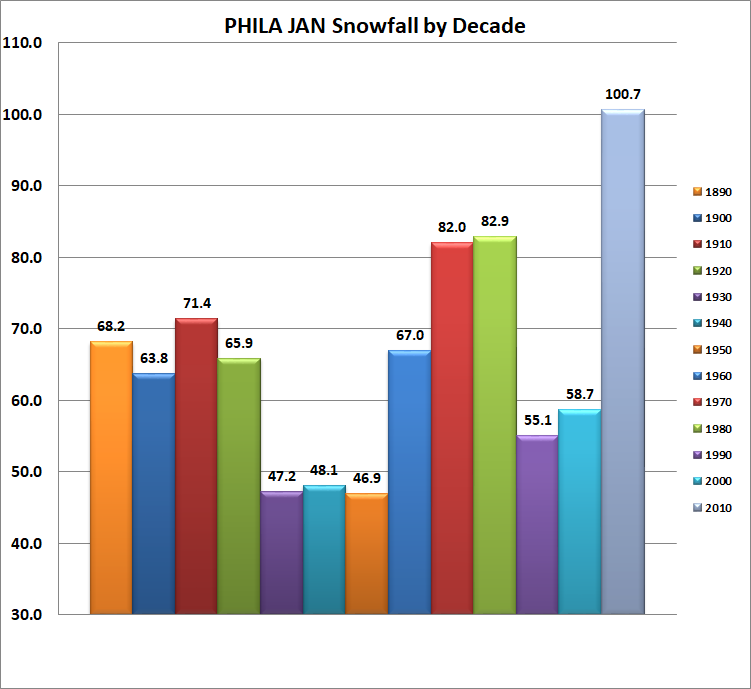
Let us start with colour. Colour is a design variable and can be used to encode data. In this case I immediately wondered what commonalities the decades shared. Why were some decades red? Why were some orange? Some blue? Then I noticed they seemed to following a pattern. Then I realised there is no meaning whatsoever in the colour.
Arguably, the creator could have used colour to encode something about, say, temperatures above/below average, or overall precipitation above/below average. Instead we have colour calling out and commanding the reader’s attention for differences that do not exist.
Then the colour itself presents a problem of attention. The red caught my eye. But the silvery blue at the end, for the most recent decade, faded into the background as a neutral colour against the bright primaries and secondaries. Yet, the narrative was largely around how the 2010s featured an unusual amount of January snowfalls. This chart emphasises all the other years instead of the 2010s.
And we have not even discussed the shadow gradient and the bevelling. These elements all add visual clutter, none of which clarifies or reinforces the story. Instead, the lighting and bevelling draws attention to the very tops of the bars. Almost as if the creator is trying to draw the reader’s attention away from the base of the columns—we shall get there. But this graphic approach has an additional problem: it creates an illegible legend.
Because each bar comprises a colour, an angled bevel, and a shadow, each little square needs to represent the same. Consequently in a very small area of precious few pixels, the software created a muddled mess of oft indistinguishable sprinkles of visual sugary sweetness.
Why did the legend need to exist in the first place? Could the creator not anchor the labels to the columns?
Next, above each column the creator chose to place a data label, which in bold black text calls for yet more reader attention. At first I had the bright reds of a rainbow shouting at me to ignore the big grey column at the end, but now, trying to yell above the shouting, I have black bold text screaming for my attention.
And none of them are needed. Do I need to know to the tenths of an inch the difference in January snowfall in Philadelphia differed by 0.9 inches? That the precise amount was 82.0 vs. 82.9? No, the precise amounts do not help tell the story, they add visual clutter and distraction. The chart makes use of an axis and labelling that clearly tells the reader the bars are above 80 inches and likely closer to 80 than 85 given the location of the 90 inch axis line.
But then read down the axis lines and you will find they stop at 30 inches. Why 30? First is the issue of not showing the entire data set, especially because the bars represent cumulative snowfall in the aggregate. They represent literal depth of snow above the ground. But the creator chose to at best misrepresent the data by chopping off the y-axis by roughly two-thirds.
This will accentuate the differences between similar numbers, see again the 82.0 vs 82.9 difference. In truth, that little of a difference matters not. What matters more is the relative lack of snow in the 1990s and 2000s. Maybe the creator just wanted the chart to look more exciting and dynamic with bigger, taller bars contrasted against shorter bars. But in truth this visualisation lies to the reader. The 100.7 inches of snow in the 2010s is certainly greater than the 58.7 inches in the 2000s. But, rounding just a touch, 60 is more than half of 100 and nearly two-thirds. Visually, however, this chart shows 60 inches as significantly less than half.
Do I think the creator intended to lie, misrepresent, or mislead the audience? No, I do not want to ascribe malicious behaviour to the individual, but the fact remains the chart visually, at best, misrepresents the data.
Are we better as a society when democratised tools allow for the creation and spread of lies, misrepresentations, and misleading content? Do we need to better educate individuals about how to read charts? Do we need to better educate creators on how to visualise data and information? Do we need to better value clear communication?
Of course if I had the answers to those questions, I would not be sat here writing this blog.
So naturally I decided this morning to take a quick pass at reworking the chart.
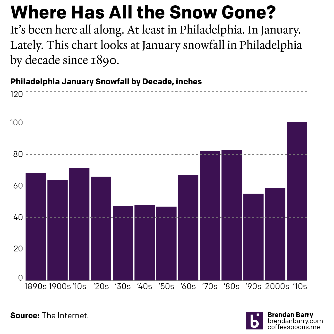
I threw the chart into my Illustrator template and the result is a quieter piece that more clearly shows the variability in January snowfall amounts in Philadelphia. Are the differences as dramatic as in the original? No, but the data does not suggest that either. Instead, the city has seen since the 1890s approximately 60 inches of snow in January each decade. Some decades have been a bit less, others a bit more, but they clearly hover around that 60 inch line. Until you get to the 2010s and the few big storms in the early years of that decade that push the most recent decade up to a high just north of 100 inches.
Credit for the reworked piece is mine.