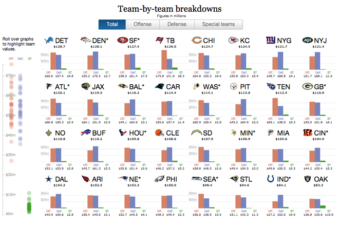
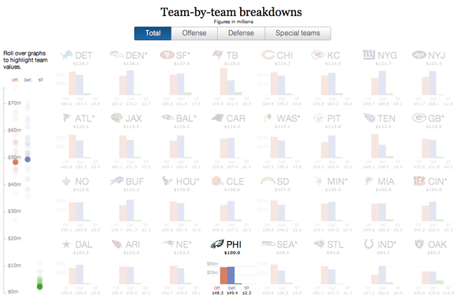
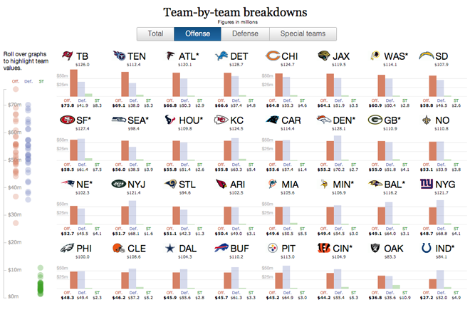
While the Superbowl was two weekends ago, I have been sitting on this post for a little while. Probably because I really just don’t understand the sport. But over at the Guardian, the interactive team put together an interactive infographic that looked at payroll spending for each team by position and by overall position, i.e. offence vs. defence.
Admittedly I found the position part not as interesting, probably because of my aforementioned lack of understanding of the game. But the small-multiples-based exploration of the offence vs. defence numbers was quite interesting. It allows the user to highlight their preferred team and then sort the view by offence, defence, or special teams.


Credit for the piece goes to the Guardian US interactive team and Harry J. Enten.
Leave a Reply
You must be logged in to post a comment.