If you do not live on the East Coast, you may be unaware that there was some minor snowfall in New England over this past weekend. The Weather Channel went ahead and named the storm Nemo. (I’m going to lay off the suspect and fishy jokes.) I wanted to revisit the storm because of two graphics that both mapped snowfall totals.
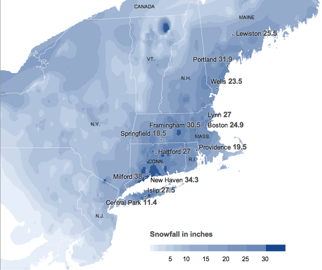
The first is from the New York Times. As one would expect, a quality graphic with clear colour ranges to show the impact across the wider New England area, western New York and New Jersey.

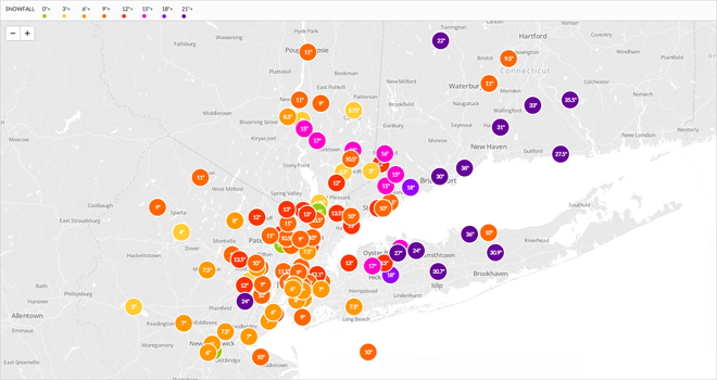
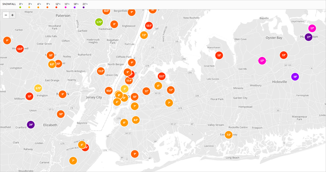
But from the local radio station WNYC came an interesting map of users’ observations. Because it’s a local radio station, the difference between the two versions is that the breadth of data is not as far-reaching as the Times’ data from the National Weather Service.

However, this sort of user-created data allows for more nuanced, locally-specific data visualisations.

Of course, this creates issues with the accuracy of the data. And in the case of this map, whether the amount given was a snapshot of the snowfall at the time the snow was falling or the final tally.
Credit for the pieces go to the New York Times, and to Steven Melendez, Louise Ma and John Keefe for the WNYC piece.
Leave a Reply
You must be logged in to post a comment.