Today’s piece maps and charts comes from the Illinois Department of Public Health. The piece combines maps and charting components to detail preventable hospitalisations and emergency room use in the state of Illinois.
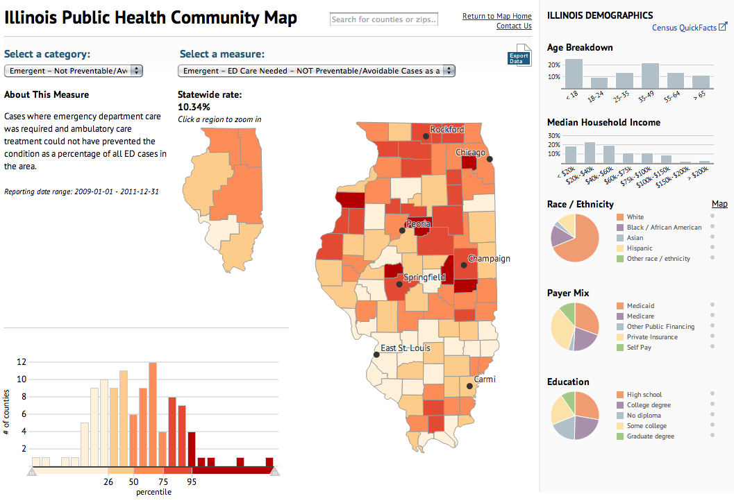
Ordinarily I would prefer just one map, however, in this case the designers realised that a regional map—with its larger surface area—need not be as large as the county map. Some additional elements worth noting is the area devoted to the human explanation of the categories, which might otherwise be difficult to understand.
Credit for the piece goes to Axis Maps.
Leave a Reply
You must be logged in to post a comment.