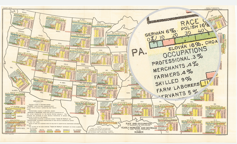
This is an old map that saw the light of day a while back. Featured on Vox, the map supports the notion that some white people are whiter than other white people. The map explores immigrant populations. Using a map for spatial arrangement of integrated components, the data looks at immigrants’ ethnic origins, their workforce breakdown, and their recent growth.
Credit for the piece goes to FS Howell. (I presume.)
Leave a Reply
You must be logged in to post a comment.