Tag: charting
-

To X or Not to X
As it happens, the Latino culture largely remains x’ed out on using the term Latinx, according to a new survey from Pew Research. The issue of supplanting Latino/Latina with Latinx as a gender neutral replacement—or as a complementary alternative—emerged in the general discourse in that oh-so-fun year of 2020 when everything went well. One common…
-
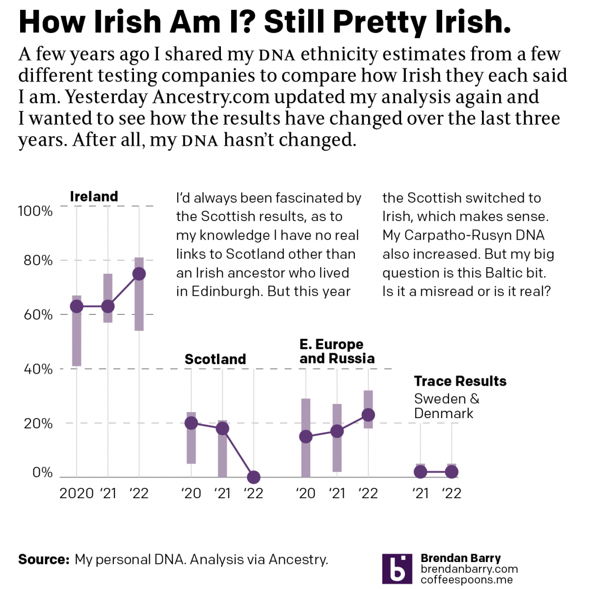
No Matter What You Say, I’m Still Me
As many long-time readers know, I was long ago bitten by the genealogy bug and that included me taking several DNA tests. The real value remains in the genetic matches, less so the ethnicity estimates. But the estimates are fun, I’ll give you that. Every so often the companies update their analysis of the DNA…
-
Climate Conscientious and Cheaper Cars
Sometimes in the course of my work I stumble across graphics and work that I previously missed. In this case I was seeking a post about one of my favourite infographics, but it turned out I’ve never posted about it and so I will have to rectify that someday. However in my searching, I came…
-
Just Keep Grinding it Out
There are certain journalism outlets that I read that consistently do a good job with information design or at least are known for it. Now I try to keep my media diet fairly large and ideologically broad, but in that there are also still some outlets that feature quality design than others. The New York…
-
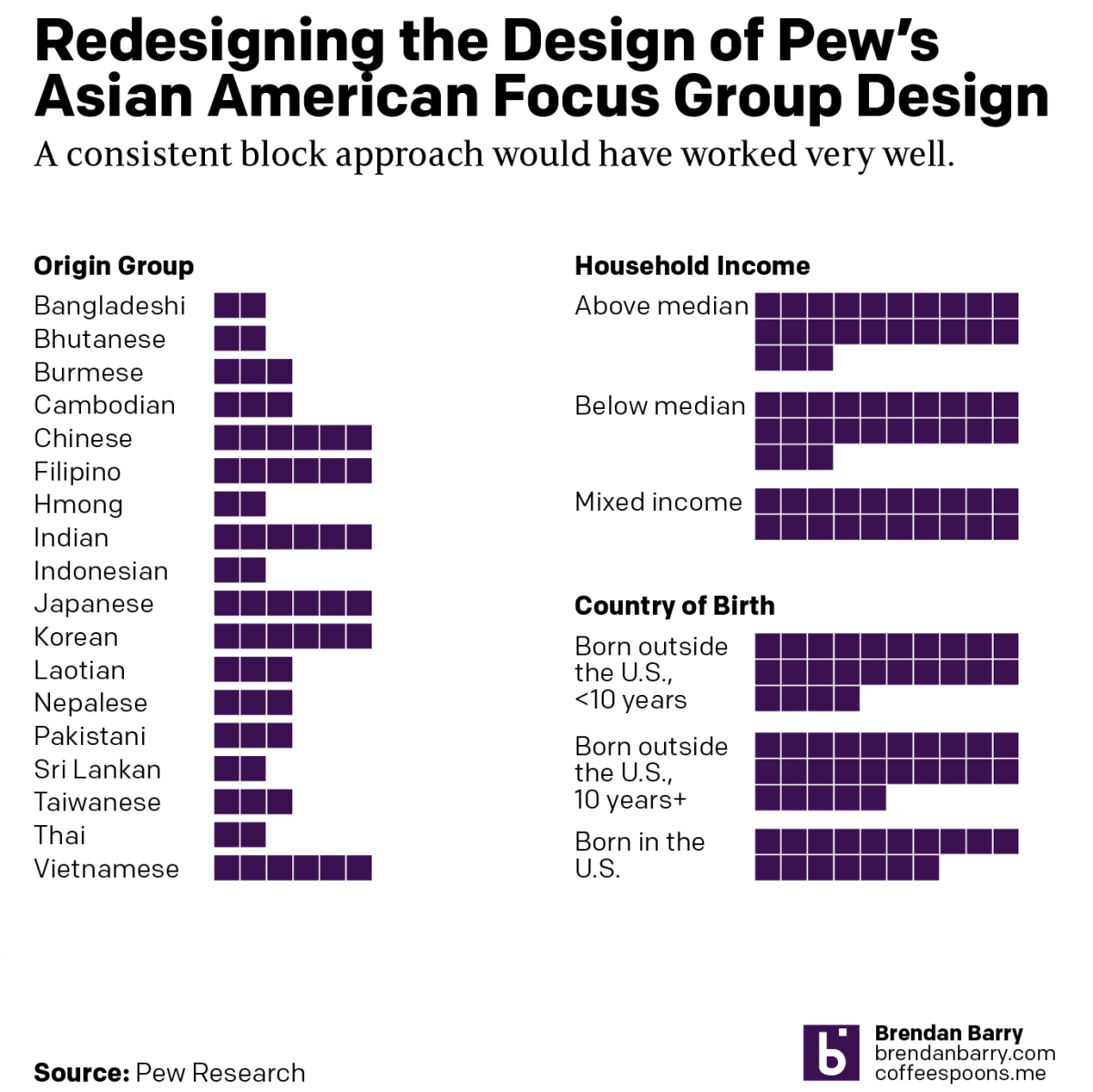
What It Is to be Asian American
Pew recently released a report into the Asian American experience. The report used 66 different focus groups to gather feedback and then summarised that with quotes, video bits, and lots of text. But at the beginning of the report was a nice little graphic that detailed the composition of the focus groups. This is not…
-
The Great British Baking
Recently the United Kingdom baked in a significant heatwave. With climate change being a real thing, an extreme heat event in the summer is not terribly surprising. Also not surprisingly, the BBC posted an article about the impact of climate change. The article itself was not about the heatwave, but rather the increasing rate of…
-
Warming Towards Women Leaders
We are going to start this week off with a nice small multiple graphic that explores the reducing resistance to women in positions of leadership in Arab countries. The graphic comes from a BBC article published last week. These kinds of graphics allow a reader to quickly compare the trajectory of a thing between a…
-
New Mexico Burns
Editor’s note: I was having some technical issues last week. This was supposed to post last week. Editor’s note two: This was supposed to go up on Monday. Still didn’t. Third time’s the charm? Yesterday I wrote about a piece from the New York Times that arrived on my doorstep Saturday morning. Well a few…
-
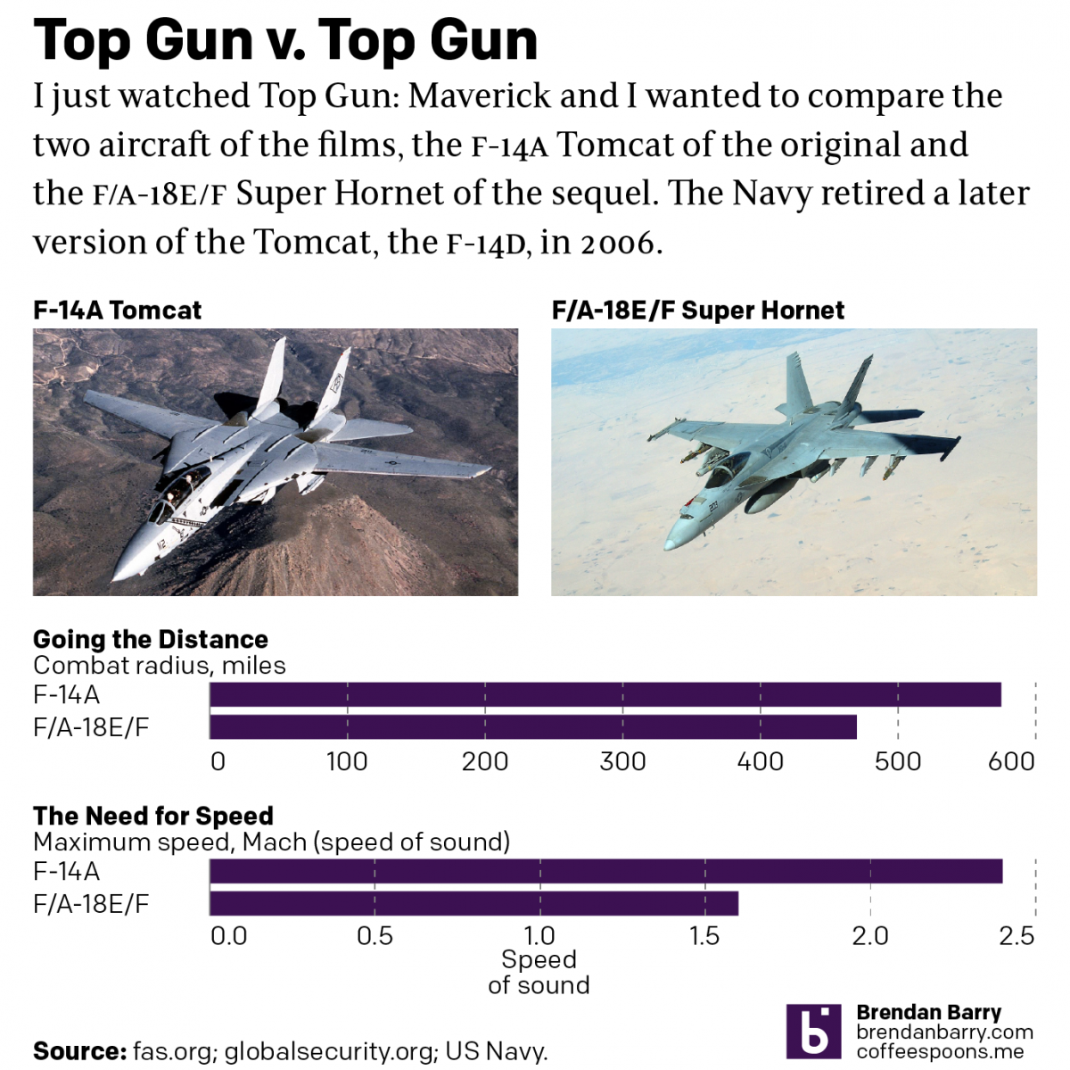
Top Gun
Last night I went to see Top Gun: Maverick, the sequel to the 1986 film Top Gun. Don’t worry, no spoilers here. But for those that don’t know, the first film starred Tom Cruise as a naval aviator, pilot, who flew around in F-14 Tomcats learning to become an expert dogfighter. Top Gun is the…