I noticed an interesting thing this morning. Over the holiday weekend I bookmarked a BBC News article about new airlines because it included a small graphic showing the number of airlines started during the pandemic (32) and the number of new airlines lost during the pandemic (55). The graphic used a stock three-dimensional illustration of a passenger airlines with a blank white body. From the top of the body rose two white bars, next to the left was the shorter of the two with a 32. The right was taller and had a 55. Above each was a header saying something to the effect of “Airlines started in 2020” and “Airlines lost in 2020”, respectively. Funny thing this morning that when I returned to the bookmark with this post in mind, the article’s graphic had disappeared.
This weekend I happened to start re-reading 1984, George Orwell’s classic dystopian novel about a man named Winston Smith. He works in the Records Department and is tasked with “rectifying” misstatements. I had just finished reading the section where Orwell describes Smith’s work wherein he takes previously published newspaper articles about statistics and figures and then edits them to include new numbers aligned with the actual outputs. This way should anyone read the old article for evidence of a previous past, they find the output forecasts have always been correct. He then destroys the written record of the old past by dumping it into a memory hole, a pneumatic tube that delivers it straight to a furnace where the old past is incinerated and thus replaced with Smith’s new version.
When I read the article again, because the graphic was gone, I read a paragraph that had figures for 2021. I cannot recall those numbers being present earlier this weekend. But they are roughly where I remember the old graphic being. Yet the article includes no note about any edits to a previous version let alone what those edits may have been. And so now I am left wondering if I really saw what I think I remember that I saw. How very Orwellian.
But let’s assume I did see what I thought I saw, the graphic was actually unnecessary. It presented two figures, 32 and 55. The bar chart itself had no axis labels and that made it a bit difficult to believe the numbers themselves. It did not help that the white bars blended almost seamlessly into the white body of the airliner. Moreover, the graphic was large and fit the full width of the text column. For two figures.
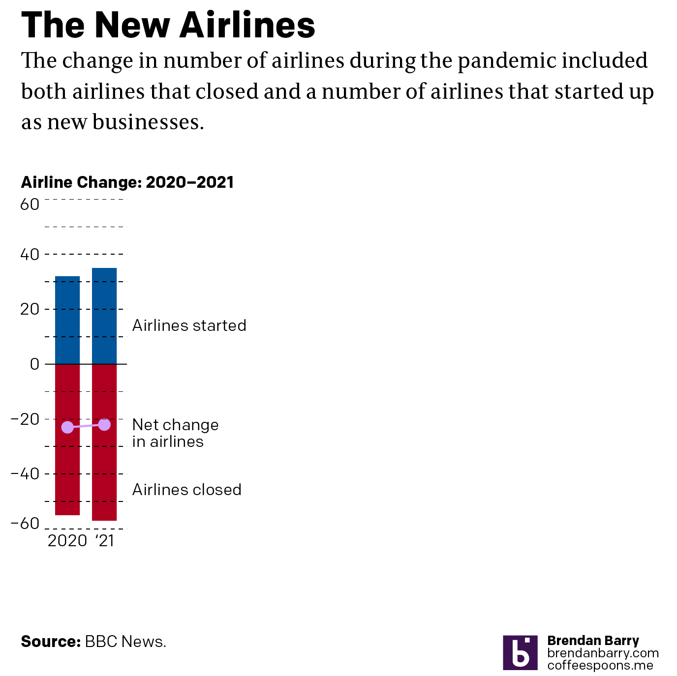
My initial goal was to show this graphic I made to show just how little space truly needs to be used to show an effective graphic. I also changed the direction of the bars. Instead of making one bar about the positive change and the other the negative change, I made both bars about the change. Therefore the one bar moved upwards with the positive (32) and the other downwards with the negative (55). I then plotted a dot to show the net change between the two. Yes, 32 airlines were created in 2020. But that still made for a net loss of 23 that year.
But because the graphic was missing and there was some new text for 2021 figures, I decided to incorporate them as well to show how the trend basically continued year over year.

I left the white space to the right to illustrate how you really do not need a full-width graphic to display only six data points, itself a three-fold increase on the original graphic’s data content. The original graphic contained more illustrated plane than it did data content.
Graphics should be about the data, not about the splashy, flashy, whizbang background content that ultimately distracts our attention away from what should be the focal point of the piece: the data. The article still contains photos of planes with the livery of the new airlines, of empty terminals to represent the pandemic losses, and portraits of executives. This graphic did not need an illustrated plane taking over the graphic. It needed to only show those two numbers.

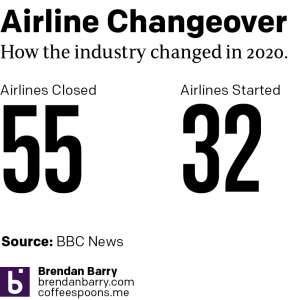
I would even contend that the article could have made do with a simple factette, two big numbers. Airlines closed in 2020 and the airlines opened. It need not be fancy, but it quickly delivers the big numbers with which the reader should be concerned. You don’t need to see an aircraft or a terminal. You could add some colour to the numbers or even a minus sign as there is a significant difference between a 55 and a -55. But all in all, the graphic need not be full width like it was originally.
But I think we should all keep in mind the value of transparency. The graphic did exist, of that I am certain. But future readers or even my sanity cannot be sure that it did. And in an era where “fake news” and fact-checking are important, I wonder if we need to be including corrections notes in more of our news articles. Because if we lose faith in our news, we have little left to lean upon in our societal discourse about the events of our time.
Credit for the piece is mine.