
Last one of these critiques—I promise. Earlier this week I looked at the New York Times’ coverage and the BBC’s coverage. Well, today I want to examine the Guardian’s coverage of the Brexit vote results. This piece differs the most from the preceding work and it starts right from the top, literally.
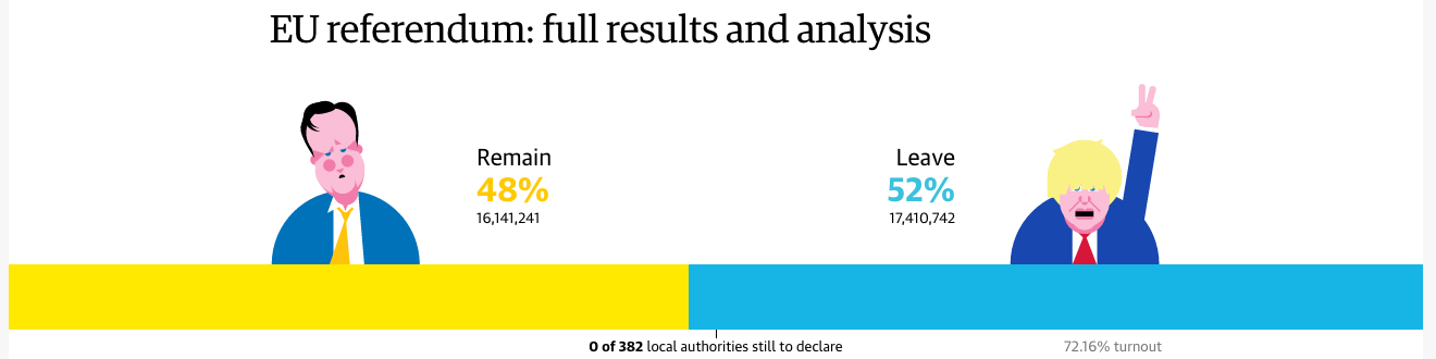
I am not the biggest fan of the illustrations of David Cameron and Boris Johnson, but in a sense, neither is a throw-in. For the last few months, the Guardian has been using these and similar illustrations of US presidential candidates to tie results into different political camps. Thus in that sense, they do fit the Guardian’s current brand. Interestingly, neither remains (pun intended) in the picture for the future of the Tories.
Data-wise, however, the decision to use the bar chart at the outset of the piece reflects an understanding of the importance of the top-line number. Districts count, but only at that granular level I discussed. What truly matter, though, is the aggregate. And this is a no-doubt-about-it means of conveying that information. (I will admit the David Cameron frowny face does help a wee bit.)
And if the use of big numbers and illustrations at the top of the piece broke with the choropleth map we saw with the New York Times and the BBC, well, we have another clear break.
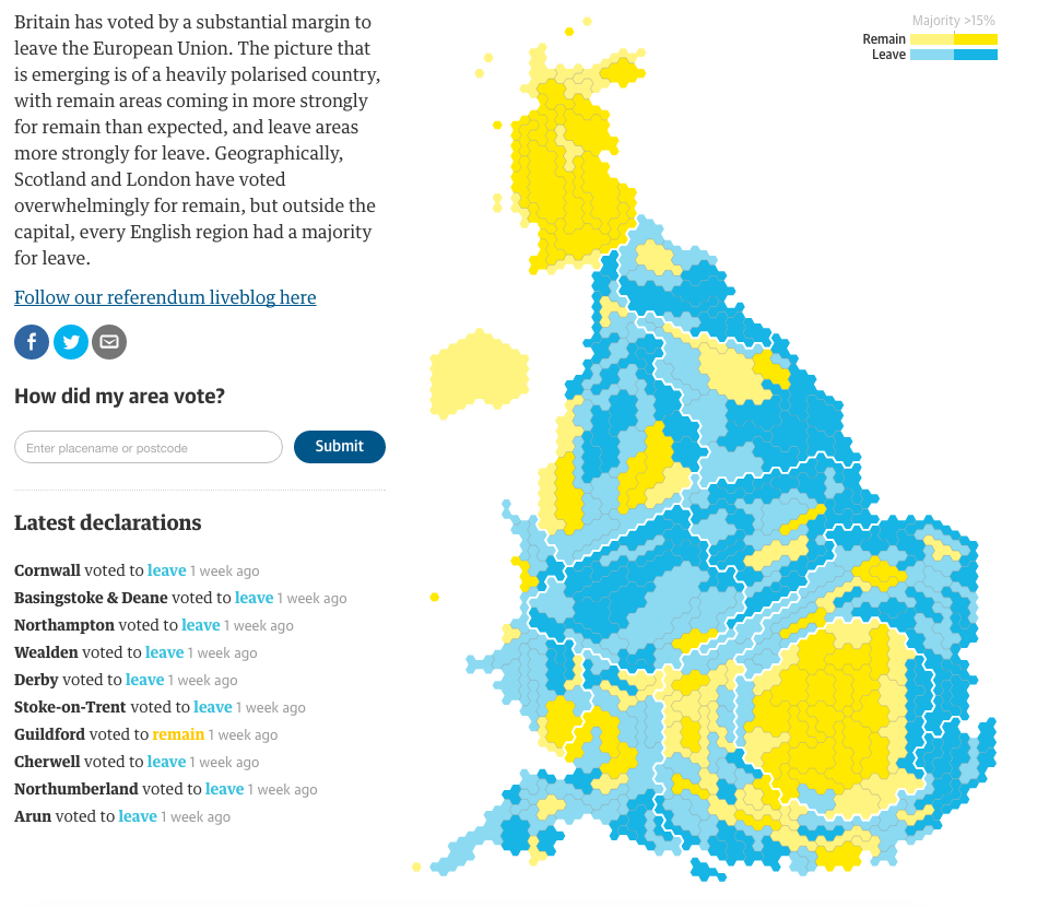
Instead of using a geographic map, the Guardian employs a cartogram with hexagons. I have covered similar uses a several times before today. The hexagon shape allows better retention of familiar geographic shapes, while still providing a means of solving the small district problem, especially in places like central London.
From another design perspective, that of colour, we see an improvement over the blue–yellow spectrum used by the BBC. You may recall from yesterday:
Having multiple tints and shades of yellow makes the map difficult to read.
Here, the Guardian instead opted for a simplified, and easier to read, two-step split. Bright blue and yellow with each have a call it half-tint. With only two blues and, more importantly, two yellows to distinguish, the map becomes easier to read. The trade-off, the darker of the colours represents anything above a 15% majority.
Clicking on the map then provides with a small summary of the district results.
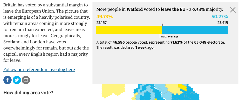
Here we see nothing too dissimilar from how the BBC treated the interaction with their map. A small, subtle design element I enjoy, however, is the inclusion of the national average. The 50% marker indicates clearly which side won, but the tick below the bar gives the reader context of where the district fell into relation to the remainder of the country.
And that leads us into the next set of comparisons.
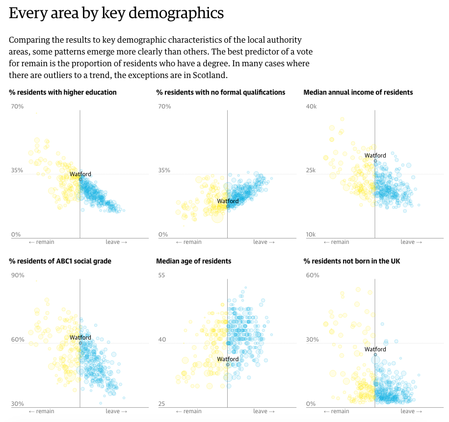
The Guardian took local district results and compared them against several different demographic and socio-economic indicators. This allowed them to present various correlations of the vote. It turns out that higher education correlated best with the results of the UK vote. From a design perspective, the linked circles provides some stability. However, I would have preferred the ability to click a geography and have it remain sticky and bring up the specific figures. Additionally, some sort of text search for geographies would be helpful.
And then the Guardian’s piece closes as strongly as it opened.
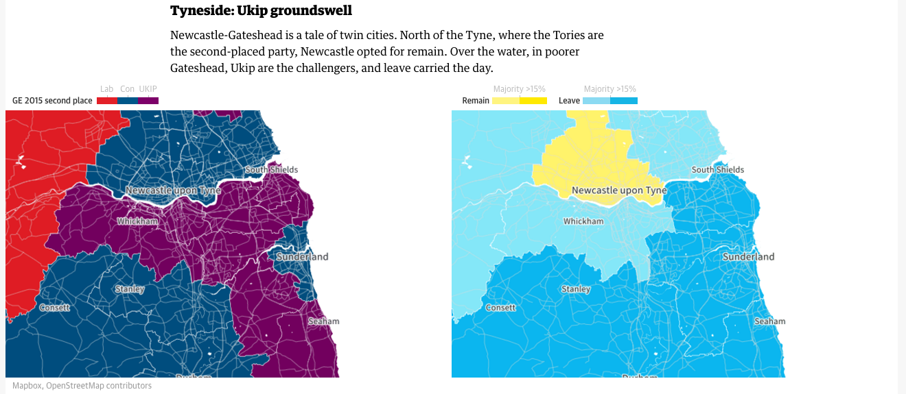
The piece examines three riverside areas to provide specific analysis to the vote. The screenshot above focuses on the Tyne, which runs alongside the aptly named Newcastle upon Tyne. The Guardian uses the previous general election results for the area to contrast with the referendum results. It does similar analysis for the Thames (London) and the Mersey (Liverpool).
Similar to the New York Times piece, the Guardian’s piece responds well to viewing the content on a small screen. The changes are less complex and they deal mostly with the arrangement of the various components instead of the layout of contextual data. But the Guardian clearly considered how the piece would work on a mobile phone up through a widescreen monitor.
Overall the piece is quite strong and does an excellent job of showcasing the results data and providing insightful analysis that complements the vote totals.
Credit for the piece goes to the Guardian graphics department.