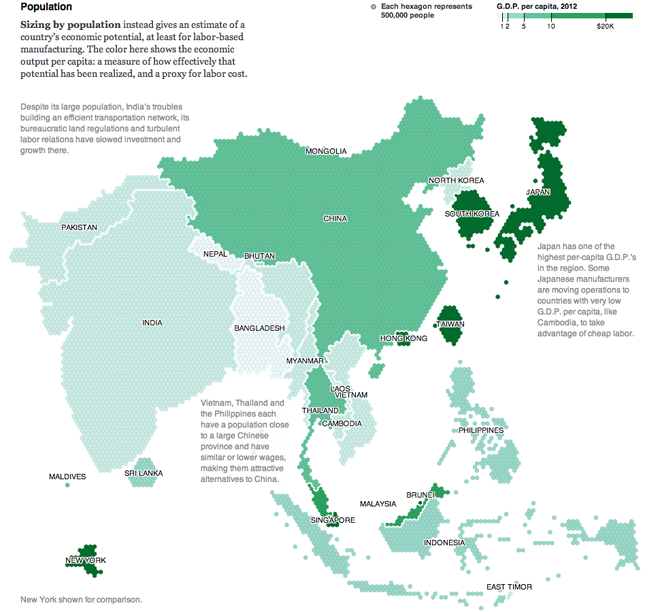
Continuing this week’s map theme, we have an example of a cartogram from the New York Times. This piece supplements an article about how some manufacturing companies are starting to look away from China as a place for their facilities. There are two maps, the first (not shown here) looks at economic output overall. The second (below) takes that output and accounts for population.

Hexagons are used instead of the more familiar squares to represent 500,000 people and the colour is the GDP per capita. The text accompanying the graphic explains how this is a measure of economic potential being (or not being) realised. But what the hexagons allow the map to do is better represent the shapes of the countries. Squares, more common in cartograms, create awkward box-like outlines of countries. That would be fine if countries were often shaped like squares, but they are not.
I am not often a fan of cartograms, but I find this one well executed and the annotations and explanatory text make what might otherwise be confusing far simpler to understand. All in all, a solid piece.
Credit for the piece goes to Mike Bostock and Keith Bradsher.
Leave a Reply
You must be logged in to post a comment.