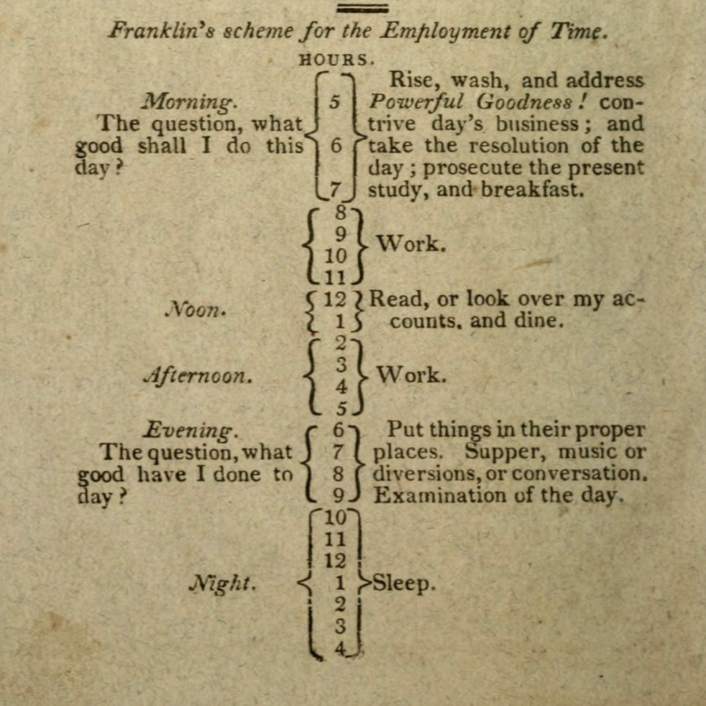
Earlier this week I was researching something for my day job that prompted me to look through an 1820 city directory for Philadelphia. Whilst looking for my information I came upon this graphic depicting how Ben Franklin advised people divide their time during the day.
But when do I check my e-mails?
Notably, this is all done in 1820, and so the typesetters used metal type, not graphics in our present-day sense, to create this. Although, that does leave room for a few issues of where these breaks actually occur. But overall this is remarkably similar to a day in the life in, well let’s just say January 2020 in the before times. An eight-hour work day with an hour’s break for lunch. And then four hours to yourself in the evening. Seven hours of sleep and then three hours to yourself in the morning.
Of course in the pre-electricity era, you can see how these times are focused around, you know, daylight. No lingering at the pub until well after midnight. It’s also notable how the emphasis on dining is at noon, not in the evening as we tend to do today.
Whilst this is billed as Franklin’s advice on how to structure your time, it should be pointed out that by 1820, Franklin had been dead just over 30 years. But that’s just one generation’s time removed.
Enjoy your weekend, everyone.
Credit for the piece goes to I’m guessing the book’s printers, McCarty and Davis.
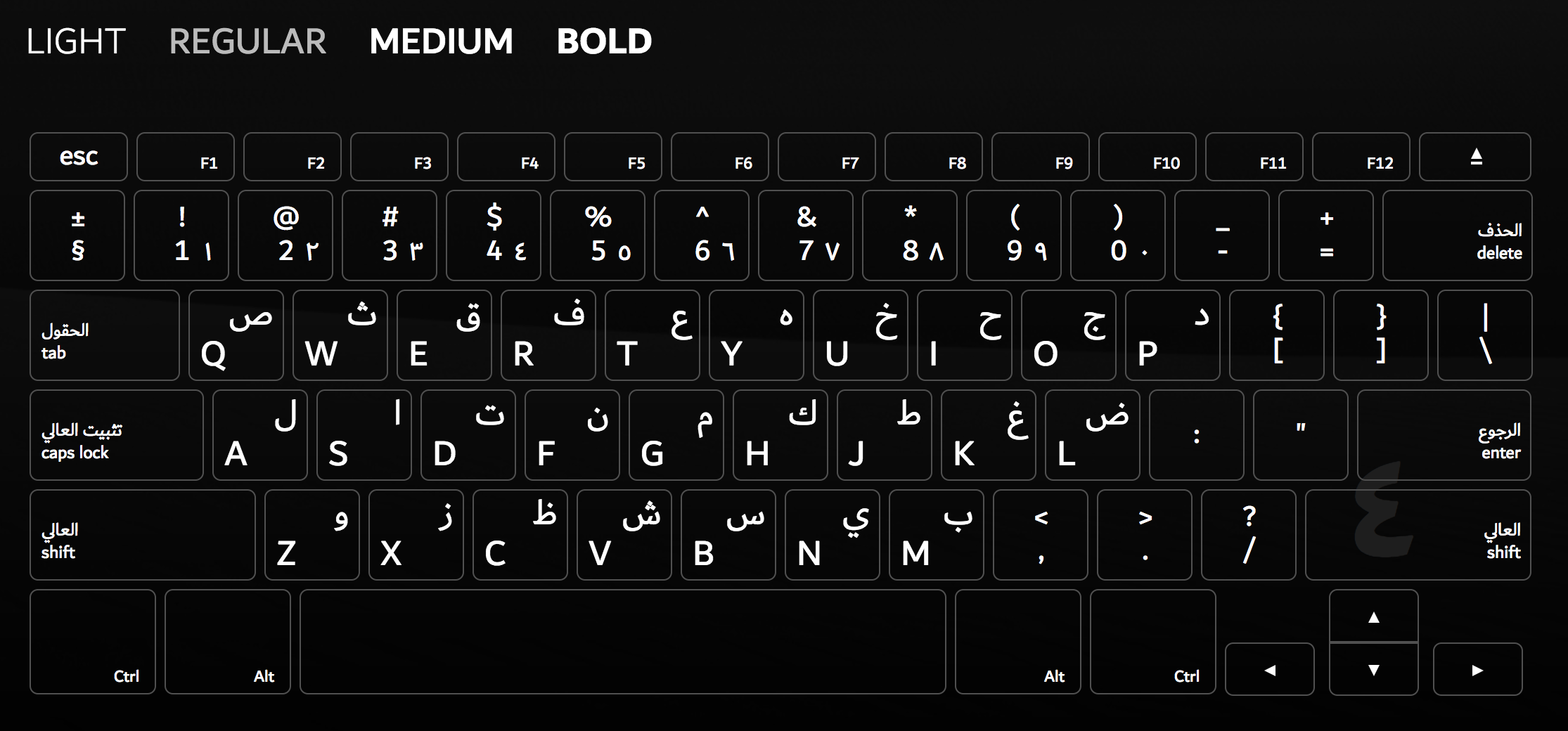
Information design takes many forms. True, in this blog I focus mostly on graphics, but signage is another important form. And the keys to signage are iconography and typography. So today we are going to take a look at some news in the typography front. Specifically, the introduction of a new typeface for Dubai designed by Nadine Chahine and Microsoft.
The uppercase
First, I am no expert in type design, but I dabble. Second, note that the above screenshot with its white type on black screen, each letter surrounded by keyboard shapes, is the only graphic on the website that I could easily find for a spec sheet.
The typeface does appear to have some nice letters in there and from the site it clearly reads well at small sizes. But that’s the Latin version. The real beauty in the thing is the simultaneous design of the Arabic script side of the face.
I am no expert in type design, but I do have experience setting type in Arabic as well as choosing an Arabic face for brand identity. It is really, really hard. (For the record, I found a really nice version of Avenir Next turned into Arabic.) So what I really like about this project is that it makes a nice typeface in both Latin and Arabic available to the public for free via Microsoft. Great, fantastic.
But where I get suspicious is that second point. That one graphic is the only one I could find. The site copy really pushes Dubai, Dubai, Dubai. And my cynical self wonders if the real purpose was to promote the emirate by throwing some money at design, which it can do because it has a lot of money.
Or to look at it another way, if it were not so Dubai-promotional, would it not have examples of it in use? A full character set on display?
But why am I most doubtful? Well, it does not take more than the first handful of results on the Google to bring up some less than stellar things about Dubai. What do I mean? Well, first look at the first two sentences on the Dubai Font page:
Expression is the way everyone shares their thoughts, ideas, and emotions. Writing is a form of expressing oneself and Dubai is giving the world a new tool to communicate with.
And now snippets from the first three results that are not Wikipedia (worth pointing out that Dubai is part of the United Arab Emirates and these reports are on that country as a whole):
International Centre for Justice and Human Rights
United Arab Emirates is a federal state comprising seven emirates, including Abu Dhabi and Dubai. The UAE nationals represent 11.5% of the population who number 8.5 million people. The country has seen a wave of arrests and violations of human rights and freedoms and mute the voices of dissent. The authorities are continuously and increasingly, restricting personal freedoms and freedom of speech, press, assembly and association. As practiced blatant attacks on the privacy of citizens.
Amnesty International
The authorities continued to arbitrarily restrict the rights to freedom of expression and association, detaining and prosecuting government critics, opponents and foreign nationals under criminal defamation and anti-terrorism laws. Enforced disappearances, unfair trials and torture and other ill-treatment of detainees remained common. Scores of people sentenced after unfair trials in previous years remained in prison; they included prisoners of conscience. Women continued to be discriminated against in law and in practice. Migrant workers faced exploitation and abuse. The courts continued to impose death sentences; no executions were reported.
Freedom House
While the United Arab Emirates (UAE) constitution provides for freedom of speech, the government uses its judicial, legislative, and executive powers to limit this right in practice.
True freedom of expression from Dubai should not and is not about designing a new typeface, but honouring the actual idea of freedom of expression. That is to say that I may say things that you do not like and vice versa.
Designing a new typeface that works in both Latin and Arabic? Well one, where were you like eight years ago? But of almost as much importance, a clean, Dutch-inspired typeface is not going to wipe your slate clean and prevent you from ever visiting the Hague. Actions speak louder than the typeface in which you set your words, whether they’re Arabic or Latin.
Credit for the piece goes to Nadine Chahine and Microsoft, designers of the typeface.
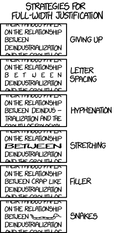
I am not a big fan of fully justified text. I get it, in things like newspaper and narrow blocks of copy, it can make sense. Although in those situations, again, personal preference is flush left ragged right. But, for when you do have to fully justify your text, xkcd has a guide to deal with those tricky situations where you have very few characters on a line.
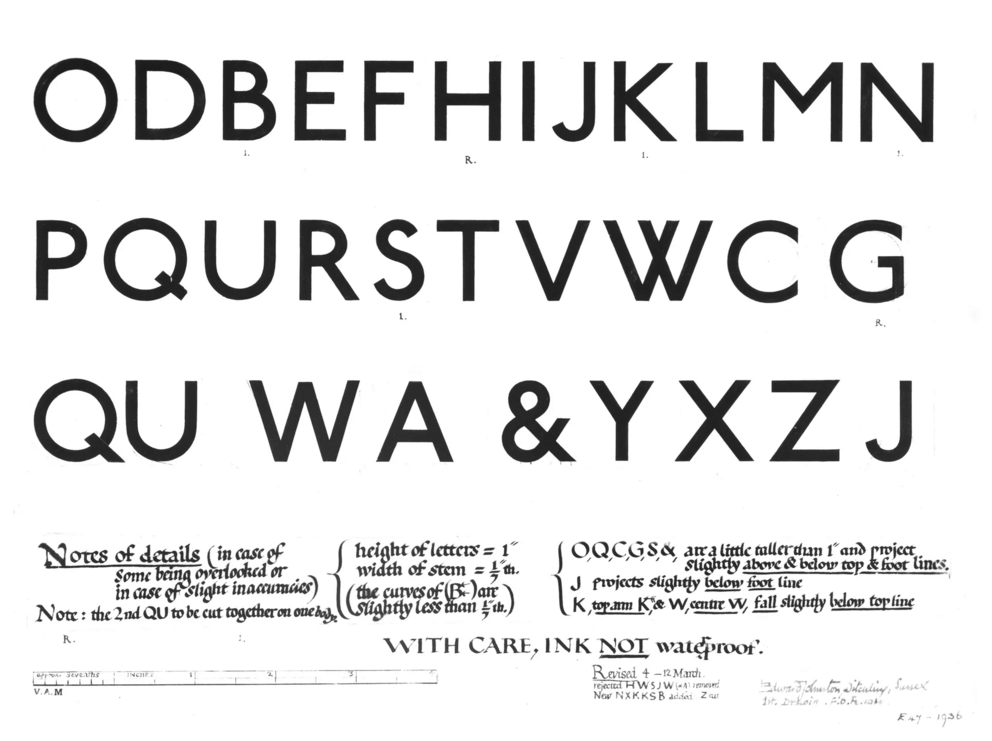
Johnston, the typeface of the London Underground, turns 100 this year. And so last Thursday the Guardian posted a short article about the typeface. It is worth a quick read, if only for the description of serif typefaces as “letters without the little flicks at the end of their strokes”. Some people overlook typeface selection when it comes to the display of data and information, but it is vitally important. Letters need to be clear and easy to understand, but also set at the right size for the audience. If they fail to do that, a work fails to be legible, and that means something is not being communicated. And that is a failure in design.
The original design
Note the handwriting for the notes versus the sans-serif letterforms.
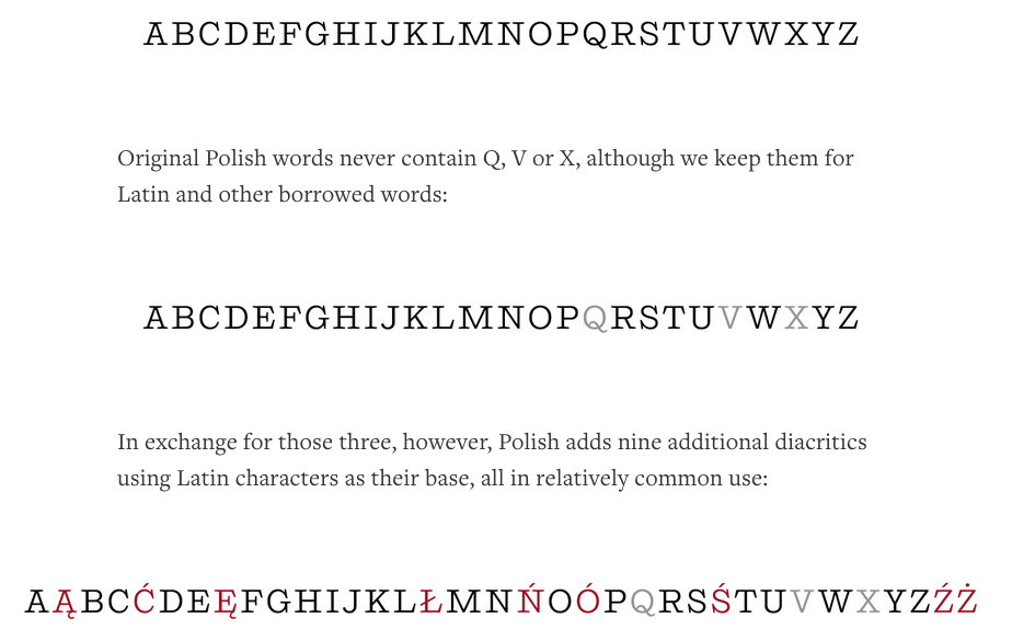
Today’s piece is not a chart, nor is it some complicated piece of data visualisation. Instead, we are looking at a piece from Medium that attempts to explain the disappearing Polish S. Basically, it is a roundabout way of saying that it is very difficult to type in foreign languages on American keyboards because of the additional letters and/or diacritics. If you are at all interested in typography, the article makes nice use of comparative photographs and highlighted colours in the alphabet to illustrate its case.
Today I am going to take a day-long step away from data visualisation. The Harvard Business Review recently published a short piece looking at some of the symbolism—I mean symbology clearly—we use on the internets.
The ampersand
Credit for the piece goes to the Harvard Business Review.
This is not strictly related to information design or maps or any such things, however, India has adopted a new symbol for their currency, the rupee. The symbol joins the dollar, the pound, the euro, and the yen in having a special symbol. According to the article in the New York Times, adding the symbol to unicode will take some time. But when it eventually happens I will probably have to learn a new shortcut.
New Rupee Symbol and Its Designer
Photo is from the Associated Press via the article.