Tag: history
-
Stone Hard(ing)ly Beats Wood
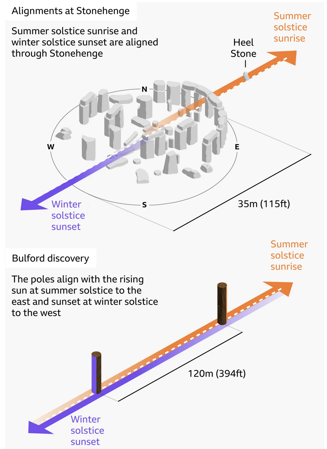
At least in chronological dating. I debated posting this today or Monday, given that this weekend is a three-day holiday in the States, and that the selected graphic—in this case an illustration—explains the alignment of Stonehenge and—the focus of the BBC article wherein this graphic appears—a prehistoric, pre-Stonehenge, well, henge of wood posts only a…
-
Words. Words. Words.
This year—and last—I have been making a more concerted effort to read more and use social media less. I just finished reading an Isaac Asimov novella, Lucky Starr the Moons of Jupiter, but that interrupted my reading of The Carpathians, a non-fiction book about the history of the northern slopes of the Carpathian Mountains—the Polish…
-
A House by Any Other Address
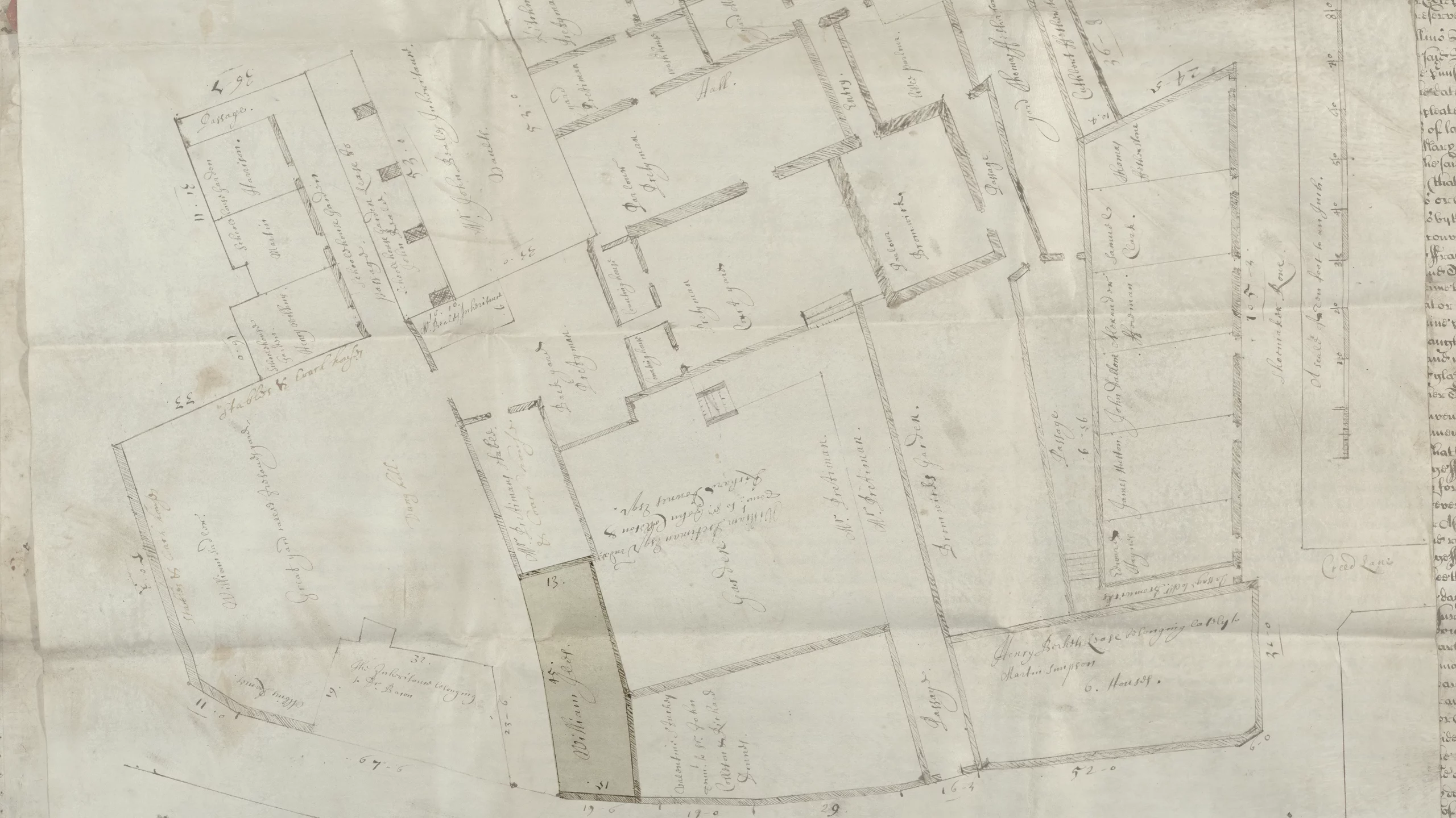
Yesterday, the BBC reported a William Shakespeare expert’s research into unrelated materials uncovered the lost address of a home owned by the Bard in Central London. Ironically, the very spot the researcher, Professor Lucy Munro of King’s College, identified is presently marked by a blue plaque—a marker system used in the UK to identify sites…
-
Iran, Not Persia
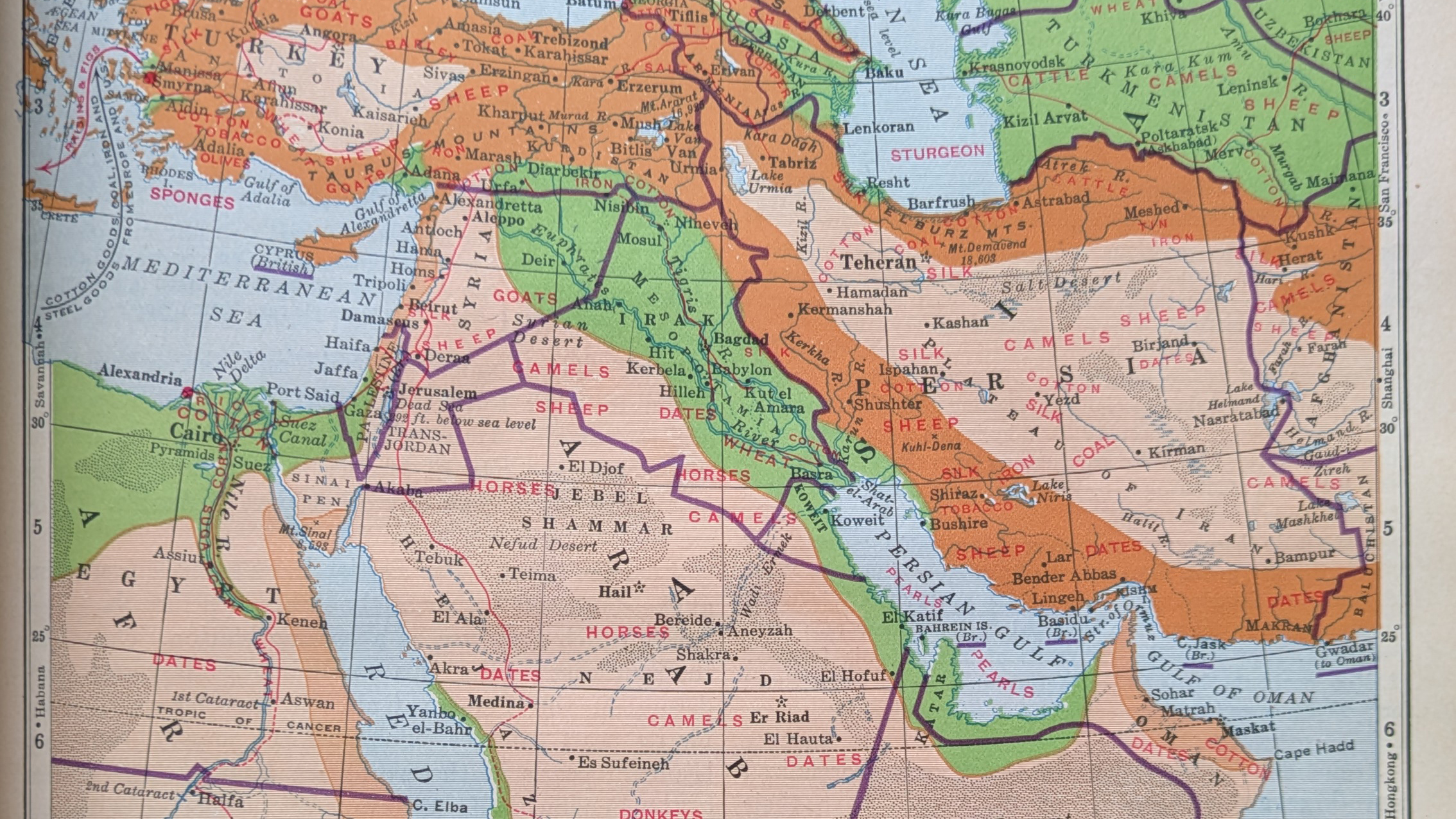
So if you’ve a date in Tehran, she’ll be waiting, in, well, Tehran. Happy Friday, all. On Monday I critiqued a graphic from Bloomberg about airstrikes in the Middle East. As we head into the weekend, I opted to pull one of my (many) atlases off the bookshelf, because I just wanted to see how…
-
Cannon, Howitzers, Mortars—Oh My!
For the last two days I have been writing about the Fort Pitt Museum and some infographics, environmental graphics, diagrams, and dioramas that help explain the strategic value and thus history behind the peninsula at the confluence of the Allegheny, Monongahela, and Ohio rivers. In particular, we looked at Fort Duquesne, the French attempt to…
-
Fort Pitt
Yesterday I discussed some of the work at the Fort Pitt Museum in Pittsburgh, Pennsylvania. Specifically we looked at Fort Duquesne, the French fortification that guarded the linchpin of their colonies along the Saint Lawrence Seaway and the Mississippi and Ohio River valleys. In 1753, the royal governor of Virginia dispatched a British colonial military…
-
Diagramming and Diorama-ing Fort Duquesne
Pittsburgh exists because of the city sits at the confluence of the Allegheny, Monongahela, and Ohio Rivers. As far back as the early 18th century, English and French colonists had recognised the strategic value of the site and as imperial ambitions ramped up, the French finally wrested control of the area from the English and…
-
Hidden Cities in the Amazon
Who did not like Indiana Jones growing up as a kid? Or better yet, stories of explorers like Heinrich Schliemann, who discovered the lost city of Troy? The ancient world boasted a number of civilisations that no longer exist. But not all lost civilisations date back thousands of years. A recent article in Nature details…
-
Revolution Number…
Nein? Last week we ended the week with a Friday post looking at Covid-19 cases. And they are not trending in the right direction, to put it mildly. Now I’m not sure I like the Covid post being on Friday, but it also doesn’t make sense on Mondays any longer given the lack of data…