The other day I misread a poster on the road that “The Cool Century” for “The Coal Century”. That is the origin of today’s title. The origin of today’s piece, however, is Bloomberg, which looked at the impact of some new environmental regulations on the coal industry vis-a-vis dozens of coal power plants.
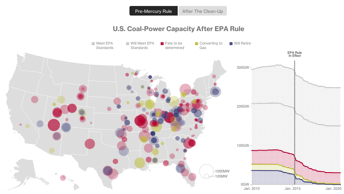
Basically, you have a map with plant size indicated by the dot size, and the type of plant by the colour of the dot. The line chart to the right shows total coal capacity. Overall, it’s a nice, clear, concise graphic. Two buttons give the user immediate access to the story: the pre-regulated environment—see what I did there?—and then then post-regulated one.
Credit for the piece goes to Eric Roston and Blacki Migliozzi.
Leave a Reply
You must be logged in to post a comment.