Today is Tuesday, 14 August. We are now 12 weeks away from the 2018 midterms. That is just three months away. Coverage will only intensify in the weeks to come, and you can be certain that if there are pieces worth noting, I will do that. But to mark the date I went with this choropleth map from the New York Times.
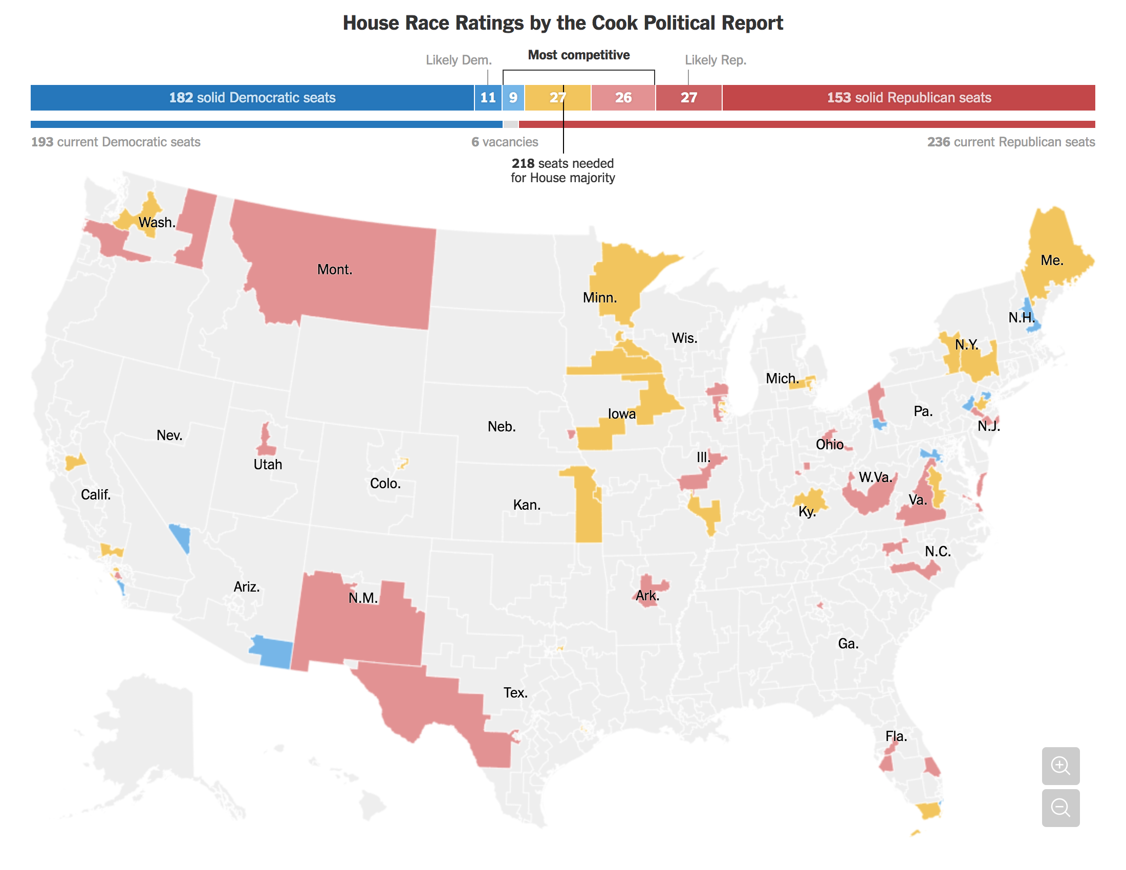
Nothing too crazy here. Likelihood of results colour the districts. The darker the blue, the more solid the Democratic seat. The darker the red, the more solid the Republican one. But what this map does really well is it excludes the likely’s and the solids and sets them to a light, neutral grey. You can still hover over a district if you are curious about where it falls, but, in general those have been excluded from the consideration set because they are not the districts of the most national attention.
Secondly, note the state labels. States like Wyoming that have no competitive seats have no label. After all, why are we labelling things that have no impact on this story, again, the competitive races. Fewer labels means fewer distracting elements in the graphic.
Finally, the piece includes the ability to zoom into a region. After all, for those of us living in urban areas, our districts are geographically tiny compared to the at-large or state-wide seats like in Wyoming, the Dakotas, and Alaska. Otherwise, good luck trying to find the Illinois 5th or Pennsylvania 3rd.
Credit for the piece goes to Jasmine C. Lee.
Leave a Reply
You must be logged in to post a comment.