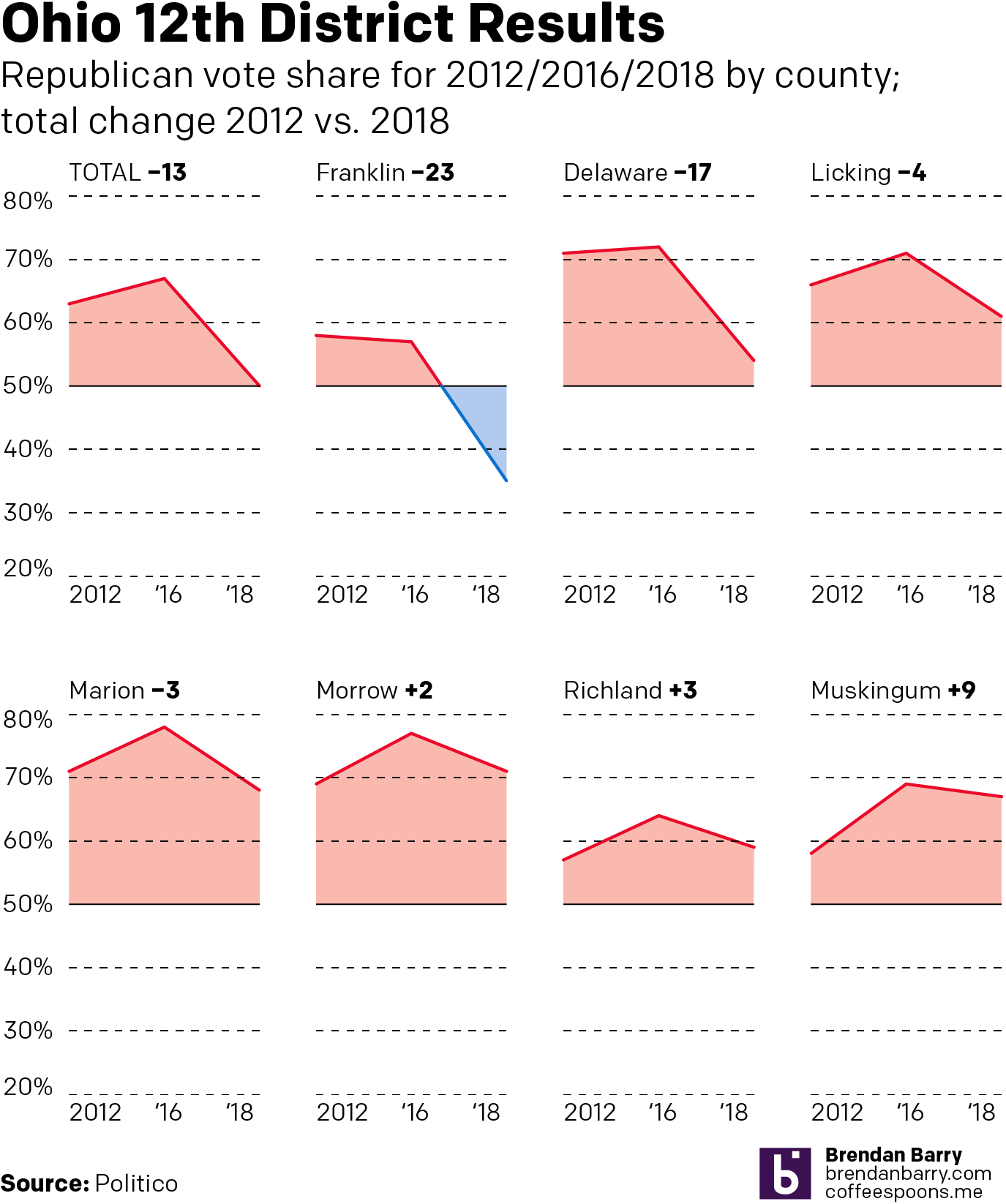
Last week parts of Ohio voted for a special election in the 12th Congressional District. Historically it has been a solidly Republican district by margins in the double digits. However, last week Republicans barely managed to hold the seat by, at the latest count I saw, less than one percentage point. Why? Well, it turns out that Republican support is bleeding away from one of the traditional strongholds: suburban counties.
I saw this data set late last week on Politico and I knew instinctively that it needed to be presented in another form than a table. Consequently I sketched out how it could work as small multiples of area charts to highlight just how Republican the district is. This is the digitisation of that take. Unfortunately my original sketch also featured a map of the district to show how this falls to the north and east of the city of Columbus. But I did not have time for that. Instead, I sketched up something else, but I need time to work on that. So for now, this concept will have to suffice.
Credit for the piece is mine.
Leave a Reply
You must be logged in to post a comment.