It’s been a little over a week now since my last update on Covid-19 in Pennsylvania, New Jersey, Delaware, Virginia, and Illinois. So where do we stand now, especially since last week we had seen a split with some good news and some not so good news?
Well let’s start with where we had good news last week: Illinois and New Jersey. In those two states we had the clearest evidence of the fourth wave peaking and beginning a slow descent.
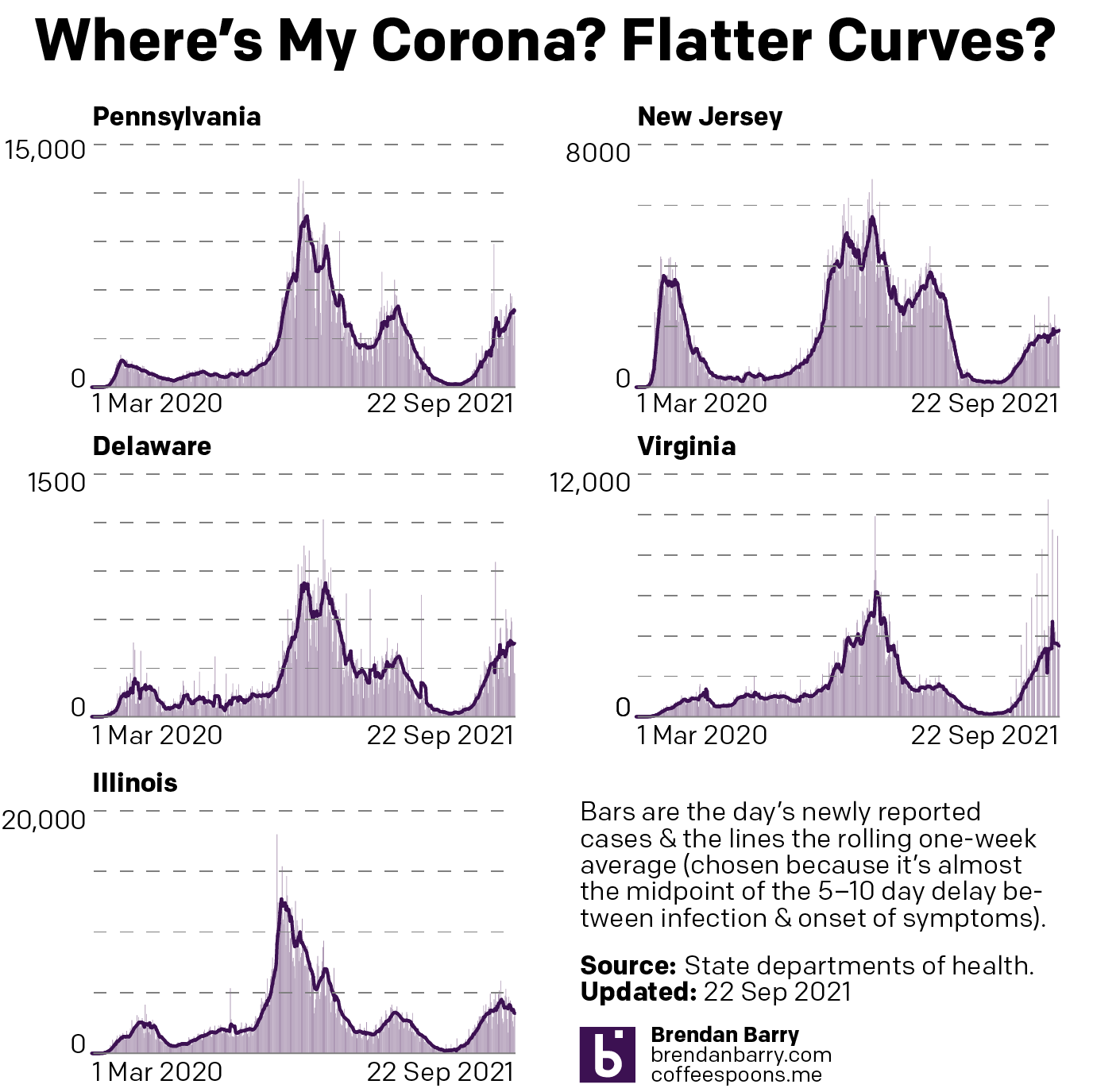
This week we can see that in Illinois the peak really does appear to have been reached as the seven-day average for new cases has been heading down slowly over the last week or so. In New Jersey we saw a sort of false peak, because new cases began to rise again not long after I posted. And with it the seven-day average did as well. However, in the last few days, the seven-day average has flattened ever so slightly, though it is still increasing.
Delaware is a bit harder to judge. When I last posted the seven-day average sat at 457 new cases per day. Yesterday? 454 new cases per day. If you look at the chart, you can see there was a brief spike that I had noted as a potential indicator of a peak for Delaware. After that brief decline however, you can see how the curve shot back up again, exceeding the earlier peak with an average of 470 new cases per day before cooling off slightly. New cases have been increasing for the last four days, but they are still below that 470 new cases number.
Virginia’s fourth wave long looked the worst. You can see some aberrant declines and spikes due to the extra day holiday in reporting—recall Virginia does not publish its weekend data. Since then however, there are some initial indications that Old Dominion may have peaked. Consider that when I last posted, the seven-day average sat at 4700 new cases per day. But over the last nine days, the average dropped to the 3600s for six days, then the 3500s for two days, and yesterday the average fell into the 3400s. That is the kind of flattening we want to see if there is a real peak.
Finally we have Pennsylvania. Right before Labour Day we had evidence of a slowing outbreak. But then after the holiday, new cases began to climb sharply. There was then a quick slowdown, but ever since we’ve continued to see rising numbers of new cases in the Commonwealth. At the time of my last post we had an average of 4100 new cases per day. Yesterday that was at 4700.
Pennsylvania looks like the only state we cover here that is clearly moving in the wrong direction.
But what about deaths?
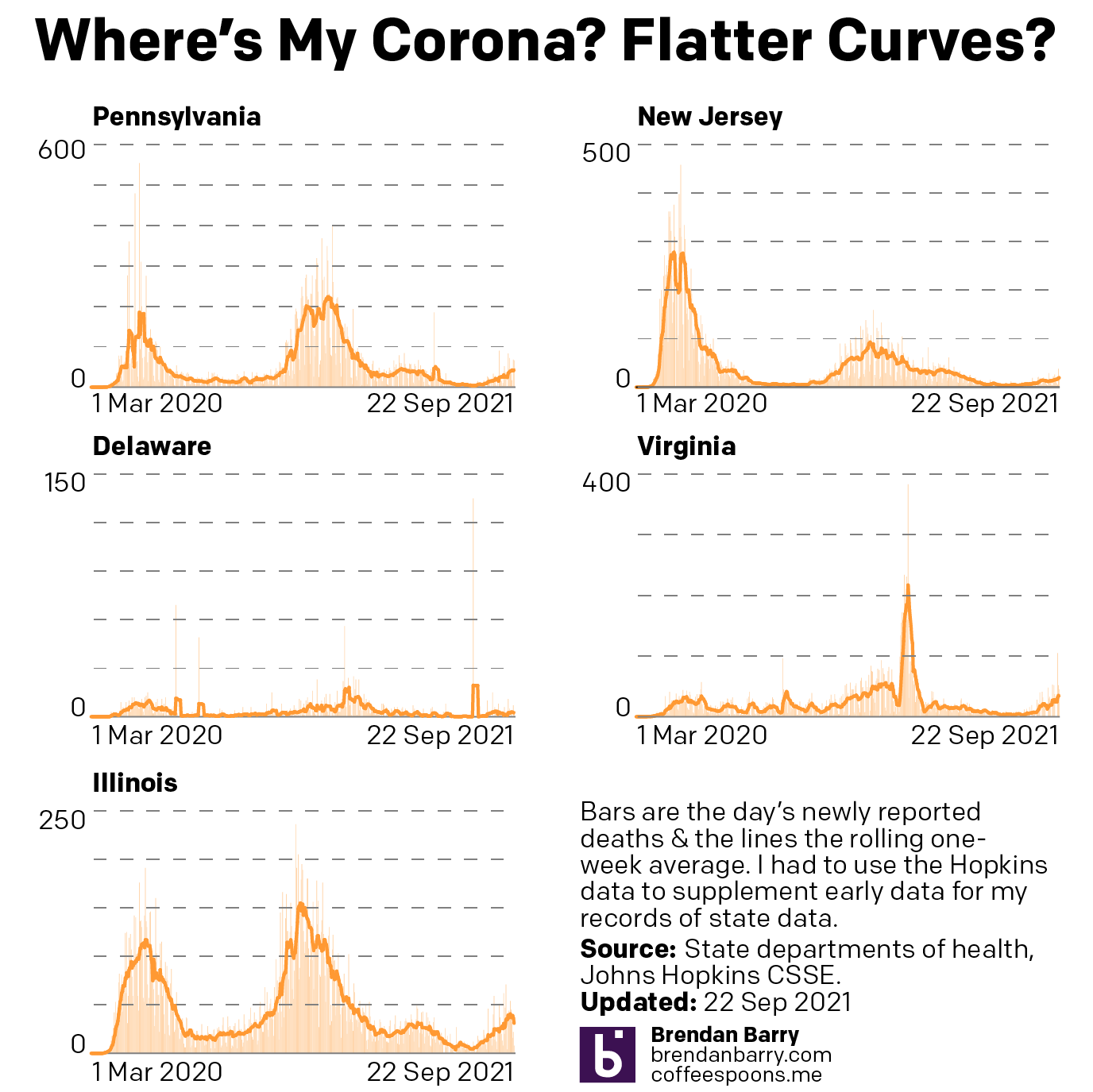
Well, here it’s almost all bad news. Before we can reasonably expect deaths to begin to slowdown, we need to see the spread of new cases slowdown. Remember that deaths are a lagging indicator as it can take weeks from infection to hospitalisation to death. And if most of our states have not yet clearly peaked, we shouldn’t really expect deaths to have peaked yet.
Here the only good news is Illinois where deaths peaked at 41 per day, but have since fallen to 31. Compare that to the shape of the curve in the new cases chart. We can clearly see the peak in new cases being followed by sometime by the peak in deaths.
In all the other states, however, we continue to see climbing numbers of deaths. In Pennsylvania over the last nine days we’ve seen the average climb from 24 deaths per day to 43. New Jersey increased a bit more slowly, from 13 to 19. And Delaware, again due to its small size, climbed, but only from 1.1 to 2.6. And in Virginia, we’ve seen the average number of deaths climb from 20 to 34.
If we are nearing peaks in New Jersey and Virginia, we should begin to see deaths cool down in the near future. The same holds true for Delaware, but there we have less evidence of a peaking outbreak.
Credit for the piece is mine.
Leave a Reply
You must be logged in to post a comment.