Tag: line chart
-
The Shrinking Colorado River
Last week the Washington Post published a nice long-form article about the troubles facing the Colorado River in the American and Mexican west. The Colorado is the river dammed by the Hoover and Glen Canyon Dams. It’s what flows through the Grand Canyon and provides water to the thirsty residents of the desert southwest. But…
-
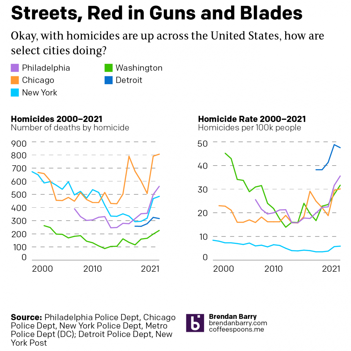
America’s Crime Problem
During the pandemic, media reports of the rise of crime have inundated American households. Violent crimes, we are told, are at record highs. One wonders if society is on the verge of collapse. But last night a few friends asked me to take a look at the data during the pandemic (2020–2021) and see what…
-
The Terrible No Good Chart About Gas Prices
Saw this graphic on the Twitter the other day from the Democratic Congressional Campaign Committee (DCCC), or the D Triple C or D Trip C. The context was that earlier in the day Matt Yglesias posted a clearly tongue-in-cheek chart about how after signing the infrastructure bill, President Biden had single-handedly fixed inflation and gas…
-
Speaking Truth to Employees
First, today is Friday and so congrats to us all for reaching the weekend. But before the weekend begins, I want to do a little housekeeping. I am taking my first real holiday for the first time in two years—thanks, Covid. So don’t expect any posts for the next two weeks. But I’ll be back…
-
Covid Vaccination and Political Polarisation
I will try to get to my weekly Covid-19 post tomorrow, but today I want to take a brief look at a graphic from the New York Times that sat above the fold outside my door yesterday morning. And those who have been following the blog know that I love print graphics above the fold.…