I will try to get to my weekly Covid-19 post tomorrow, but today I want to take a brief look at a graphic from the New York Times that sat above the fold outside my door yesterday morning. And those who have been following the blog know that I love print graphics above the fold.
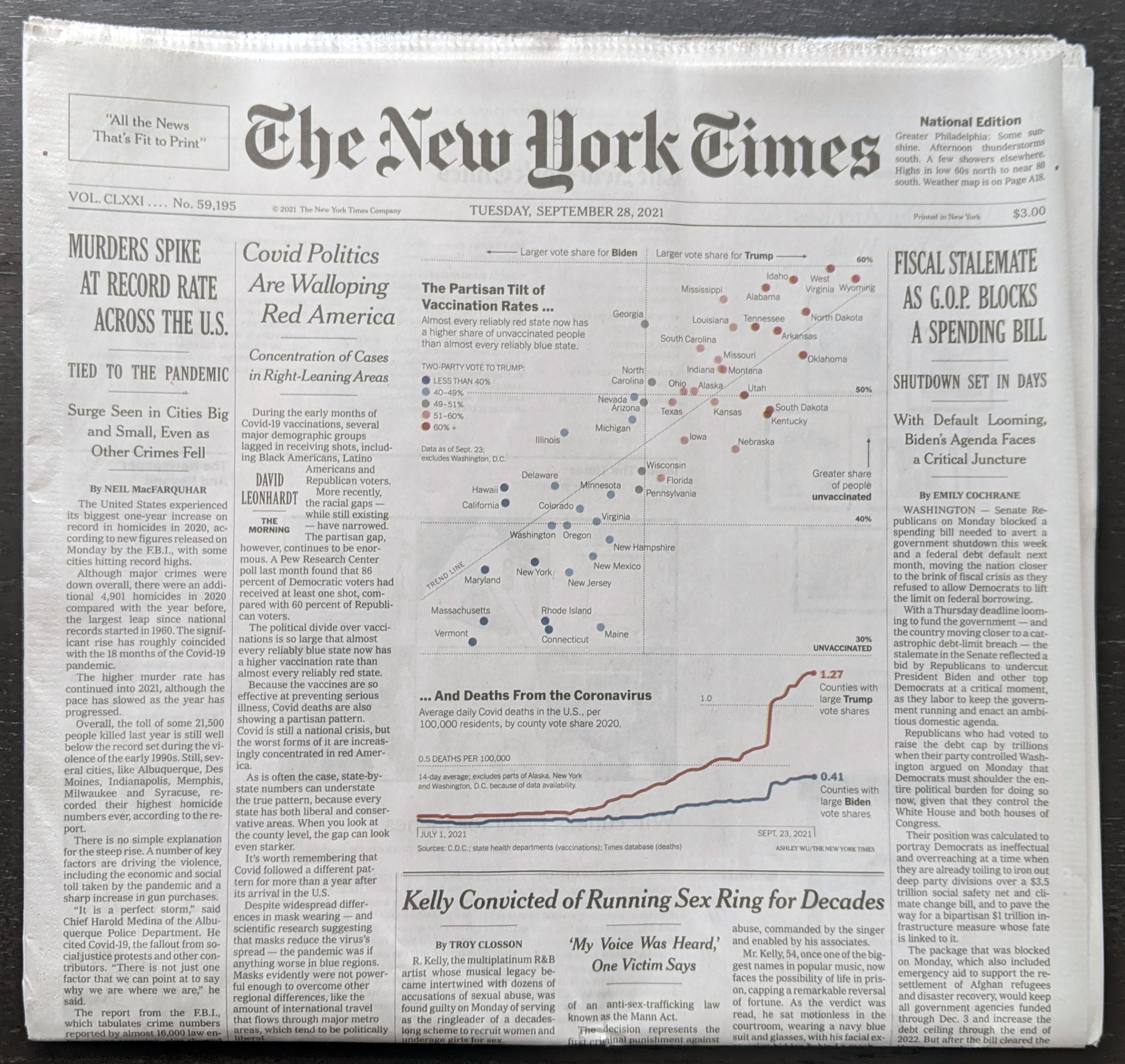
Of the six-column layout, you can see that this graphic gets three, in other words half-a-page width, and the accompany column of text for the article brings this to nearly 2/3 the front page.
When we look more closely at the graphic, you can see it consists of two separate parts, a scatter plot and a line chart. And that’s where it begins to fall apart for me.
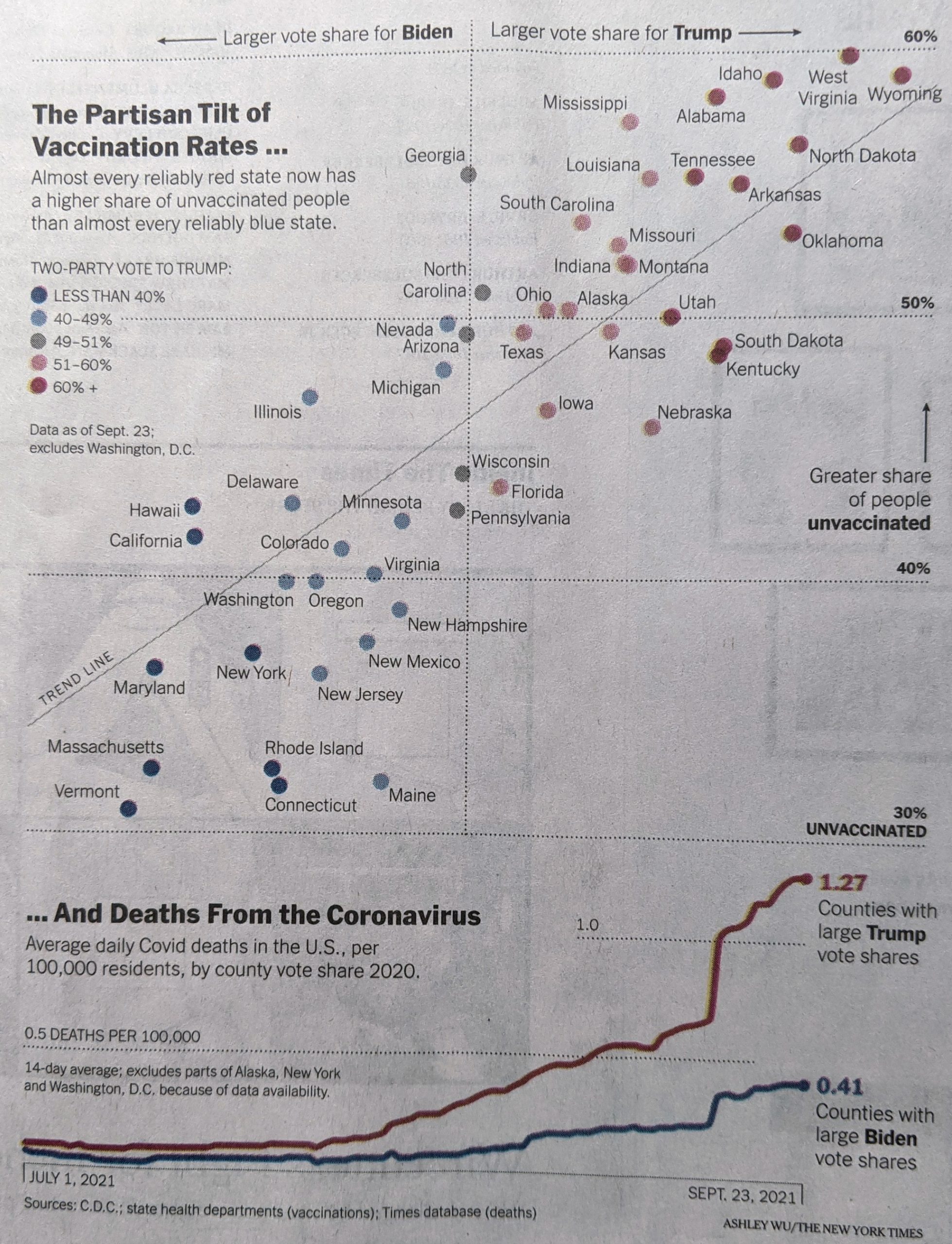
The scatter plot uses colour to indicate the vote share that went to Trump. My issue with this is that the colour isn’t necessary. If you look at the top for the x-axis labelling, you will see that the axis represents that same data. If, however, the designer chose to use colour to show the range of the state vote, well that’s what the axis labelling should be for…except there is none.
If the scatter plot used proper x-axis labels, you could easily read the range on either side of the political spectrum, and colour would no longer be necessary. I don’t entirely understand the lack of labelling here, because on the y-axis the scatter plot does use labelling.
On a side note, I would probably have added a US unvaccination rate for a benchmark, to see which states are above and below the US average.
Now if we look at the second part of the graphic, the line chart, we do see labelling for the axis here. But what I’m not fond of here is that the line for counties with large Trump shares, the line significantly exceeds the the maximum range of the chart. And then for the 0.5 deaths per 100,000 line, the dots mysteriously end short of the end of the chart. It’s not as if the line would have overlapped with the data series. And even if it did, that’s the point of an axis line, so the user can know when the data has exceeded an interval.
I really wanted to like this piece, because it is a graphic above the fold. But the more I looked at it in detail, the more issues I found with the graphic. A couple of tweaks, however, would quickly bring it up to speed.
Credit for the piece goes to Ashley Wu.
Leave a Reply
You must be logged in to post a comment.