Last Friday, the government released the labour statistics from April and they showed a weaker rebound in employment than many had forecasted. When I opened the door Saturday morning, I got to see the numbers above the fold on the front page of the New York Times.
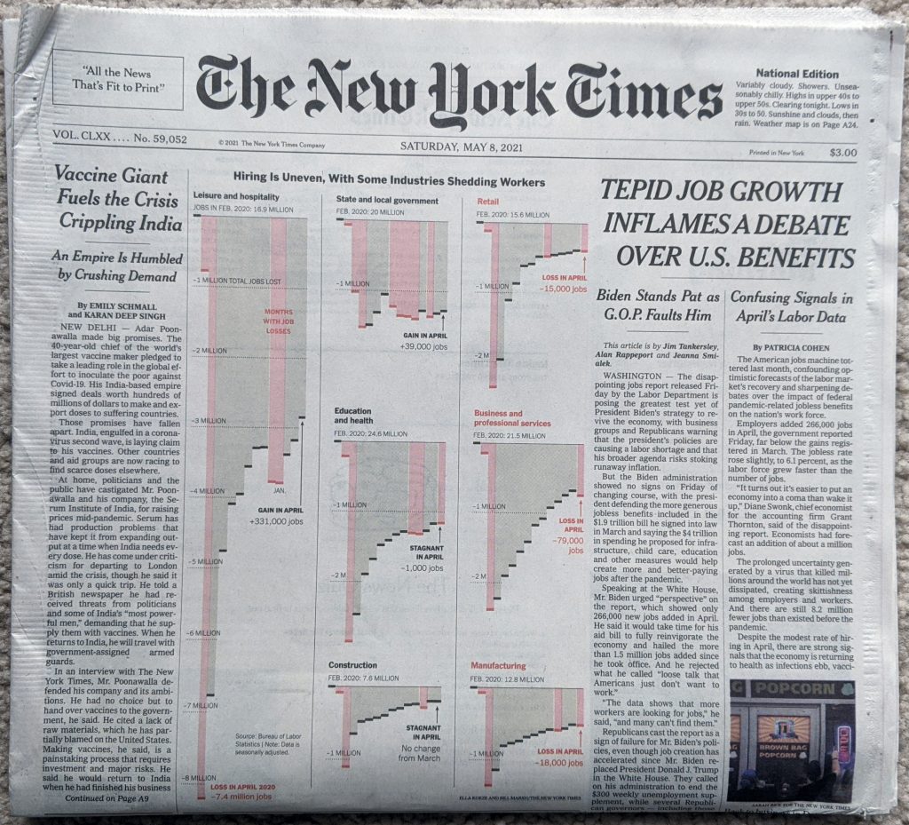
What I enjoyed about this layout, was that the graphic occupied half the above the fold space. But, because the designers laid the page out using a six-column grid, we can see just how they did it. Because this graphic is itself laid out in the column widths of the page itself. That allows the leftmost column of the page to run an unrelated story whilst the jobs numbers occupy 5/6 of the page’s columns.
If we look at the graphic in more detail, the designers made a few interesting decisions here.
First, last week I discussed a piece from the Times wherein they did not use axis labels to ground the dataset for the reader. Here we have axis labels back, and the reader can judge where intervening data points fall between the two. For attention to detail, note that under Retail, Education and health, and Business and professional services, the “illion” in -2 Million was removed so as not to interfere with legibility of the graphic, because of bars being otherwise in the way.
My issue with the axis labels? I have mentioned in the past that I don’t think a designer always needs to put the maximum axis line in place, especially when the data point darts just above or below the line. We see this often here, for example Construction and Manufacturing both handle it this way for their minimums. This works for me.
But for the column above Construction, i.e. State and local government and Education and health, we enter the space where I think the graphic needs those axis lines. For Education and health, it’s pretty simple, the red losses column looks much closer to a -3 million value than a -2 million value. But how close? We cannot tell with an axis line.
And then under State and local government we have the trickier issue. But I think that’s also precisely why this could use some axis lines. First, almost all the columns fall below the -1 million line. This isn’t the case of just one or two columns, it’s all but two of them. Second, these columns are all fairly well down below the -1 million axis line. These aren’t just a bit over, most are somewhere between half to two-thirds beyond. But they are also not quite nearly as far to -2 million as the ones we had in the Education and health growth were near to -3 million.
So why would I opt to have an axis line for State and local governments? The designers chose this group to add the legend “Gain in April”. That could neatly tuck into the space between the columns and the axis line.
Overall it’s a solid piece, but it needs a few tweaks to improve its legibility and take it over the line.
Credit for the piece goes to Ella Koeze and Bill Marsh.
Leave a Reply
You must be logged in to post a comment.