Two Fridays ago, I opened the door and found my copy of the New York Times with a nice graphic above the fold. This followed the announcement from the White House of aggressive targets to reduce greenhouse gas emissions
In general, I love seeing charts and graphics above the fold. As an added bonus, this set looked at climate data.
But there are a few things worth pointing out.
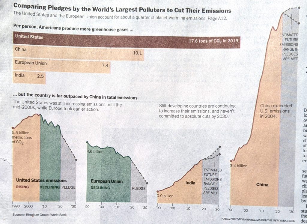
First from a data side, this chart is a little misleading. Without a doubt, carbon dioxide represents the greatest share of greenhouse gasses, according to the US Environmental Protection Agency (EPA) it was 76% in 2010. Methane contributes the next largest share at 16%. But the labelling should be a little clearer here. Or, perhaps lead with a small chart showing CO2’s share of greenhouse gasses and from there, take a look at the largest CO2 emitters per person.
Second, where are the axis labels?
I will probably have more on this at a later date, but neither the bar chart nor the line charts have axis labels. Now the designers did choose to label the beginning value for the lines and the bars, but this does not account for the minimums or maximums. (It also assumes that the bottom of the lines is zero.)
For example, we can see that China began 1990 with emissions at 3.4 billon metric tons. The annotation makes clear that China’s aggregate emissions surpassed those of the US in 2004. But where do they peak? What about developing countries?
If I pull out a ruler and draw some lines I can roughly make some height comparisons. But, an easier way would be simply to throw some dotted lines across the width of the page, or each line chart.
This piece takes a big swing at presenting the challenge of reducing emissions, but it fails to provide the reader with the proper—and I think necessary—context.
Credit for the piece goes to Nadja Popovich and Bill Marsh.
Leave a Reply
You must be logged in to post a comment.