Every ten years the United States conducts a census of the entire population living within the United States. My genealogy self uses the federal census as the backbone of my research. But that’s not what it’s really there for. No, it exists to count the people to apportion representation at the federal level (among other reasons).
The founding fathers did not intend for the United States to be a true democracy. They feared the tyranny of mob rule as majority populations are capable of doing and so each level of the government served as a check on the other. The census-counted people elected their representatives for the House, but their senators were chosen by their respective state legislatures. But I digress, because this post is about a piece in the New York Times examining the new census apportionment results.
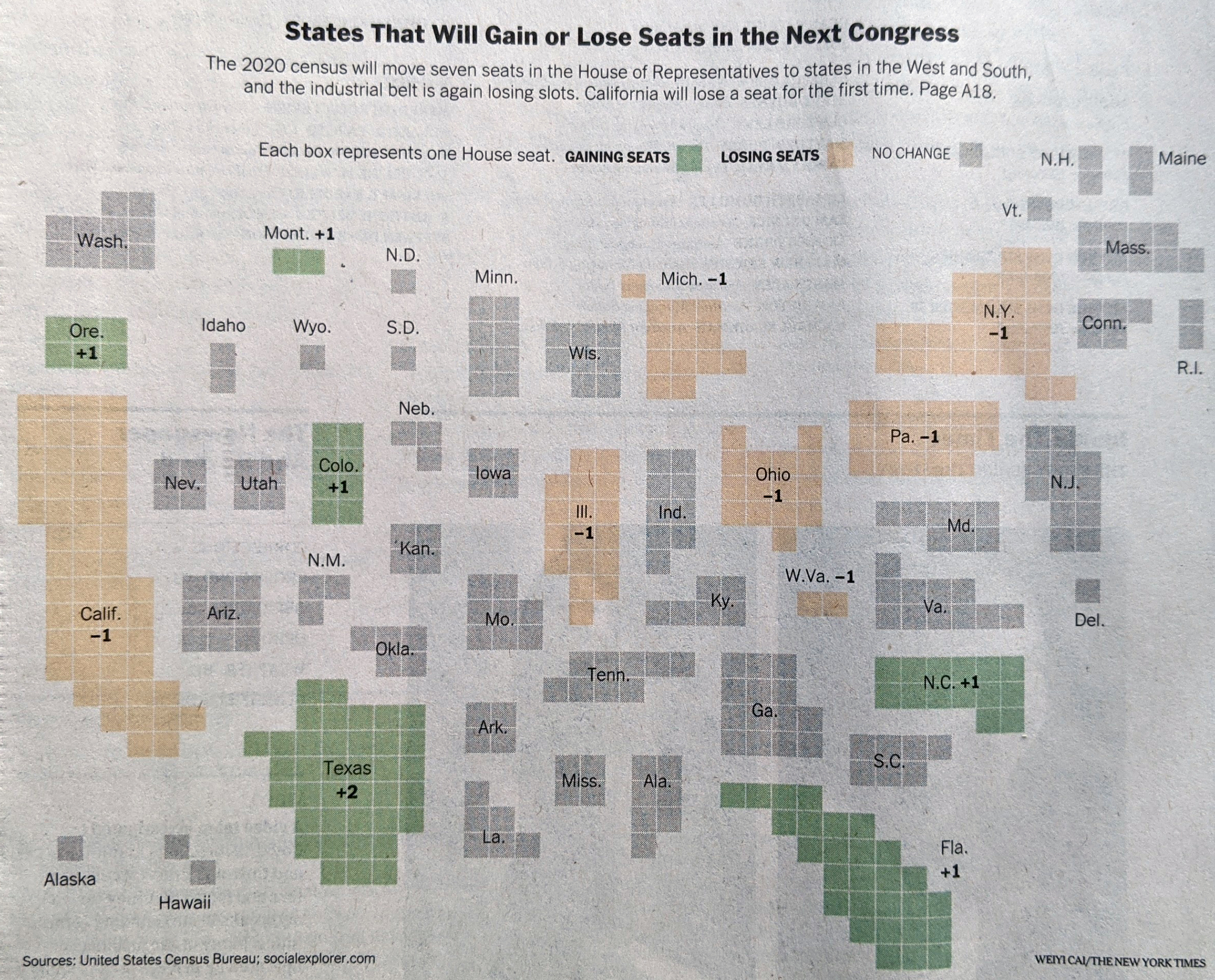
I received my copy of the Times two Tuesdays ago, so these are photos of the print piece instead of the digital, online editions. The paper landed at my front door with a nice cartogram above the fold.

Each state consists of squares, each representing one congressional district. This is the first place where I have an issue with the graphic, admittedly a minor one. First we need to look at the graphic’s header, “States That Will Gain or Los Seats in the Next Congress” and then look at the graphic. It’s unclear to me if the squares therefore represent the states today with their numbers of districts, or if we are looking at a reapportioned map. Up in Montana, I know that we are moving from one at-large seat to two seat, and so I can resolve that this is the new apportionment. But I am left wondering if a quick phrase or sentence that declares these represent the 2022 election apportionment and not those of this past decade would be clearer?
Or if you want a graphic treatment, you could have kept all the states grey, but used an unfilled square in those states, like Pennsylvania and Illinois, losing seats, and then a filled square in the states adding seats.
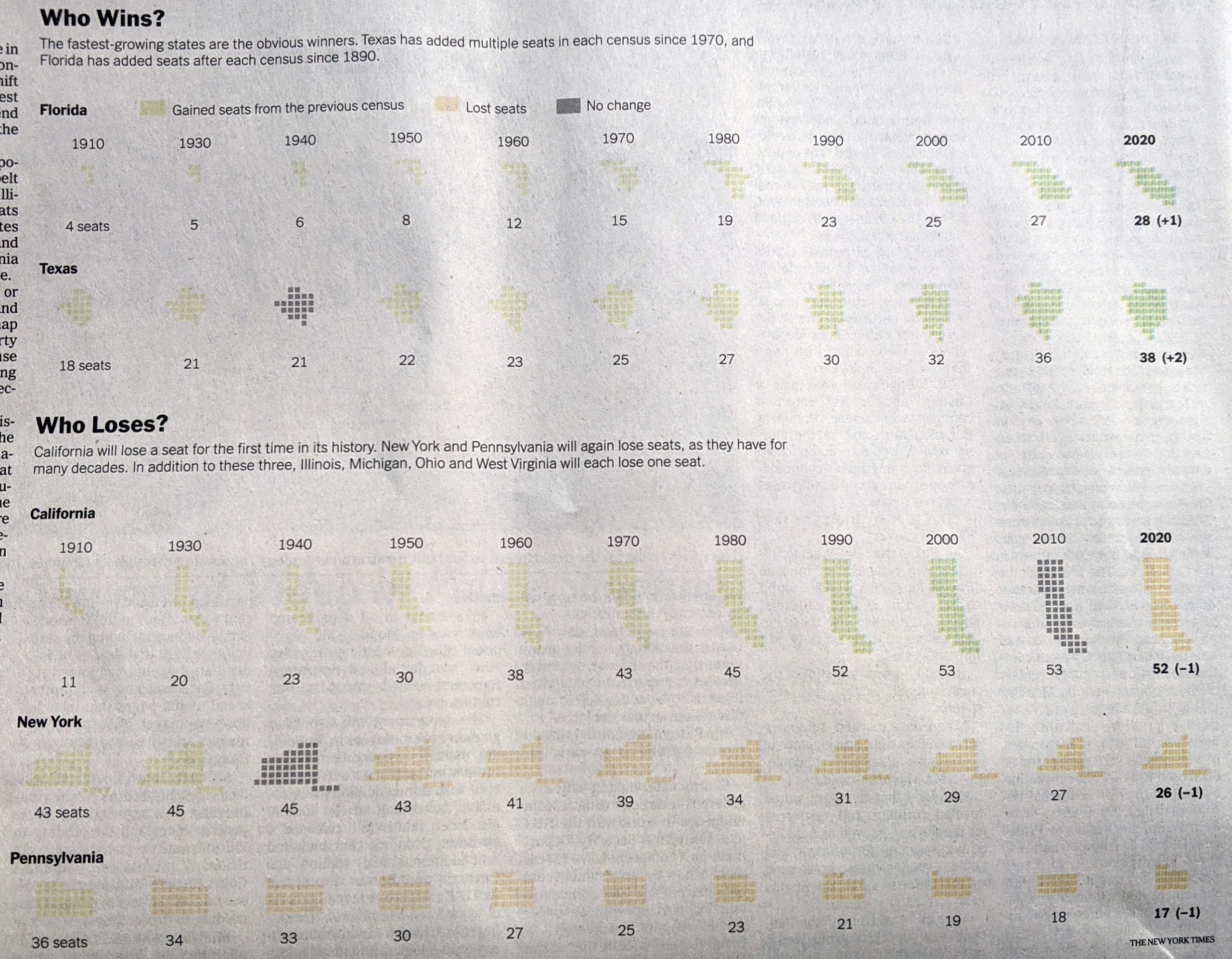
Inside the paper, the article continued and we had a few more graphics. The above graphic served as the foundation for a second graphic that charted the changing number of seats since 1910, when the number of seats was fixed.

I really like this graphic. My issue here is more with my mobile that took the picture. Some of these states appear quite light, and they are on the printed page. However, they are not quite as light as these photos make them out to be. That said, could they be darker? Probably. Even in print, the dark grey “no change” instances jump out instead of perhaps falling to the background.
The remaining few graphics are far more straightforward, one isn’t even a graphic technically.
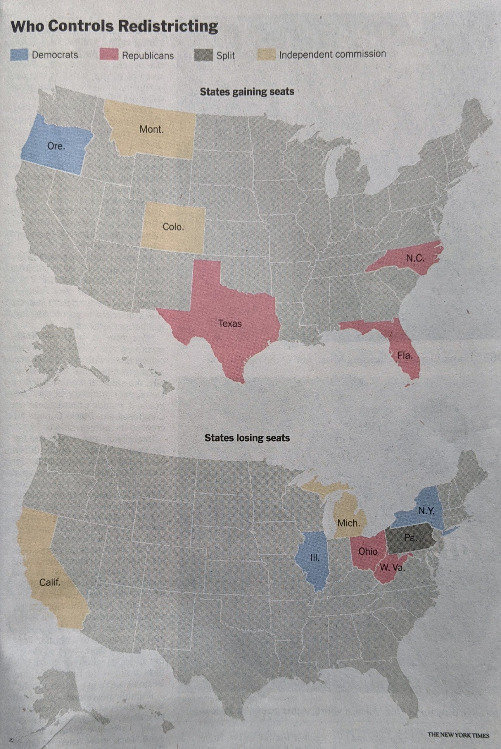
First we have two maps.

Nothing particularly remarkable here. The colours make a lot of sense, with red representing Republicans and blue Democrats. Yellow represents independent commissions and grey is only one state, Pennsylvania, where the legislature is controlled by Republicans and the governorship by Democrats.
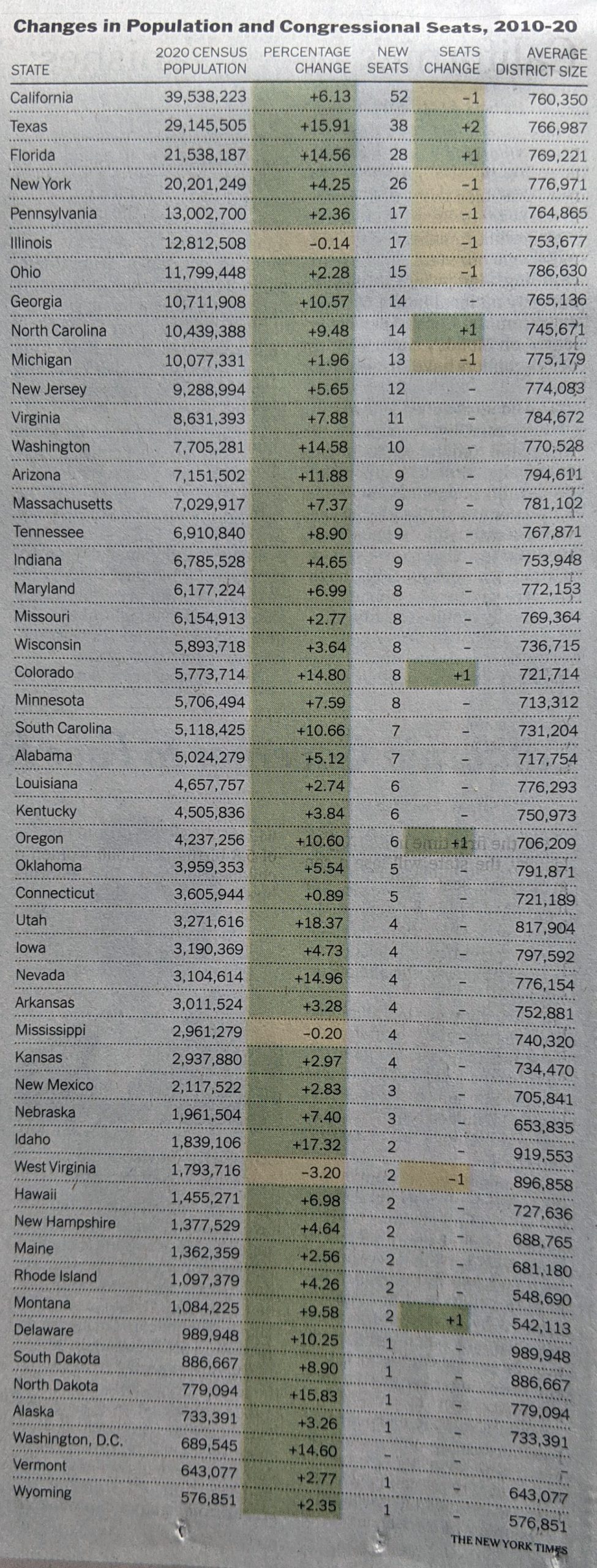
Finally we have a table with the raw numbers.

Tables are great for organising information. Do you have a state you’re most curious about, Illinois for example? If so, you can quickly scan down the state column to find the row and then over to the column of interest. What tables don’t allow you to do is quickly identify any visual patterns. Here the designers chose to shade the cells based on positive/negative changes, but that’s not highlighting a pattern.
Overall, this was a really strong piece from the Times. With just a few language tweaks on the front page, this would be superb.
Credit for the piece goes to Weyi Cai and the New York Times graphics department.
Leave a Reply
You must be logged in to post a comment.