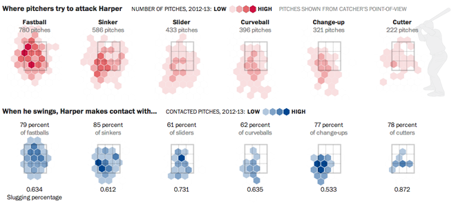
Bryce Harper is undoubtedly one of the best baseball players in the game today. To put it simply, he hits. And he hits well. And he hits well often. So the Washington Post put together an interactive, long form piece about Harper’s swing and hitting.

The piece begins with a narrated video outlining the science behind Harper’s swing. Then the reader can down into the piece and learn more about Harper’s history and development and how he compares to other hitters. Statistics and data visualisation pieces show just how impressive Harper is as a hitter and how pitchers are trying to combat that.
Interactive long form articles are appearing more and more often online. But this is perhaps the most data- and science-intensive piece I have seen thus far. What is particularly nice about the format is that, as I have often noted, annotations and explanations are what make good infographics and what move data visualisation from presentational to informational. That this piece in particular happens to be about baseball, well, all the better.
Credit for the piece goes to Adam Kilgore, Sohail Al-Jamea, Wilson Andrews, Bonnie Berkowitz, Todd Lindeman, Jonathan Newton, Lindsay Applebaum, Karl Hente, Matthew Rennie, John Romero, and Mitch Rubin.
Leave a Reply
You must be logged in to post a comment.