The British election campaign is wrapping up as it heads towards the general election on Thursday. I haven’t covered it much here, but this piece from the BBC has been at the back of my mind. And not so much for the content, but strictly the design.
In terms of content, the article stems from a question asked in a debate about income levels and where they fall relative to the rest of the population. A man rejected a Labour party proposal for an increase in taxes on those earning more than £80,000 per annum, saying that as someone who earned more than that amount he was “not even in the top 5%, not even the top 50”.
The BBC looked at the data and found that actually the man was certainly within the top 50% and likely in the top 5%, as they earn more than £75,300 per annum. Here in the States, many Americans cannot place their incomes within the actual spreads of income. The income gap here is severe and growing. But, I want to look at the charts the BBC made to illustrate its points.
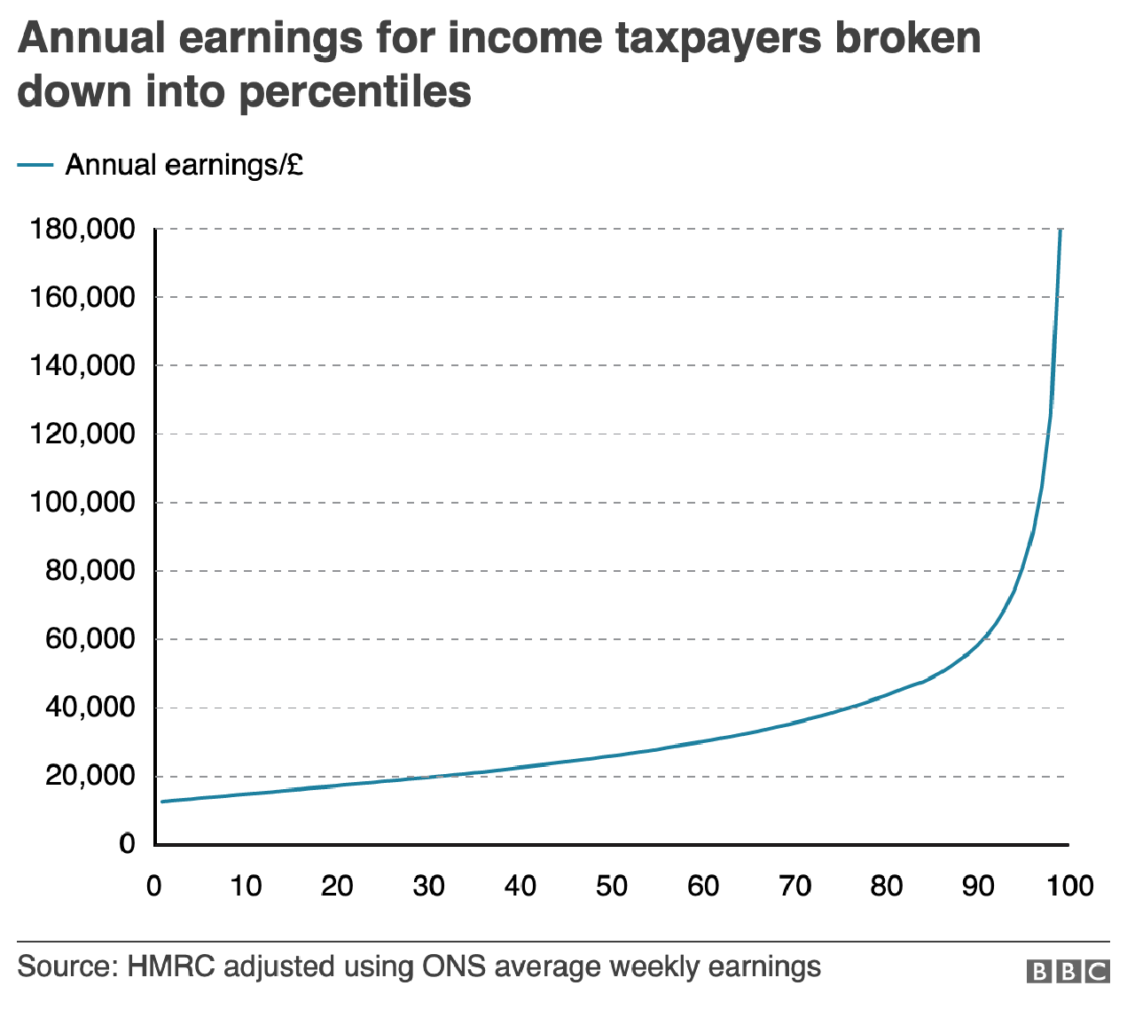
The most important is this line chart, which shows the income level and how it fits among the percentages of the population.

I am often in favour of minimal axis lines and labelling. Too many labels and explicit data points begin to subtract from the visual representation or comparison of the data. If you need to be able to reference a specific data point for a specific point on the curve, you need a table, not a chart.
However, there is utility in having some guideposts as to what income levels fit into what ranges. And so I am left to wonder, why not add some axis lines. Here I took the original graphic file and drew some grey lines.
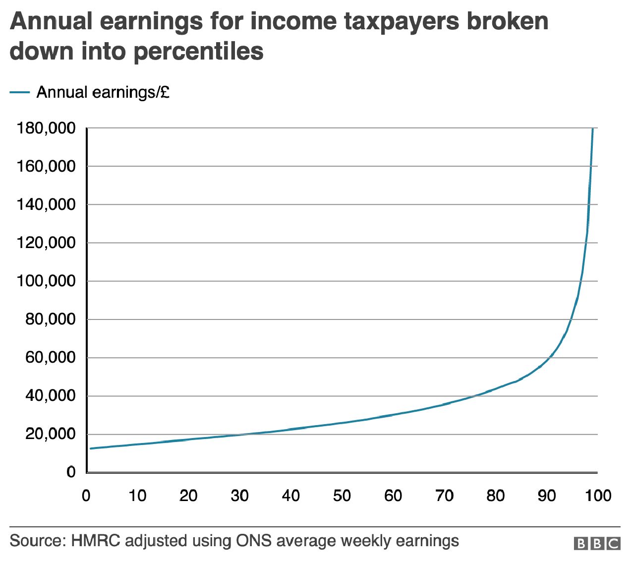
Of course, I prefer the dotted or dashed line approach. The difference in line style provides some additional contrast to the plotted series. And in this case, where the series is a thin but coloured line, the interruptions in the solidity of the axis lines makes it easier to distinguish them from the data.
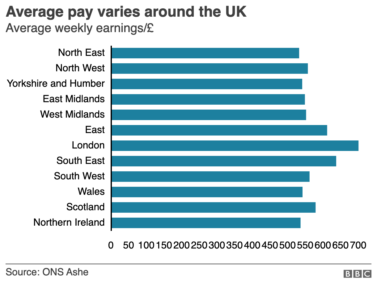
But the article also has another chart, a bar chart, that looks at average weekly incomes across different regions of the United Kingdom. (Not surprisingly, London has the highest average.) Like the line chart, this bar chart does not use any axis labels. But what makes this one even more difficult is that the solid black line that we can use in the line charts above to plot out the maximum for 180,000 is not there. Instead we simply have a string of numbers at the bottom for which we need to guess where they fall.
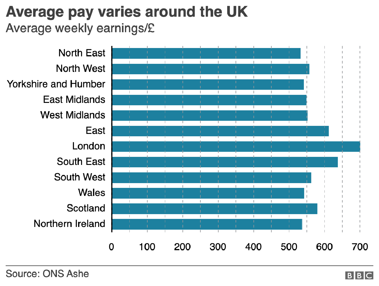
If we assume that the 700 value is at the centre of the text, we can draw some dotted grey lines atop the existing graphic. And now quite clearly we can get a better sense of which regions fall in which ranges of income.

But we still have this mess of black digits at the bottom of the graphic. And after 50, the numbers begin to run into each other. It is implied that we are looking at increments of 50, but a little more spacing would have helped. Or, we could simply keep the values at the hundreds and, if necessary, not label the lines at the 50s. Like so.
The last bit I would redo in the bar chart is the order of the regions. Unless there is some particular reason for ordering these regions as they are—you could partly argue they are from north to south, but then Scotland would be at the top of the list—they appear an arbitrary lot. I would have sorted them maybe from greatest to least or vice versa. But that bit was outside my ability to do this morning.
So in short, while you don’t want to overcrowd a chart with axis lines and labelling, you still need a few to make it easier for the user to make those visual comparisons.
Credit for the original pieces goes to the BBC graphics department.
Leave a Reply
You must be logged in to post a comment.