Well not likely—it was going to be tough regardless.
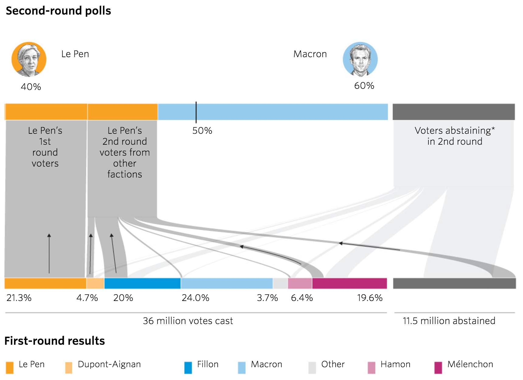
Today’s piece is also from the Wall Street Journal and it was posted Saturday, the day before the election. It used a Sankey diagram to explore the support that Le Pen would have needed to draw from every candidate in the first round to get over the 50% mark in the second round.
Turns out she didn’t get the maths
If anything this chart is not the story. The story is that the final count I saw put Macron not on 60%, but on just over 66%.
Turns out she couldn’t.
Credit for the piece goes to Stacy Meichtry and Jovi Juan.
Emmanuel Macron won the French presidential election yesterday. So Guess what we have a graphic or two of this week? If you guessed Mongolian puppies, you were wrong.
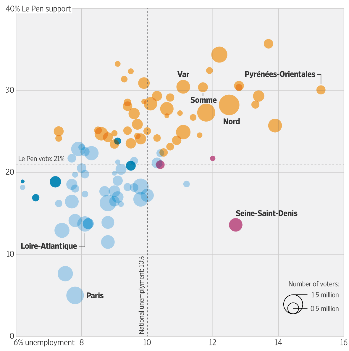
Thursday afternoon the Wall Street Journal—they seem to really be upping their game of late—published an article breaking down the connection between a Le Pen support in the first round and unemployment. For me, the key to the article was the following graphic, which plots those two variables by department. The departments that she won, generally speaking, suffer higher unemployment.
Unemployment and Len Pen support
Colour coding relates to the winner of the department. I am not certain that the size of the voters in the department matters as much. But the annotation of particular departments, qualified as being limited to the French mainland—see my problem back in April about when France is more than France—flows through the several graphics in the piece.
This is a piece from the Thursday running up to Sunday’s vote. Tomorrow we will look at a piece from the day before the vote that looked at another key component of Macron’s win.
Credit for the piece goes to Martin Burch and Renée Rigdon.
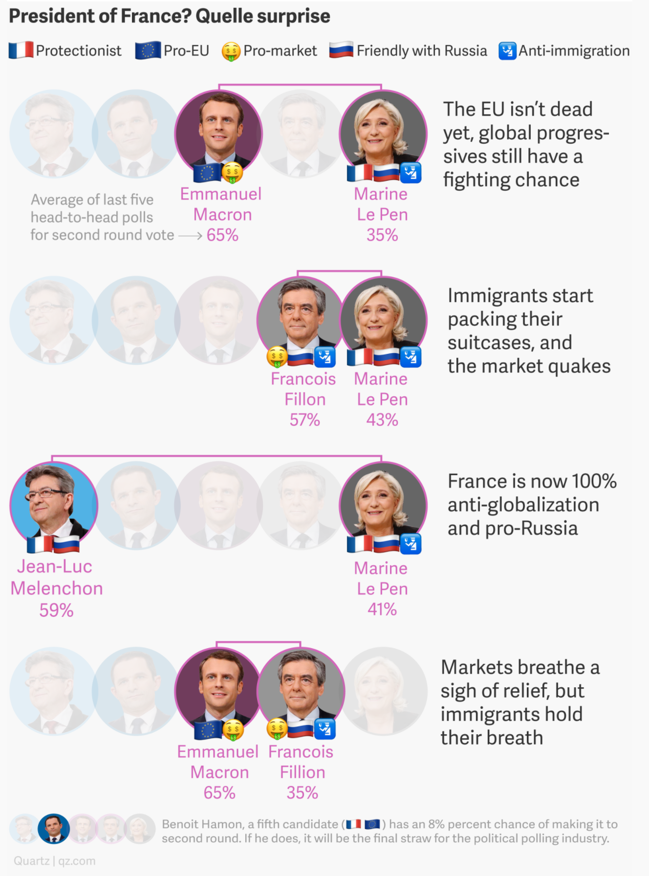
Well there you have it. Macron and Le Pen are moving on to round two of the French presidential election. Now, I have two things I want to address regarding the election. Today’s post looks at the meaning of the result and tomorrow’s will be about how that result was displayed.
Quartz did a really nice job outlining the likeliest outcomes, where the candidates stand, and then the initial polling for a round two head-to-head. And they did it all in one graphic.
What do the outcomes mean?
I might not like the style of the icons—a a dollar sign emoji for a country that uses the Euro?—but the concept works well. But the best part is the brief synopsis to the right that describes the meaning of that particular outcome.
Credit for the piece goes to the Quartz graphics department.
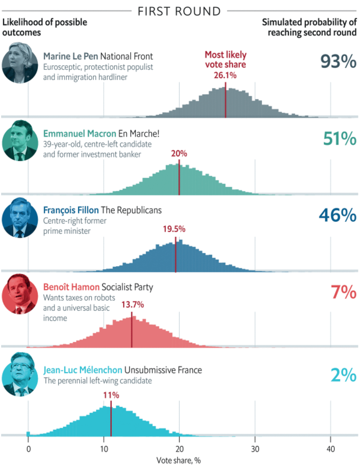
Last Friday the Economist published this article about the odds of Marine Le Pen, the leader of France’s National Front party, winning the French presidential election in April. You may recall I focused on other things last Friday. So today we have this graphic.
Without a majority of the vote, the top two vote earners move to a second round
But this morning news broke about new allegations over fraudulent claims by Le Pen and the National Front. This, after claims of fraud against Fançois Fillon and some unhelpful remarks about Algeria from Emmanuel Macron, could be enough to make the French presidential election a complete toss up.
But for now we just wait to see if the rise of populist nationalism continues.
Credit for the piece goes to the Economist’s graphics department.