By now we have probably all seen the maps of state coverage of the COVID-19 outbreak. But state level maps only tell part of the story. Not all outbreaks are widespread within states. And so after some requests from family, friends, and colleagues, I’ve been attempting to compile county-level data from the state health departments where those family, friends, and colleagues live. Not surprisingly, most of these states are the Philadelphia and Chicago metro areas, but also Virginia.
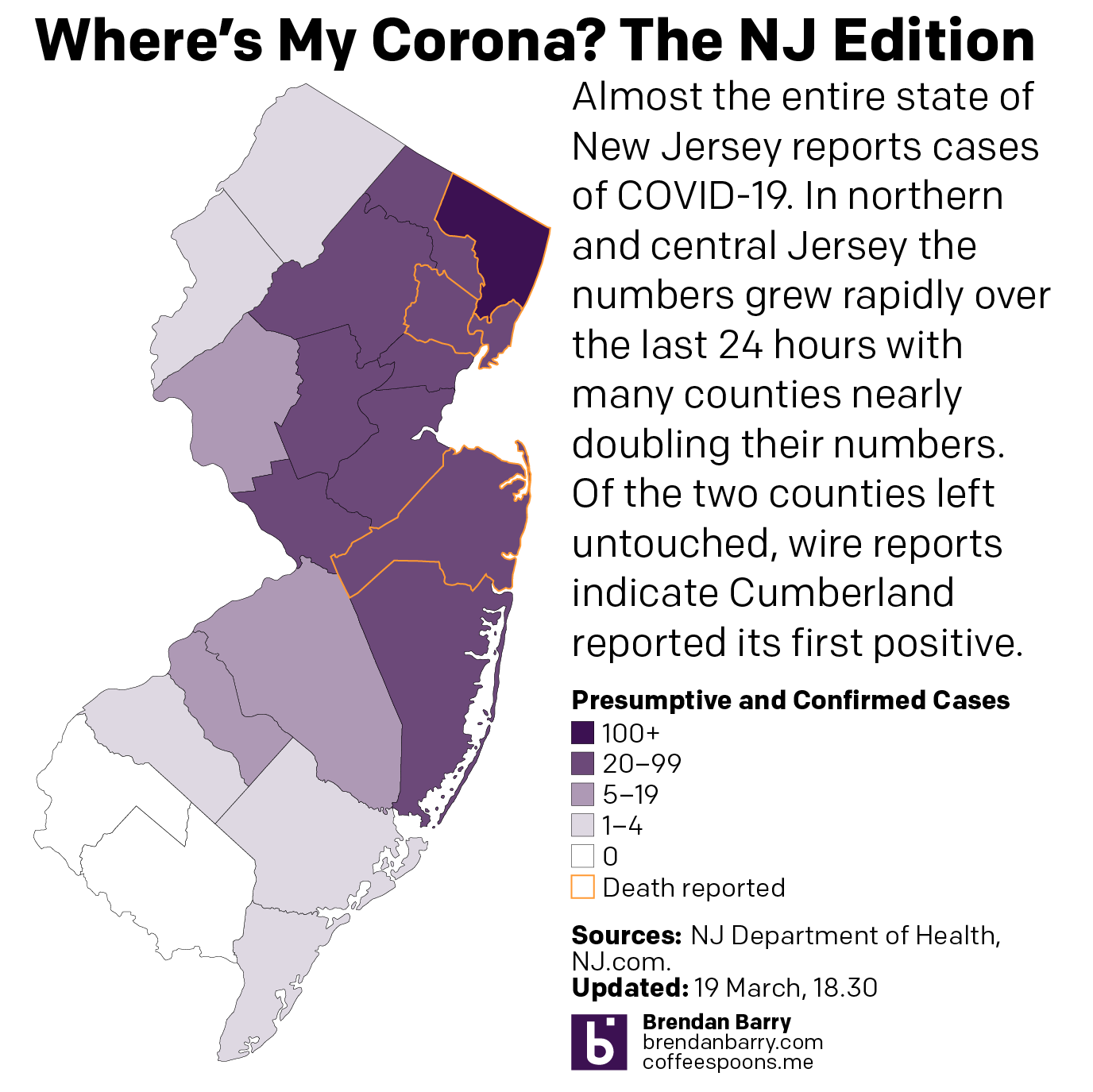
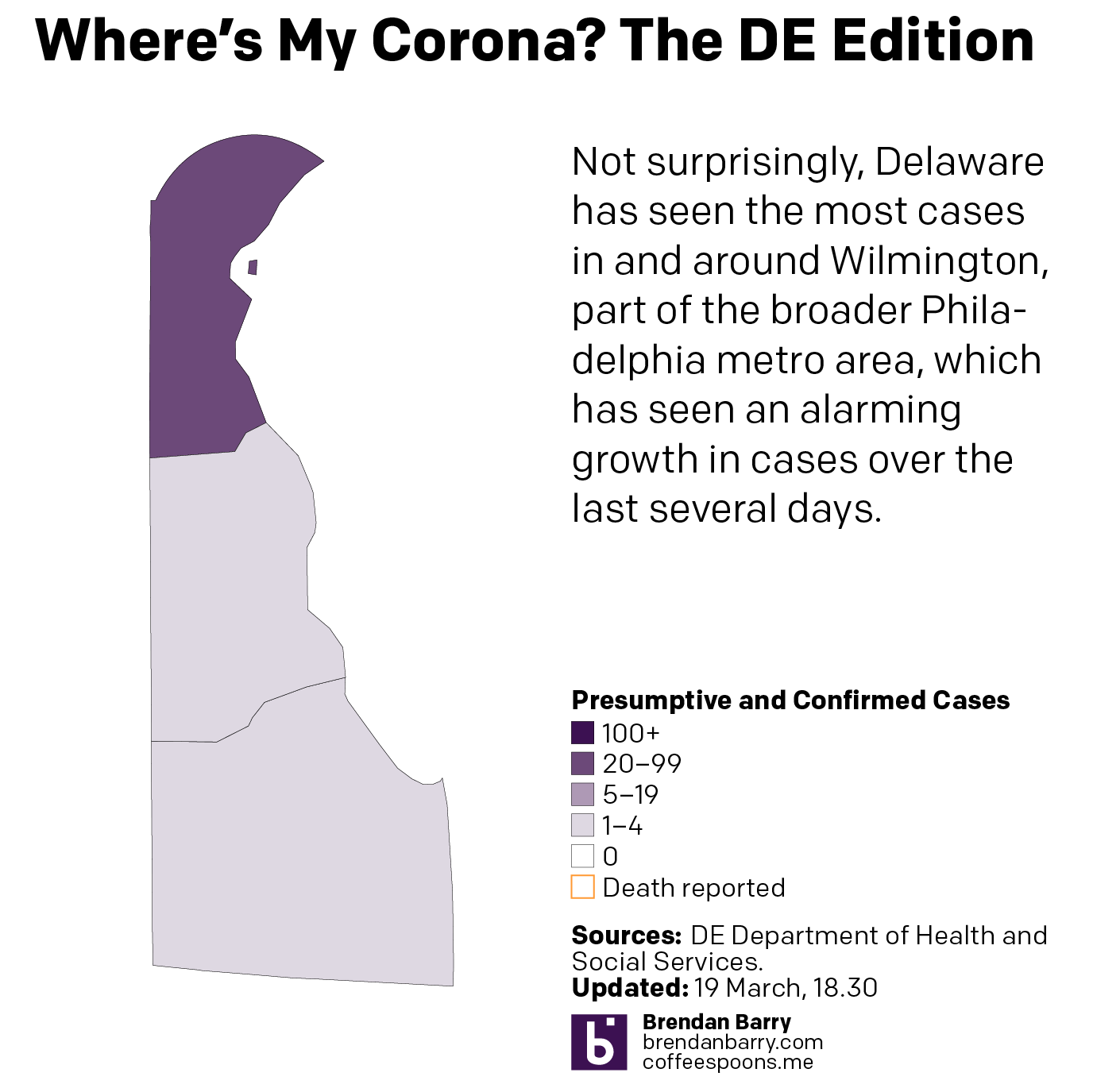
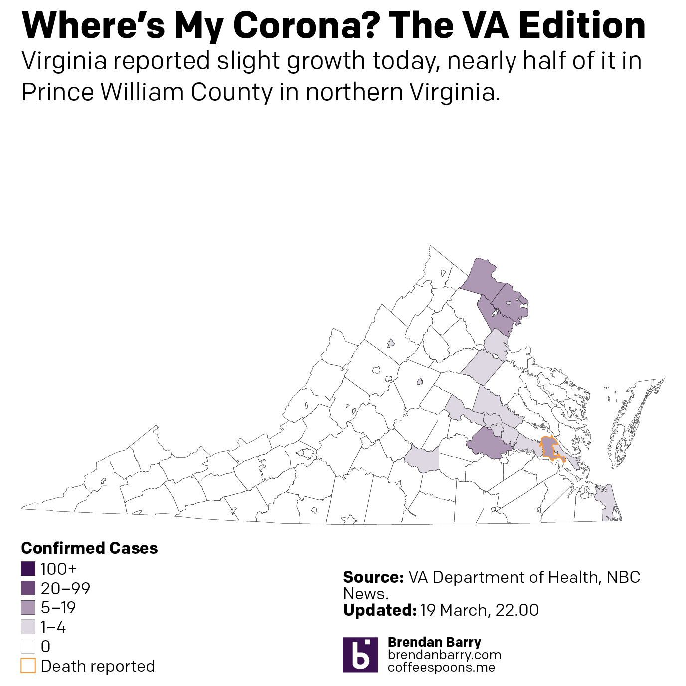
These are all images I have posted to Instagram. But the content tells a familiar story. The outbreaks in this early stage are all concentrated in and around the larger, interconnected cities. In Pennsylvania, that means clusters around the large cities of Philadelphia, Pittsburgh, and Harrisburg. In New Jersey they stretch along the Northeast Corridor between New York and Trenton (and along into Philadelphia) and then down into Delaware’s New Castle County, home to the city of Wilmington. And then in Virginia, we see small clusters in Northern Virginia in the DC metro area and also around Richmond and the Williamsburg area. Finally in Illinois we have a big cluster in and around Chicago, but also Springfield and the St. Louis area, whose eastern suburbs include Illinois communities like East St. Louis.


I have also been taking a more detailed look at the spread in Pennsylvania, because I live there. And I want to see the rapidity with which the outbreak is growing in each county. And for that I moved from a choropleth to a small multiple matrix of line charts, all with the same fixed scale. And, well, it doesn’t look good for southeastern Pennsylvania.

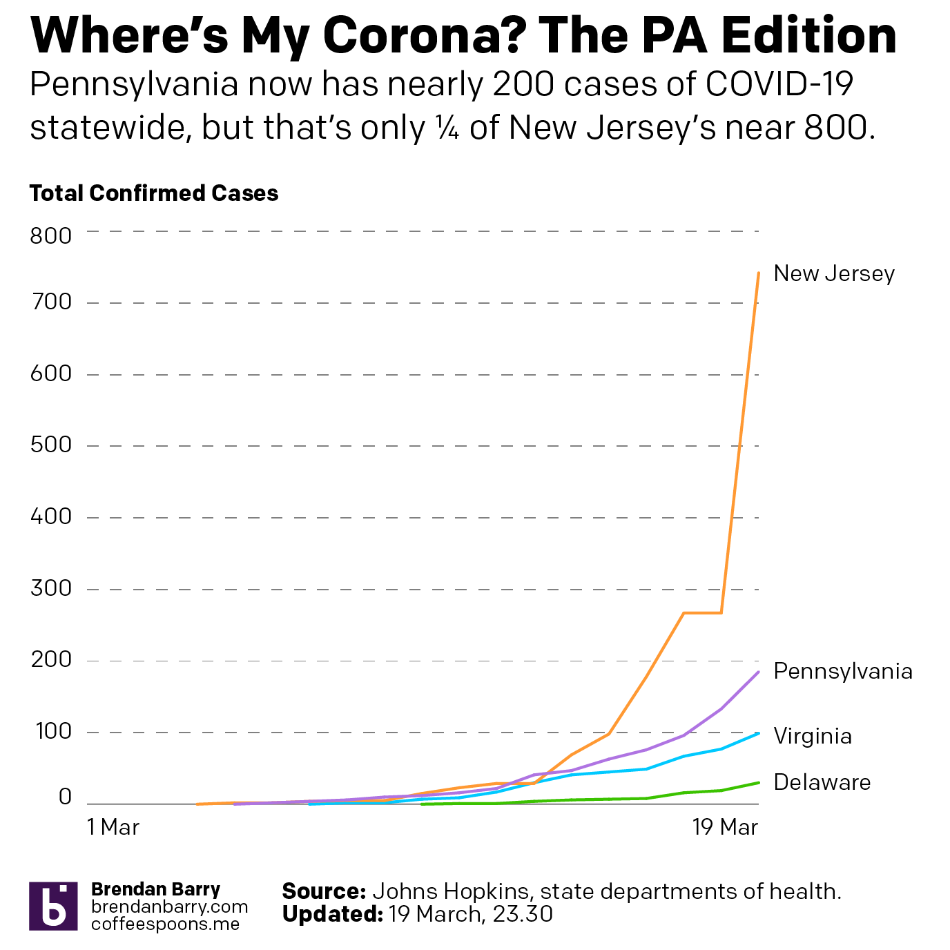
Then last night I also compared the total number of cases in Pennsylvania, New Jersey, Delaware, and Virginia. Most interestingly, Pennsylvania and New Jersey’s outbreaks began just a day apart (at least so far as we know given the limited amount of testing in early March). And those two states have taken dramatically different directions. New Jersey has seen a steep curve doubling less than every two days whereas Pennsylvania has been a bit more gradual, doubling a little less than every three.
For those of you who want to continue following along, I will be looking at potential options this coming weekend whilst still recording the data for future graphics.
Credit for the pieces is mine.
Leave a Reply
You must be logged in to post a comment.