Tag: conflict
-
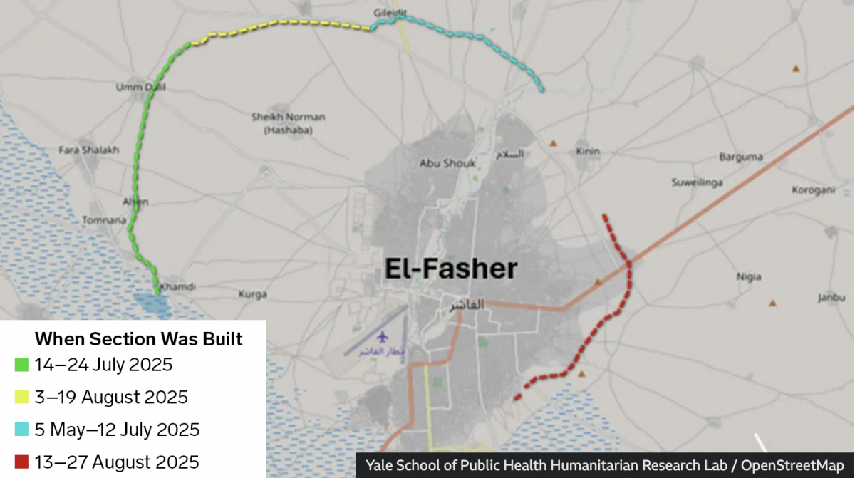
When the Walls Fell
Back in September I wrote about the siege of el-Fasher in Sudan, wherein the town and its government defenders faced the paramilitary rebel forces, the Rapid Support Force (RSF). At the time the RSF besiegers were constructing a wall to encircle the town and cut residents and defending forces off from resupply and reinforcements. At…
-
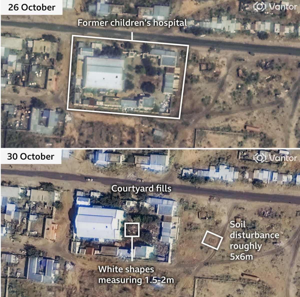
Sudan Side by Side
Conflict—a brutal civil war—continues unabated in Sudan. In the country’s west opposition forces have laid siege to the city of el-Fasher for over a year now. And a recent BBC News article provided readers recent satellite imagery showing the devastation within the city and, most interestingly, one of the most ancient of mankind’s tactics in…
-
The Crisis in Syria
The crisis in Syria now resembles more of a civil war. The UN General Assembly has condemned the conflict and passed a resolution calling for Bashar al-Assad to step aside along with a host of other steps to resolve the conflict. However, nothing can happen until the Security Council agrees on a measure, which is…