The crisis in Syria now resembles more of a civil war. The UN General Assembly has condemned the conflict and passed a resolution calling for Bashar al-Assad to step aside along with a host of other steps to resolve the conflict. However, nothing can happen until the Security Council agrees on a measure, which is still unlikely given the previous vetoes by China and Russia.
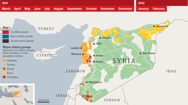
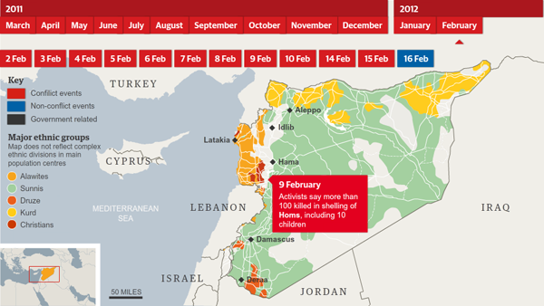
This piece from the Guardian chronologically explains what has been happening—at least as best as can be determined in the not-so-media-friendly country. As this story focuses on dates and places, a map feels natural. The designers have added some crucial details from the backstory about the ethnic complexities of the country and denoted the larger and more important urban centres.

When one clicks on a date, coloured by what part of the story is taking place, markers with text boxes overlay the original city markers and provide the user information on what happened in that city on that date. Or, if the event is more general, the box appears outside the borders.

The interface is rather simple, but works in focusing a person in on a time. Unfortunately, since much of this story can be seen through the lens of locale, e.g. the city of Homs has borne the brunt of al-Assad’s wrath, one cannot focus in on a place and then add time. For example, clicking on the marker for Homs and then seeing a chronological list of events that occurred there would also be quite useful.
Another slight improvement would be more clearly signifying the date being viewed. It does appear in the text box, but with the visual prominence of the main navigation at the top, on a few occasions when I was going through the piece, I did forget what date I was on and had brief moments of confusion.
Leave a Reply
You must be logged in to post a comment.