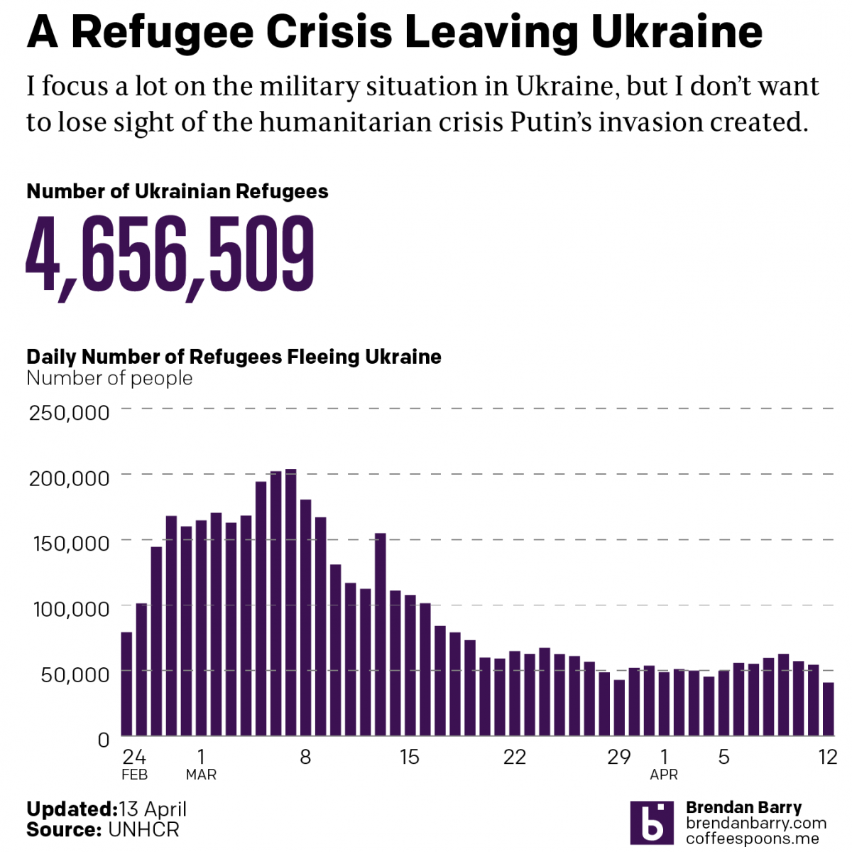
Russo-Ukrainian War Refugees: 12 April

Another week, more combat and refugees in Ukraine. I’m going to try and hold the war update until tomorrow pending some news that hasn’t been confirmed yet: the fall of Mariupol. Instead, we’re going to again look briefly at the refugee situation in Ukraine—technically outside. I haven’t seen a recent number on the internally displaced, though we have begun to see some people return to Ukraine especially in the north and around Kyiv. It’s unclear to me if the data includes those people returning.

Regardless, we are at over 4.6 million Ukrainians who have fled Ukraine.

Slowing down of late.

The question now is as Russia refocuses its effort now on the Donbas—though fierce fighting has been waged in the area for eight years now—will these numbers begin to see a notable change.

Credit for the piece is mine.

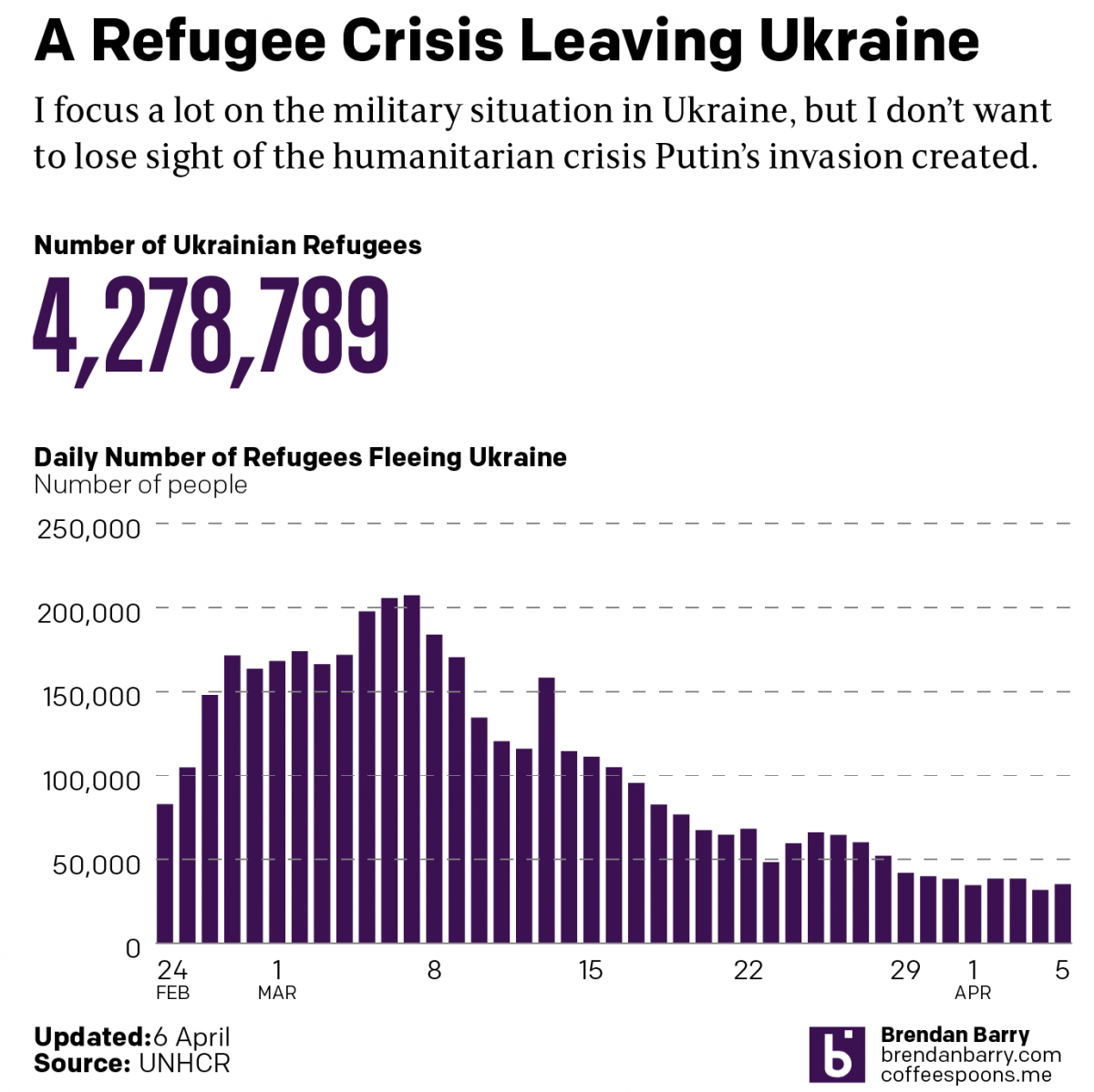
Russo-Ukrainian War Refugees: 5 April

Just a quick update as I try to update my battle map. Today we’re taking another look at the refugee crisis Putin created in eastern and central Europe. Over four million Ukrainians have left Ukraine and millions more have been displaced internally within Ukraine.

Whilst we may hope they will eventually return home, the photos and videos we are seeing of Ukrainian areas that had been captured by Russian forces show that many Ukrainians no longer have homes or even villages to which they can return.

This problem will persist for years as Ukraine tries to rebuild. And that doesn’t include the fact that much of southern and parts of eastern Ukraine remain under Russian control. And some of those areas continue to see fierce fighting.

Credit for the piece is mine.

The Safe List

Migrants and refugees continue to reach Europe. But some of those people can be sent back, depending upon their country of origin. The tricky part is that there is no common set of countries as this graphic from the Economist shows.

The safe list
The safe list

In terms of design, we see nothing too elaborate here. This is really just a table where checks, half-checks, and exes would have sufficed. But, sometimes, a table is really all you need to convey the important data.

Credit for the piece goes to the Economist’s Data Team.

The EU’s Migrant Problem

Last week we looked at a map produced by the Washington Post, which detailed the routes chosen by migrants and refugees desiring to reach the European Union. This week, I want to compare that to one from the BBC—there are others, even from the BBC, but we will examine them later—that details the differences in countries along the route.

EU border map
EU border map

The previous map simply highlighted countries in the Schengen Area, which allows for Passport-free travel between participating EU members. This map uses colour to denote which countries participate and whether they belong in the EU. But it also uses white lines to indicate border, so that Schengen Area countries seem more contiguous. This allows them to use colour to add the layer of recent news: recently imposed border controls and newly constructed fences. My concern in this particular piece is that those pink and green countries should probably have some sort of line indicating that they do have border controls.

Credit for the piece goes to the BBC graphics department.