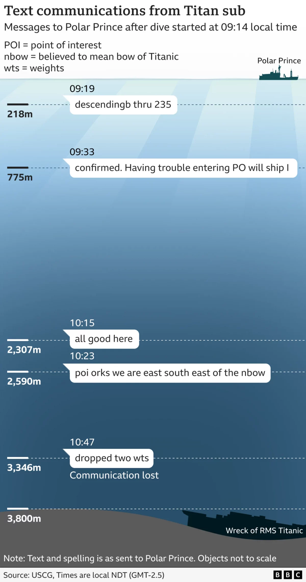
Last week wrapped up the Coast Guard’s two-week inquiry into the sinking of the submersible Titan, which imploded on a dive to the wreck of Titanic. The BBC summarised the findings in an article at the weekend. It included a number of fascinating annotated photographs identifying parts of the wreckage. But it also included the following graphic, which captures the text messages sent by the Titan and the depths at which the messages were sent.
This is significantly better than a number of pieces I have seen lately, to be fair, most of those focus on the dive depths of various objects and creatures. Mostly that is because the graphics—this one included—do not scale the objects to the depths. I understand the why; many would be too small to see. But I think that difference in scale really hits home just how deep Titanic rests on the seabed.
Because this graphic does not focus on the dive depths of objects, but rather the texts Titan sent at what depth, the scale issue is less relevant. Though, the weird bit is how Titanic sits below 3800 m. She rests at 3840 and that little dip on the sea floor looks closer to 400 m.
Overall, though, a solid piece.
Credit for the piece goes to the BBC’s graphics department.
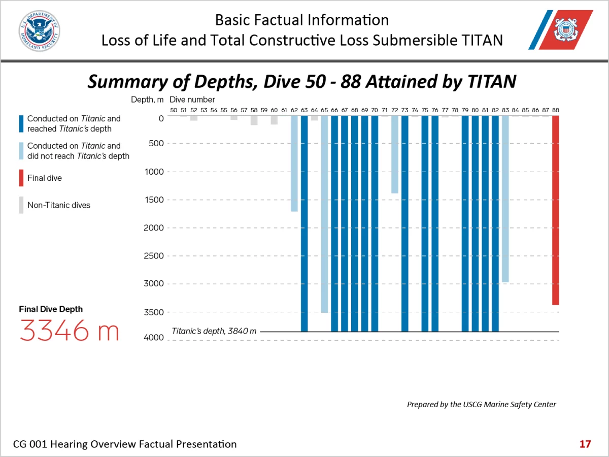
I thought three-dimensional charts died back in the 2010s. Alas, here we are in 2024 and I have to discuss one once again. have been following the Titan Inquiry this week and the opening presentation included this gem of data visualisation.
To be fair, I do not know how many designers, let alone specialist information designers, the US Coast Guard had or made available to create a clear and compelling chart and presentation, but…this is not it. First I will go through a number of points and then, when I had written about half of the post this morning, I decided it would simply be easier to put a white box over the main chart area and just recreate the graphic myself.
Unfortunately, after digging around, I could not find the actual dive depth data the Coast Guard used and so I essentially traced out the chart by hand. Not ideal, but for proof of concept as to how this chart could have been improved…I think my reinterpretation ssuffices.
To start, the chart sits on the slide with a drop shadow. Drop shadows are not all bad. They create perceived depth between an object and it’s background. The interwebs love them. I have used them. But I do not understand why here the chart needs a drop shadow to sit on the slide. Especially since the shadow pushes the chart “above” the deck, only for the three-dimensional bar chart to push the data “below” the chart’s surface, which means the chart data is being represented on the slide surface.
Deep breath.
The chart background features some kind of coloured gradient that became pixellated upon export and import into the PowerPoint deck.
The type was too small that it too became pixellated and grainy to the point that the dive labels are illegible. I would argue labelling each dive beyond its number is unnecessary in the context of Titan’s final dive, but without having listened to the presentation I cannot say for certain.
Next we have the third-dimension. It adds nothing and creates more coloured areas—because the dimension is fake, this a two-dimensional representation of three dimensions—that distract the eye from the important dimension, the length of the bar.
After that, we can look at the axis labels. First, there are far too many. Second, the maximum depth labelling makes no sense. Sometimes, if a line or a bar exceeds the chart maximum once or twice by a small amount, you can let it poke above the top—in this case bottom—line. If you know the rules, you know when you can break the rules. Here, however, the maximum label is 3800 metres.
But Titanic rests at 3840. Ergo 13 different measurements will need to sit below the chart’s maximum—minimum, technically—axis line.
Deep breath.
If she rests at 3840 metres, just add 60 to the chart minimum and you will ahve a final axis label of 3900 metres. Look carefully, however, and you will see in the bottom left how after the final white line, the chart keeps going. Clearly, the designers knew the chart needed more space. This unlabelled minimum is probably 3900 metres given the 100-metre increments used throughout.
But, however, if you add 160 metres to the chart you have a nice, round, divisible number of 4000, which means you do not need to mark the depths in 100-metre increments. It means all the bars sit within the chart. It means fewer pixels on the slide to distract the eyes. (Especially if you drop the background colour.)
Furthermore, if you look carefully at the green boxes, which represent successful dives to Titanic, you can see how the bars break the dimensional rules and are actually flat two-dimensional bars. Perhaps this was only noticeable to me as I worked off the downloaded file at a high-level of zoom to try and figure out the depths as precisely as possible. Or perhaps it is an artifact of the pixellated export of the graphic. If the latter, more of a reason not to make the thing a three-dimensional bar chart.
Then we can get to the colours.
Deep breath.
To start, red-green colour blindness is a thing. I harp on this often and so I will not rehash everything here. No, it does not mean all green and red combinations will not work, one just needs to be careful with them. This one comes pretty close to not working so I would have avoided it.
Secondly, just look at the red. I mean, how can you not. It is very bright and draws your eye almost immediately to all those red bars, particularly the one nearly a fifth of the way in from the right edge. That one is next to one of the successful Titanic dives. My first thought? Oh, that was the final dive. Wrong.
Red means non-Titanic dives. Again, I have not listened to the presentation, but these would presumably be dives of relatively less importance than the Titanic dives. I would not have made the less important dives the one colour that stands out the most.
If you want to go green represents successful Titanic dives and red represents unsuccessful Titanic dives, that makes sense. I can understand the design decision. (Though you would still need to ensure the shades work with each other.) In that case maybe the blue bars represent non-Titanic dives.
Instead, here blue represents unsuccessful dives to Titanic, which of course means the final dive, which of course includes the inquiry’s raison d’être. Not only that, the chart’s background is also blue, which makes visually separating the bars from the background more difficult. This is particularly true at the sides of the chart where the gradient leaves the darker blue.
Finally we have a little orange box with some tiny type pointing out the final dive’s depth. That bit, more visible than the green and orange bars, was still lost to me behind the red bars.
And breathe.
All in all, a mess.
As I noted at the top, halfway through I decided this was such a mess I would prefer just to show how the chart could have been designed. It took a little over an hour to make the chart. Clearly I do not have the chart style guidelines for the Coast Guard, so I just chose a typeface I think worked and then picked some reasonable colours from the deck.
Call me biased, but my design substantially improves the chart. First, you can read the text. Second, the colours fit the brand, do not distract from and in fact highlight the final dive. If I started from scratch, I would prefer to use what looks like the full content area of the PowerPoint slide, but I simply traced over the existing chart. I.e., ideally the chart would have been a little bit taller. I did have to cut out the labels for each dive, but as I stated earlier, they were illegible.
Credit for the original piece goes to the US Coast Guard.
The anniversary of the RMS Titanic’s sinking led to a flurry of graphics related to the sinking, two of which I covered last week. Today’s is from the National Post and looks at the people onboard, most of whom died. Specifically, it breaks out the survivors and those who perished into their class—by berth not birth—and age. It also shows how empty most of the lifeboats were when they launched.
On 14 April 1912—that is 100 years—RMS Titanic avoided slamming bow-on into an iceberg. But her turn allowed the iceberg to slice a long gash beneath the waterline and the North Atlantic gushed into watertight compartment after watertight compartment. Several hours later over 1500 people would be dead.
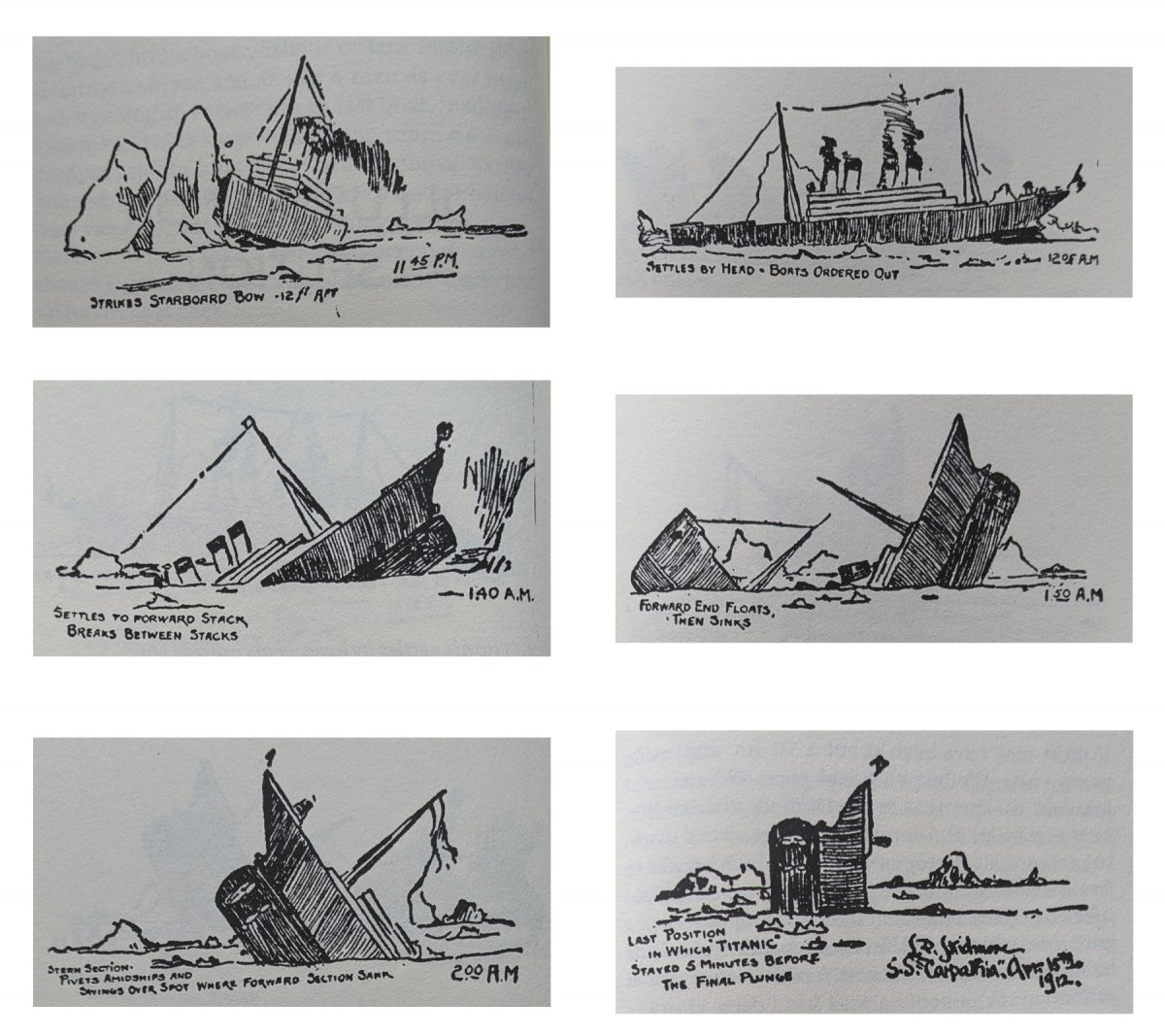
The BBC has published several articles about the sinking in the lead-up to the anniversary. This one is an illustration through small multiples of how the Titanic sank, from the bow slipping beneath the waves to the point at which the liner split in two to the stern rising vertically out of the water before it too plummeted to the seabed.
At the end of the graphic is an exploration of the wreck and a small chart showing the scale of the depth at which the wreck now sits, slowly deteriorating.
Saturday will be the 100th anniversary of the sinking of the RMS Titanic. She struck an iceberg just before midnight—at the time the crew thought merely as a glancing blow—and within three hours she would be headed towards the seabed. By the time the survivors were all picked up, over 1500 people would die in what is perhaps the most (in)famous sinking in human history.
But, what about the iceberg? There are of course the reports that a ship scouring the sea for survivors after the sinking found the killer berg. But how did it get there? The New York Times put together an infographic exploring the science behind how the RMS Titanic might have ended up colliding with what originally was part of (probably) a Greenlandic glacier.
Also in the piece are explanations of how it is possible that the SS Californian did not come to the rescue of the stricken RMS Titanic.
Credit for the piece goes to Mika Gröndahl and Joe Burgess.
RMS Titanic launched 100 years ago today in Belfast, where the anniversary was marked all these years later and the BBC covered it. In a related article, the BBC looked at why people celebrate a ship that had such a brief and tragic history, in which there was this small little graphic illustrating the failure of the watertight bulkheads.