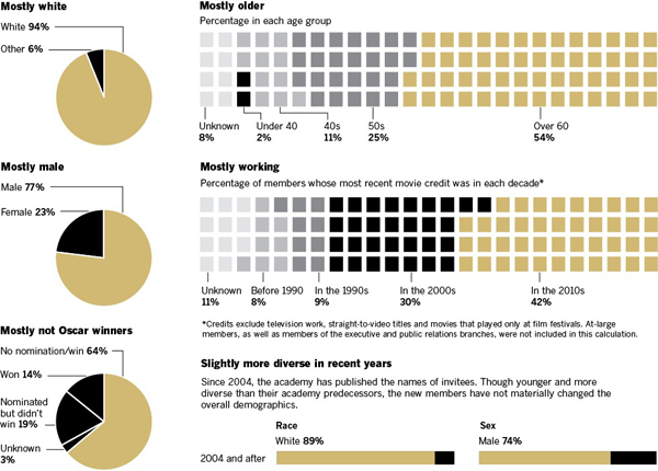
So apparently last night actors, directors, and others associated with the production of films won little statues. (And then probably celebrated with fancy foods and wines.) Yes, last night was the Academy Awards. But who is this Academy that decides upon the best films and performances?
As it turns out, the demographics of the Academy do not quite mirror those of the broader country. Just over a week ago, the Los Angeles Times looked at the Academy and visualised its membership, discovering the details of which was itself a journalistic feat.

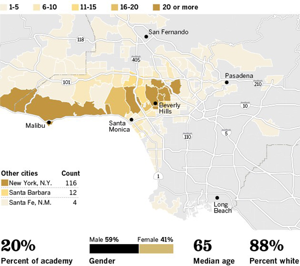
After a broad overview with pie charts and such, each branch was mapped as a choropleth to the Los Angeles area. Those members from outside the LA metropolitan area were given small squares to represent their cities.

As someone not at all familiar with Los Angeles and its neighbourhoods, perhaps where the members of the various branches of the Academy live is actually somewhat interesting. However, I fail to understand the value in that. More useful is the idea of breaking out a socio-economic demographic and mapping that data. And if that had been the case here we almost have a set of small multiples. These are just a bit big.
Overall, a solid body of work.
Credit for the visualisation piece goes to Doug Smith, Robert Burns, Khang Nguyen, and Anthony Pesce.
Leave a Reply
You must be logged in to post a comment.