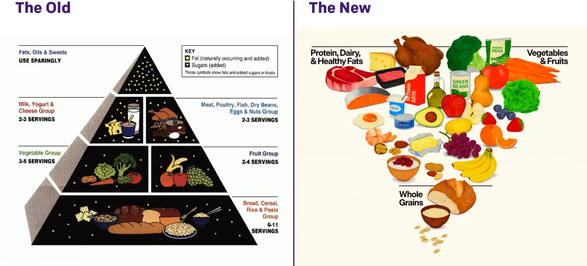
Turning the Pyramid Upside Down

Literally.

Last week amongst all the things, the administration released new dietary guidelines, including a brand new food pyramid. The guidelines needed some tweaking as dietary and nutritional science evolves.

The administration made a big deal about replacing the old pyramid with the new pyramid, and you can see the comparison here.

I am not a scientist. I don’t even play one on television. So I will keep my thoughts to the design—although I will say that is a lot of steak and turkey…

My first thought about the design? Pyramids are an incredibly strong and stable shape. Just look over at Giza to see how stable a pyramid is compared to the tower that is the Lighthouse of Alexandria or the man-shaped Colossus of Rhodes.

But when you flip the script and turn the pyramid upside down…you place all the weight at the top and focus the pressure on the tip of the pyramid. That is an incredibly unstable design, and I have to wonder do we want that implicit communication in a message to people about how to be healthy?

The other point I would make is that the new pyramid does not just explicitly reference the older pyramid, but quietly and without mention replaces the MyPlate initiative of the Obama administration.

The plate design worked better from a personal planning standpoint because the circular plate is—usually—the device upon which we eat our meals. (The whole square meal thing, as I was taught, originated with the Royal Navy, which served three meals a day to sailors on wooden, square-shaped plates.) And who doesn’t like a small side dish of cheese with their meals?

I cannot say an inverted pyramid showing the aforementioned steak and turkey provides the same instructional use of what people should be placing on their plates.

Either the right-side-up pyramid of the healthy plate design works best from a design perspective. Though, to be clear, I have no real thoughts on what the division of the simplified three categories should be. But would I eat a wedge of cheese half the size of a turkey? Yes, yes I would.

Credit for the new pyramid goes to the National Design Studio.

Credit for the older works I cannot find, but if anyone does, please let me know.

How Healthy Is It?

Happy Friday after the election. Now that we have had our fill on sweets and bitters, we probably need to move towards a more balanced, more moderate diet. A couple of months ago the New York Times put together this scatter plot from the difference between public and nutritionist opinion on whether certain common foods are healthy.

I normally do not comment on the design of my Friday posts, since I intend them to be on the lighter, more humourous side of things. But this piece interests me, because despite the seriousness of the subject matter I find it lighter and less serious. Why? After studying it, I think it is because of the inclusion of photographs of the items. With the labels still present, I am left thinking that a small dot would be equally effective in communicating what falls where.

In general, try to be in the upper right

But more importantly, look at the sizes of the images relative to the plot. Take the bowls of granola or popcorn, for example. They occupy almost an entire square; the actual value could be anywhere with the 10 percentage point range either vertically or horizontally. And for those two, it does not matter a great deal. Each falls firmly on one side of the line. But what about butter? Kind bars? Cheddar cheese? The large graphic size straddles the line, but because the designers opted for photos over more precise dots, we cannot ascertain whether these foods fall on one side of the line or the other.

The point is that the graphics and design of a piece can influence the perceived seriousness of a piece. An image of a can of Coca-Cola certainly can be more engaging than a 10-pixel dot. But the precision of the dot over the image can also be engaging to the right audience, an audience interested in the data behind the story. There are ways of integrating both, because later on in the same article, we see a means of doing just that.

The image lives on the left of the table

Here the image provides supplemental information. Just what does a granola bar look like? Well here you can see it. But even here, despite the smaller size and cropped dimensions, the photographs steal a bit of emphasis from the numbers and the charts to the right. (For things like SlimFast, that is no surprise, because the package is designed to capture your attention.)

At the end of the day, the piece interests me because the data interests me. And the story interests me. And I generally like the data visualisation forms the designers chose. But I keep getting hung up the photographs. And not in a good way. What do you think? Do the photos add to the story? Do they make the data clearer?

Credit for the piece goes to Kevin Quealy and Margot Sanger-Katz.

Rainbowship Enterprise

You can rightly file this one under what the fuck, which is how I found it on WTF Visualizations. The piece appears to be some sort of comprehensive guide to minerals, nutrients, and in which foods you can find them. But, as the critique title declares, this is more like Rainbowship Enterprise. How this is supposed to be remotely useful, I cannot even begin to fathom. But, hey, the title references Star Trek, so that’s a redeeming characteristic, right? Oh wait, that was in the criticism…

Set your phasers to stun(ningly bad)

Credit for the original piece goes to Nuique and datadial.

Chipotle and Calories

In my office, Chipotle is a popular fast-casual lunch choice. I am not sure, however, whether people would want to see today’s piece, an article from the New York Times about the nutritional value of a Chipotle meal. The piece makes good use of a few bar charts and nice photographs and table to explain how calorific a burrito there can be. Maybe I should be having a salad for lunch today…

Chipotle calories
Chipotle calories

Credit for the piece goes to Kevin Quealy, Amanda Cox, and Josh Katz.