Tag: Winter Olympics
-
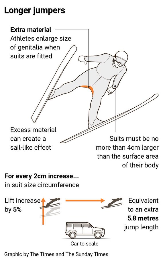
A Matter of Millimetres
Well we have made it to the weekend. And so it is the time to look at the area of men’s genitalia. This week on baseball Twitter the following graphic made the rounds. The graphic itself claims to be from the Times—the original, not the New York version for my American audience—though I have been…