The Winter Olympics are creeping ever closer and so this piece from the New York Times caught my eye. It examines the impact of climate change on host cities for the Winter Olympics. Startlingly, a handful of cities from the past almost century are no longer reliable enough, i.e. cold and snow-covered, to host winter games.
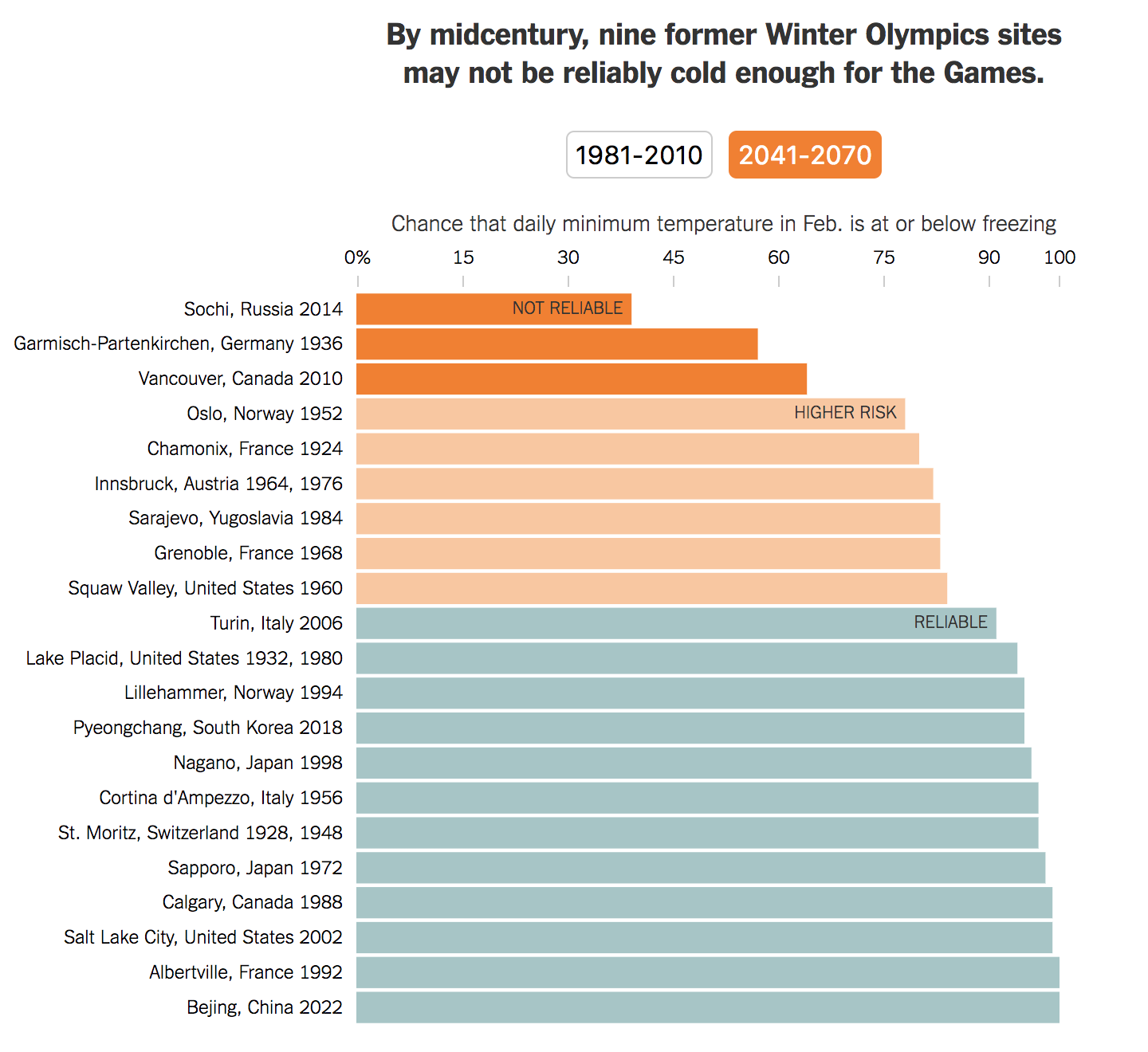
This screenshot is of a bar chart that looks at temperatures, because snow and ice obviously require freezing temperatures. The reliability is colour-coded and at first I was not a fan—it seemed unnecessary to me.
But then further down the piece, those same colours are used to reference reliability on a polar projection map.
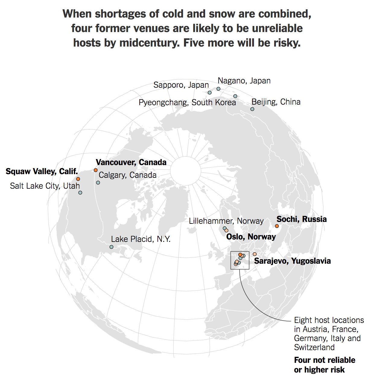
That was a subtle, but well appreciated design choice. My initial aversion to the graphic and piece was changed by the end of it. That is always great when designers can pull that off.
Credit for the piece goes to Kendra Pierre-Louis and Nadja Popovich
Leave a Reply
You must be logged in to post a comment.