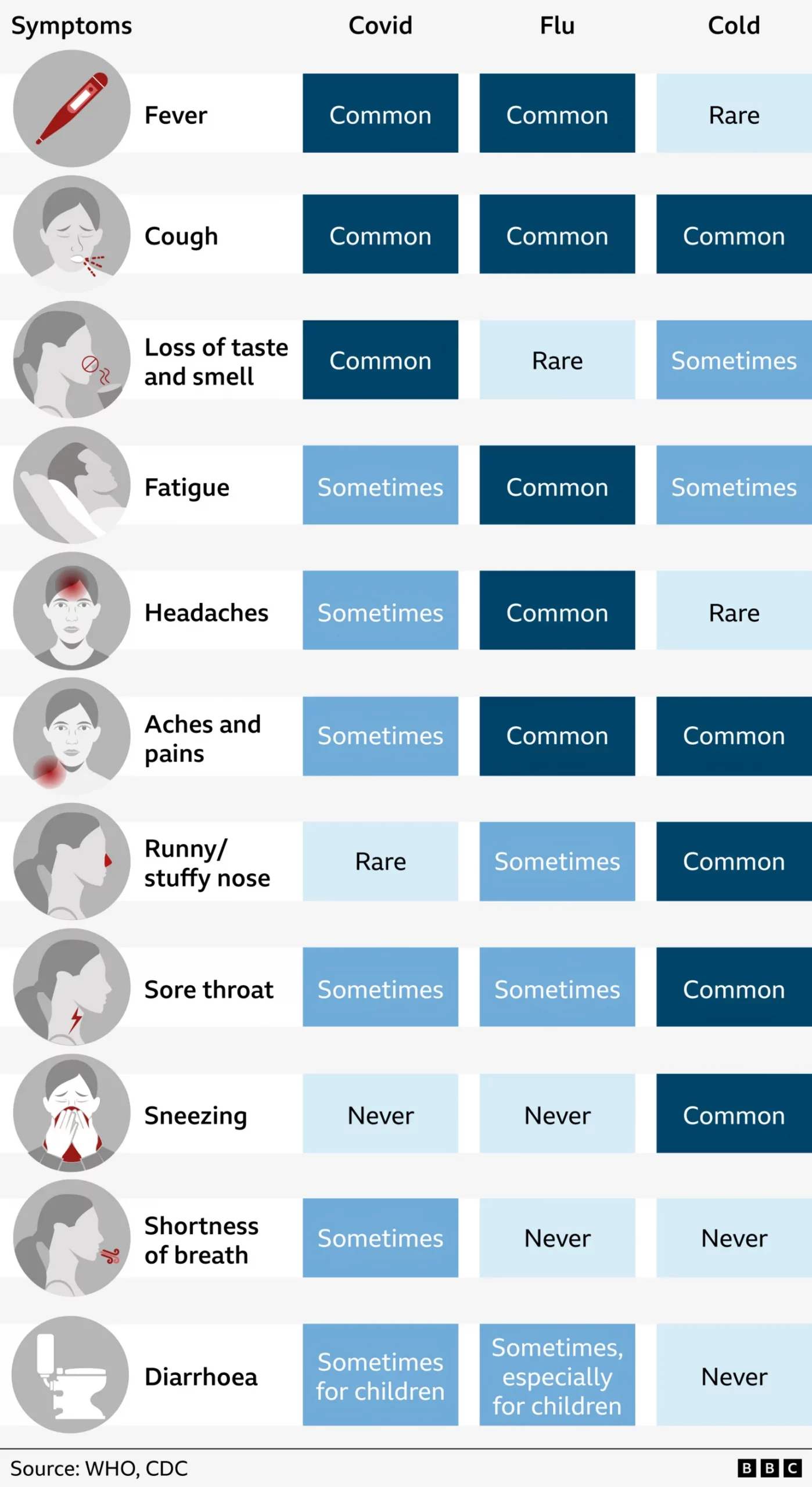
Comparing Covid-19 to Influenza

I want to share a small graphic I made yesterday evening. And I am being charitable with the term graphic. Really it is nothing more than a collection of organised factettes. But I have seen the footage of those protesting the lockdowns in various states, including Pennsylvania.

To be clear, people can have different policy prescriptions to solve the pandemic. For example, the governor of Pennsylvania is considering lifting the lockdown piecemeal once the state overall has sufficient testing and tracing capabilities. Look at the state.

The situation in Pennsylvania

He rightly said that Cameron County, one of the little light purple shapes in the upper left, with its one case for the last 25 days is in a different situation than Philadelphia where cases continue to grow, albeit at a slowing rate. And in the future it is possible that Cameron County could open before Philadelphia. That is a different policy prescription than, say, opening the state all at once.

I don’t think most people enjoy lockdown—I haven’t left my building in 38 days and I cannot wait to leave and go do something. But I recognise that spreading outside these walls we have a deadly pandemic for which we have no vaccine. But then I see people protesting—protesting in a manner that contradicts the guidelines put out by the health officials—and claiming that we should open up because this is nothing worse than the flu.

Well, Covid-19 is not the flu. It is much worse.

This isn't your grandmother's flu. Or anyone else's flu. Because this isn't the flu.
This isn’t your grandmother’s flu. Or anyone else’s flu. Because this isn’t the flu.

Now, those numbers will change because the pandemic is ongoing. But, let’s spitball. Let’s assume those numbers hold. The idea of the shutdowns, lockdowns, and quarantines is to prevent the spread of the virus. For the sake of this thought experiment, let’s just assume, however, that it infects 56 million people, the upper end of the range for this most recent influenza season.

Influenza this year killed as many as 62,000 people after infecting 56 million. Hypothetically, with a mortality rate of 5%, Covid-19 would kill 2,800,000 people.

With a 4% rate that drops to 2,240,000

With a 3% rate that drops to 1,680,000

With a 2% rate that drops to 1,120,000

With a a 1% rate that drops to 560,000

With a 0.5% rate that drops to 280,000

And even at 0.5% that is still far greater than the flu. And so that is why it is so important to keep the number of people infected as low as possible. (And I won’t even get into the surge problems overwhelming hospitals that acts as a force multiplier and is the proximate reason for the lockdowns.)

This is not the flu.

Credit for the piece is mine.

The 2017–18 Flu Season

Last week I covered the Pennsylvania congressional district map changes quite a bit. Consequently I was not able to share a few good pieces of work. Let’s hope nothing goes terribly wrong this week and maybe we can catch up.

From last Friday we have this nice piece from FiveThirtyEight looking at the spread of influenza this season.

Red is definitely bad

The duller blues and greens give way to a bright red from south to north. Very quickly you can see how from, basically, Christmas on, the flu has been storming across the United States. It looks as if your best bets are to head to either Maine or Montana. Maybe DC, it’s too small to tell, but I kind of doubt that.

As you all know, I am a fan of small multiples and so I love this kind of work. To play Devil’s advocate, however, I wonder if an interactive piece that featured one large map could have worked better? Could the ability to select the week and then the state yield information on how the flu has spread across each state? I am always curious what other other forms and options were under consideration before they chose this path.

Credit for the piece goes to the FiveThirtyEight graphics department.