Tag: maps
-
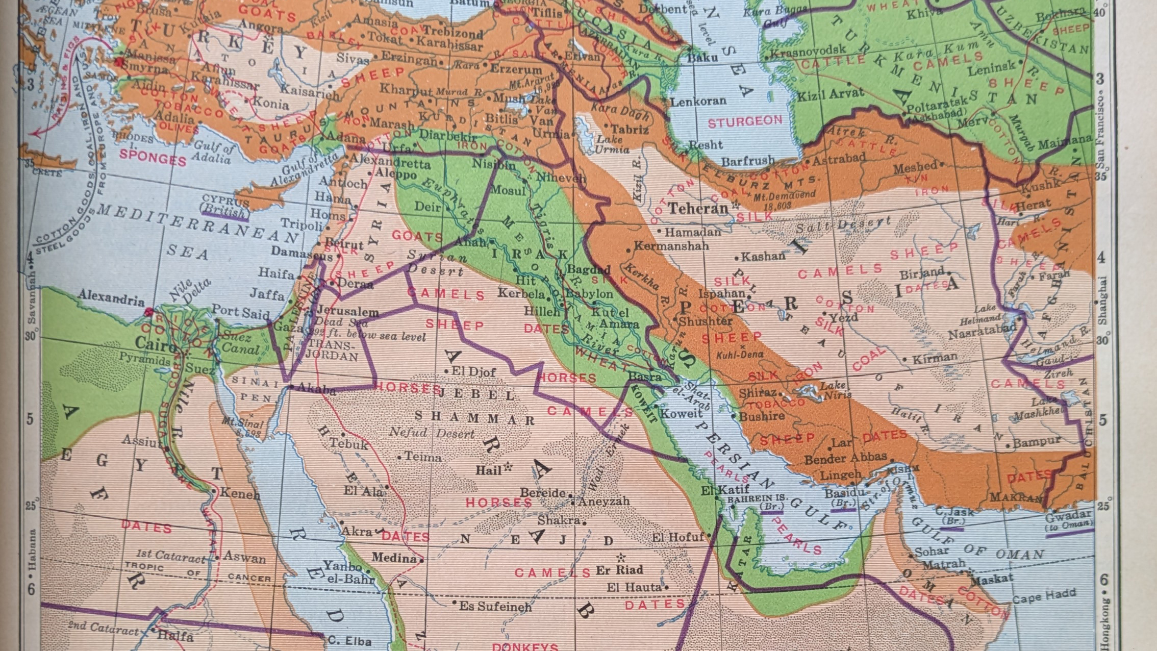
Iran, Not Persia
So if you’ve a date in Tehran, she’ll be waiting, in, well, Tehran. Happy Friday, all. On Monday I critiqued a graphic from Bloomberg about airstrikes in the Middle East. As we head into the weekend, I opted to pull one of my (many) atlases off the bookshelf, because I just wanted to see how…
-
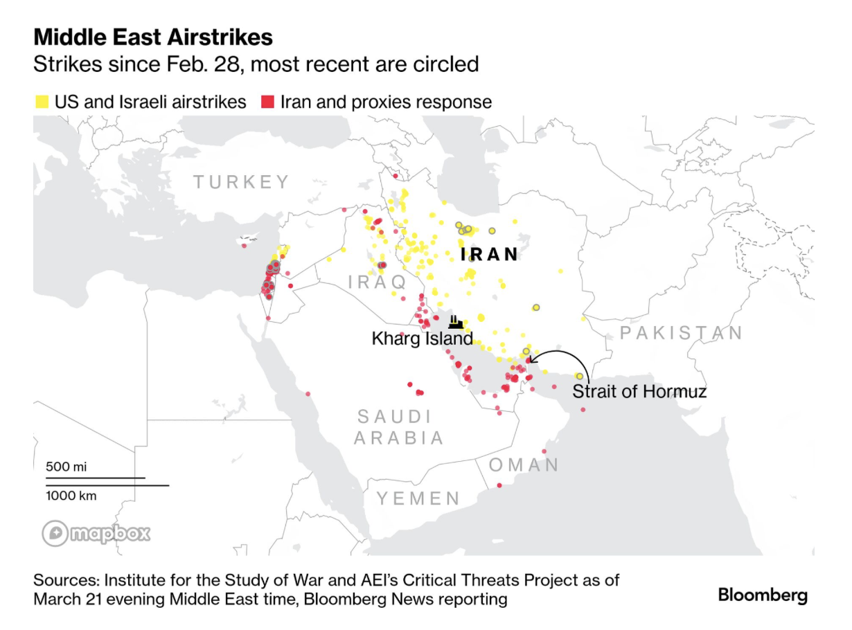
Gooood Morning, Bomb Iran?
As I ate breakfast this morning, I read through the Morning Briefing I receive from Bloomberg. These days, it provides a good update of what happened in Iran and the Middle East. Every once in a while I will flag one of their graphics to share here, but never decide to ultimately do it because…
-
Reticulating Splines
Happy Friday, all. In looking at my calendar the other day, I saw that in three weeks I will be in Appalachia for Orthodox Easter. That means driving through Pennsylvania’s Ridge and Valley region and then sleeping in the mountains. But wherefore the mountains? Thankfully, xkcd posted a map explaining why all the natural features.…
-
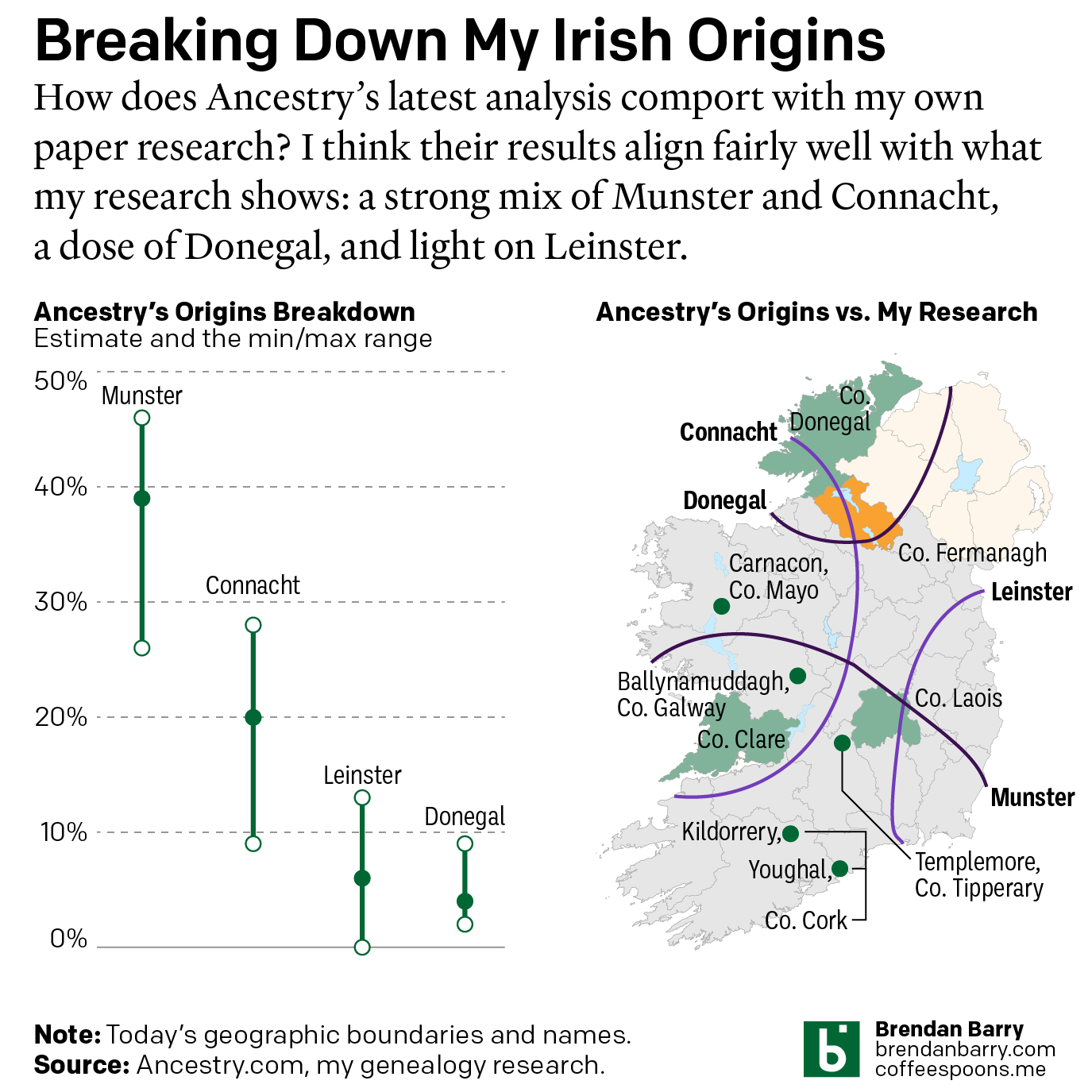
Still Irish
Last October Ancestry.com updated their ethnic origins breakdowns. Longtime readers will know these are not the most useful tools for helping one in their genealogical research. But, if they garner interest in one’s family history and motivate people to explore their own pasts, more power to them. I only encourage those people to dig a…
-

The Women in My Ancestry
International Women’s Day was Sunday and last weekend I attempted to research the occupations and careers of my direct line female ancestors. Including the scope to aunts and cousins broadened things too much in my mind. Unfortunately, there were too few who had recorded careers outside of “keeping house” or similar descriptions in census records.…
-
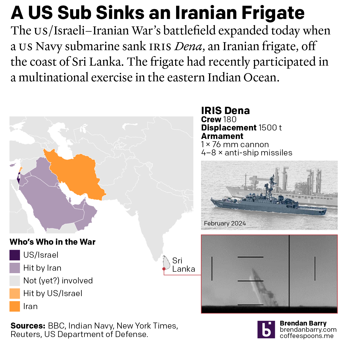
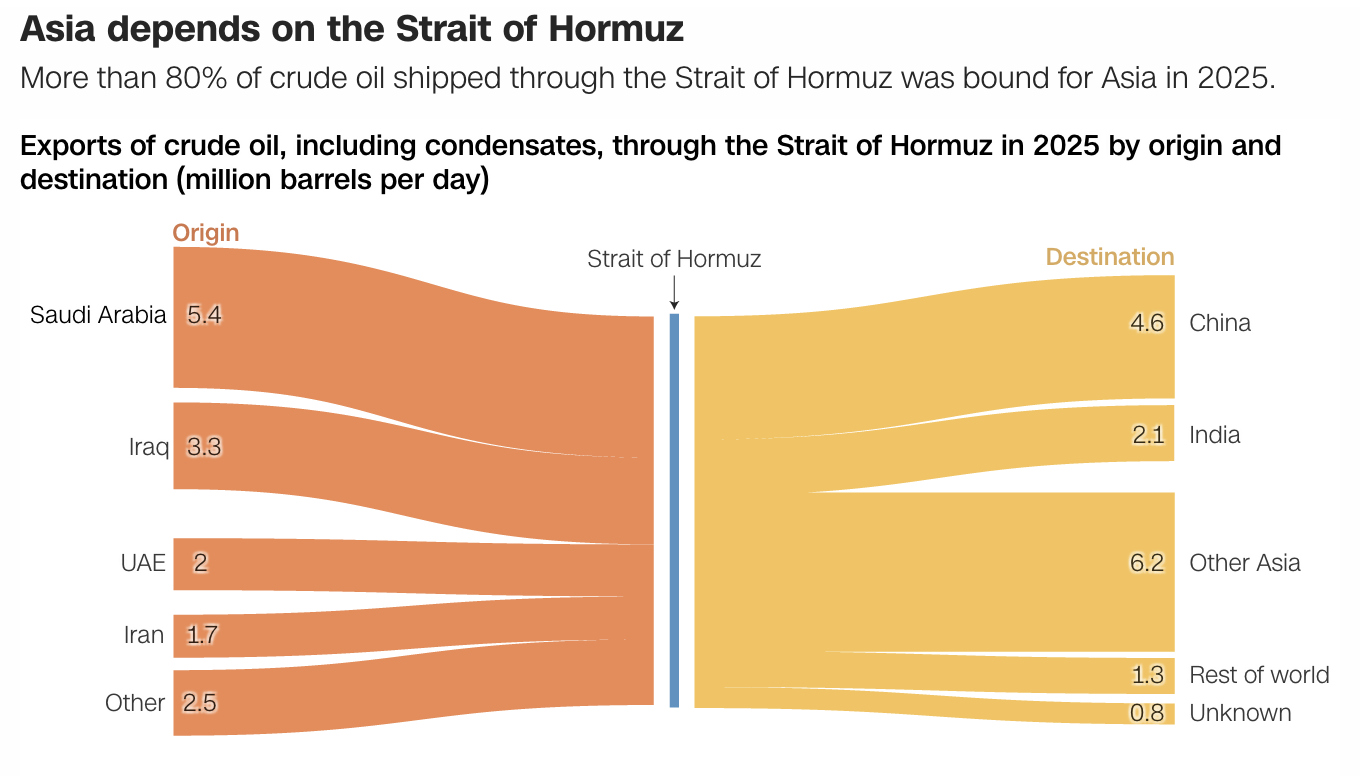
US Sub Sinks Ship off Sri Lanka
I woke up this morning thinking I was going to write about the graphics I mentioned on Monday. Instead, reading the news over breakfast brought me up to speed on the US Navy’s sinking of an Iranian frigate off the southwestern coast of Sri Lanka in the wee hours of the morning local time. Longtime…
-
Mission Accomplished
Last weekend the United States and Israel preemptively struck Iran and kicked off a regional war. As I type this Monday morning, the US–Israeli strike forced assassinated the ayatollah and numerous other senior Iranian officials—but this seems to have been anticipated to a degree and the regime quickly retaliated and has delegated roles and responsibilities.…
-
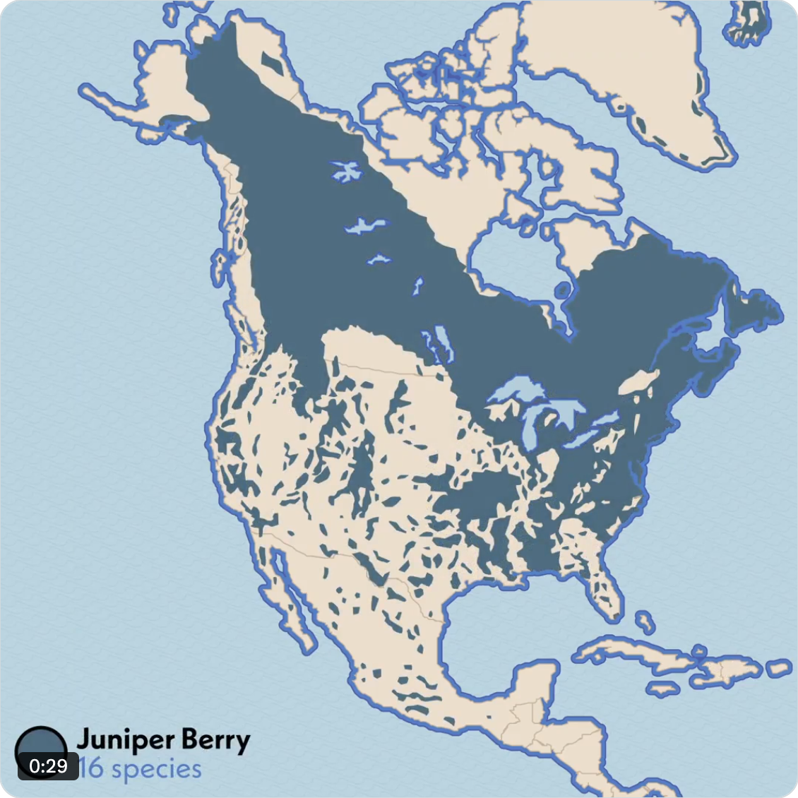
Jumpin’ Juniper
Happy Friday, all. Baseball is back with Spring Training now in full swing. That means checking in on my Twitter feeds for Red Sox baseball coverage. Sometimes that means seeing content not at all related to baseball. And given yesterday was the day before the weekend, this post stuck with me and now you can…
-
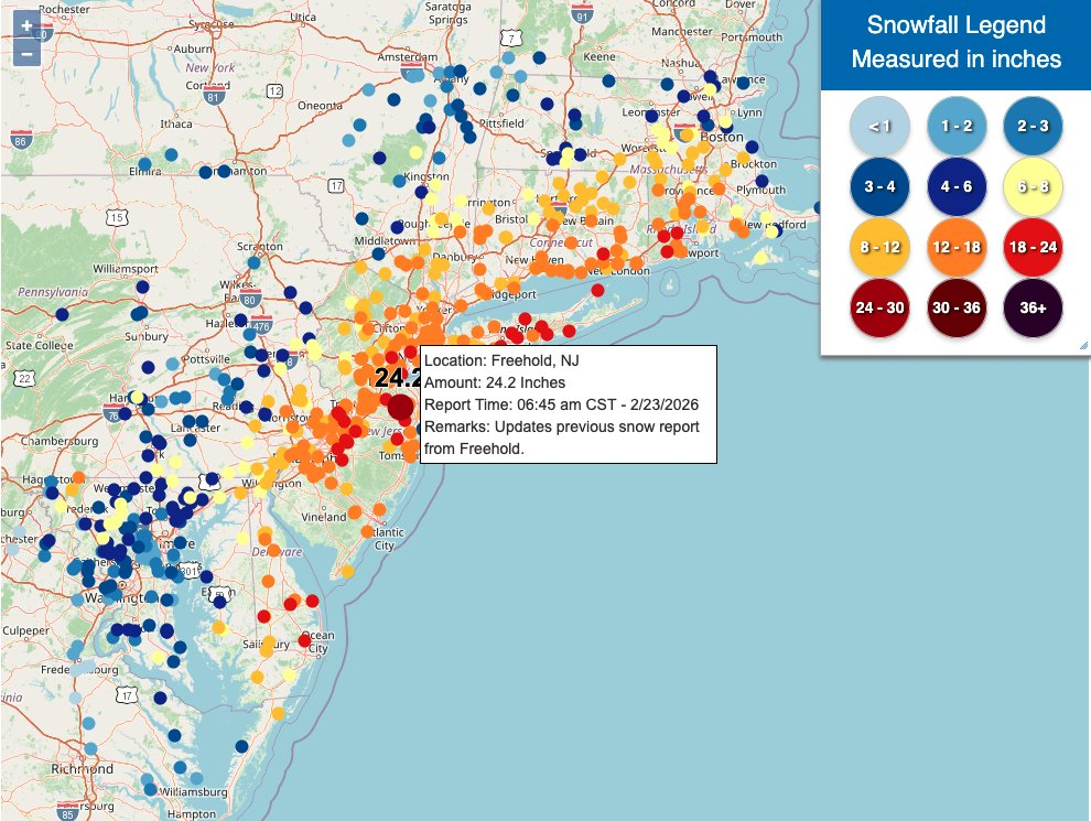
Winter Is Still Here
Ah, a blizzard. Even if the worst of the storm that recently impacted Philadelphia struck mostly at night, it still left a picturesque mess for the morning. I, however, was struck by some of the maps of the snowfall totals and I figured that would be worth sharing today. What got me started on this…
-
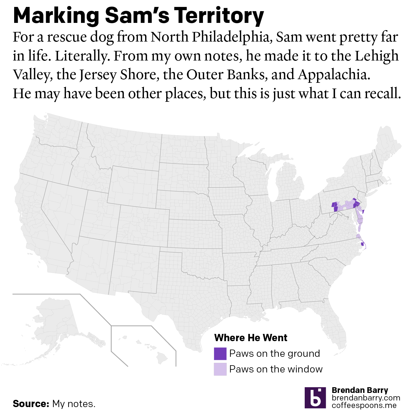
A Ruff Week
After last Friday’s post went live I headed home, because I received word that in the evening, we would be saying farewell to our family dog of 17 years, Sam. My sister adopted him after his first owners gave him up to a rescue shelter with injuries they could not afford to tend after he…