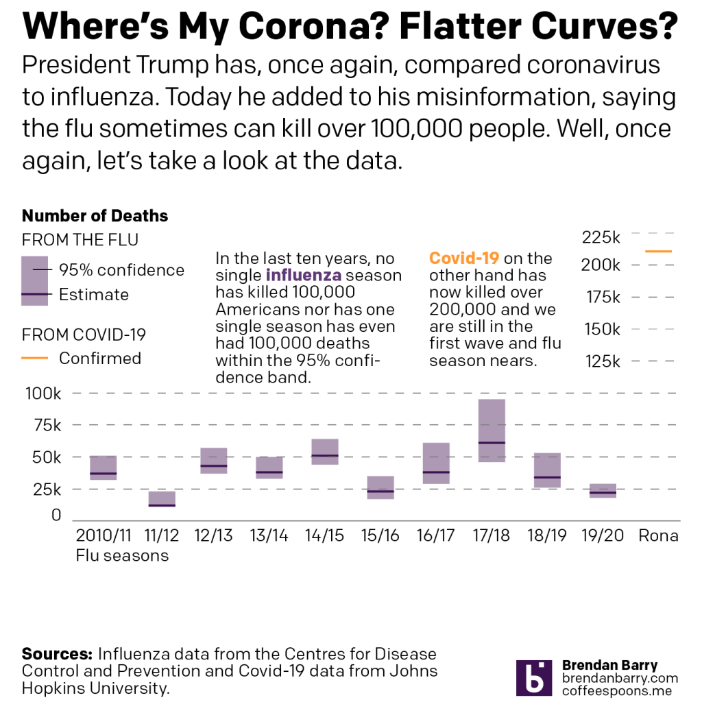
Yesterday, President Trump once again lied to the American public on his social media platforms. He falsely claimed that Covid-19 was nothing worse than the flu, which he falsely claimed sometimes kills more than 100,000 people. Once again we are going to look at the data comparing influenza to the novel coronavirus and the disease it causes, Covid-19. We are going to look at the president’s claim that Covid isn’t much worse than the flu, which sometimes kills more than 100,000 people.
I mean, I don’t know where else to begin. Over the last decade, not in any flu season has the flu killed 100,000 people. In the 2017/18 season, the CDC estimates the flu killed 61,000 Americans. But they also give a range where they feel with 95% confidence that the flu killed between 46,000 and 95,000 Americans. And that is the closest it’s come.
In fact, as of yesterday, Covid-19 has killed 207,000 Americans. That averages out to about 30,000 Americans per month. In other words, Covid-19 has killed each month the same number of people the flu kills in an entire (average) fly season.
And the worst part is that we still haven’t exited the first wave of the coronavirus, because we never got it under control in the first place.
I just don’t know how many more times we have to say this, but because the president keeps lying about it, I feel like I need to say, once again…
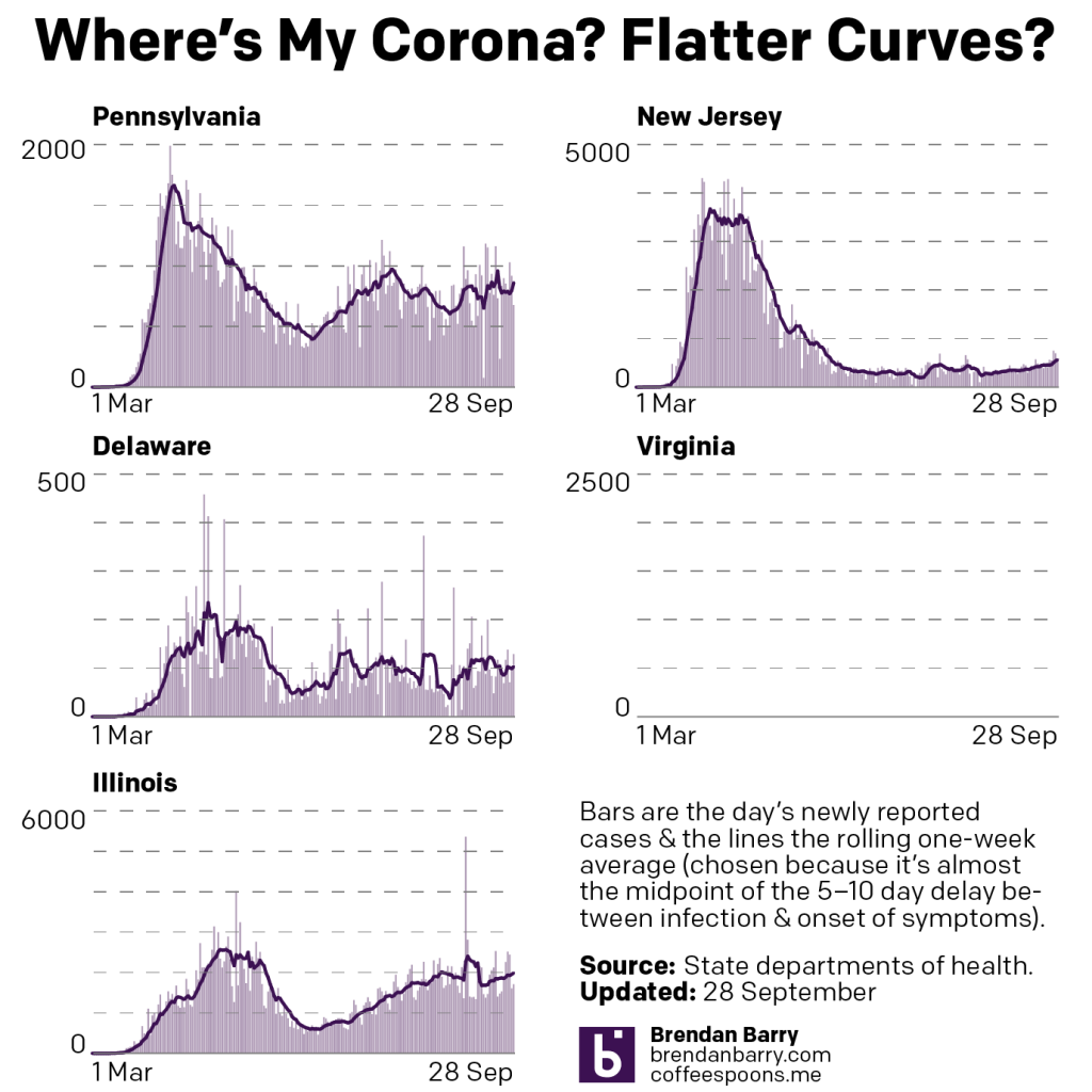
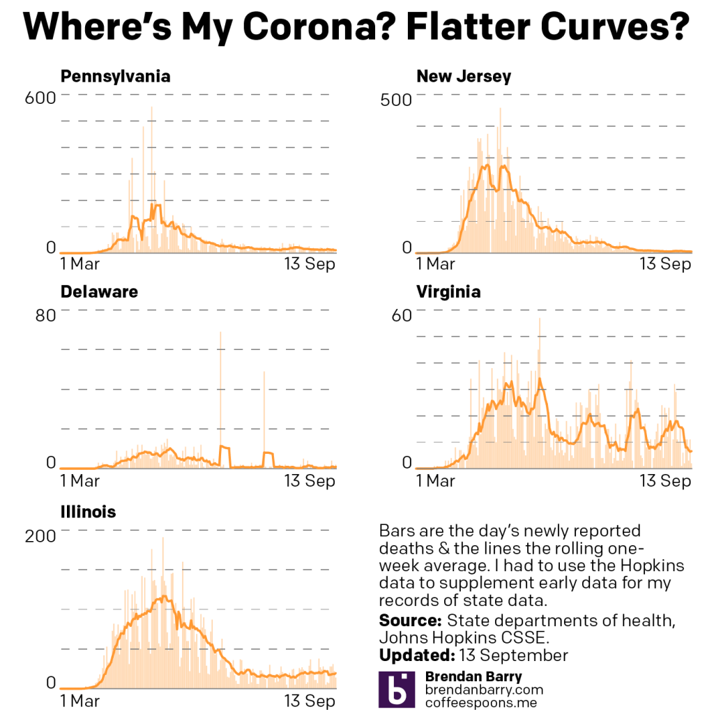
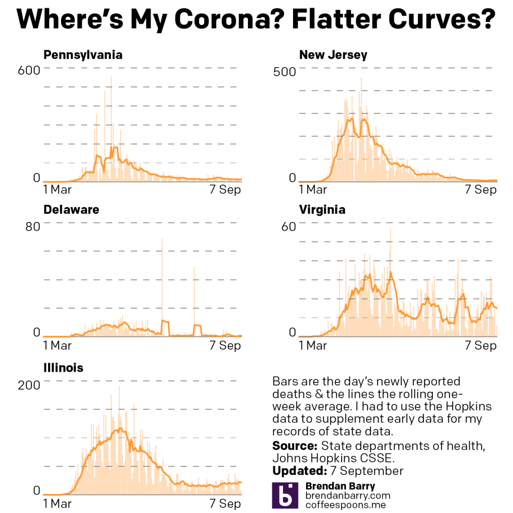
Apologies for the lack of posting, work is pretty busy as we wrap some projects up. But here’s a look at the latest Covid data for Pennsylvania, New Jersey, Delaware, and Illinois. Normally we look at Virginia as well, but their site was down for maintenance and so there was no data to report.
When it comes to new cases, we have on the one hand places like New Jersey and Illinois, where new cases continue to rise. The rate is nowhere near as fast as it was in March and April, but the inclines are clearly there. Delaware has been up and down, but largely hovering around just shy of 100 new cases per day. Pennsylvania is a bit harder to tell because of some dramatic swings that have knocked the average around, but it does appear to be trending upward, though I’m not quite as confident in that as I am with New Jersey and Illinois.
New cases curve in PA, NJ, DE, and IL.
And then when we look at deaths, we generally have good news. Last week we were looking at Virginia and its working through a backlog of unreported deaths. That artificially inflated recent days, but also depressed deaths earlier in the pandemic. Beyond the old Dominion, however, deaths have remained fairly low. Only in Pennsylvania and Illinois do they hover around 20 deaths per day from the virus.
Apologies for the lack of posting yesterday, but I wasn’t feeling well. I had some other things planned for today, but then some other things happened this weekend and then I took ill. But it’s still important to look at what’s going on with the pandemic, especially in the United States where it’s been disastrously handled by the White House.
As we approach 200,000 dead Americans, we still look at what’s going on in the tristate region alongside Virginia and Illinois. Specifically we compare last week’s post to this week’s post. Note that normally we look at Sunday data on Monday morning and today we’ll be looking at Monday data on a Tuesday. Both Sunday and Monday are reports from their preceding days, and so we are still looking at weekend reporting of figures. So we can expect them to be lower than workweek data.
New cases curves for PA, NJ, DE, VA, & IL.
If we compare the above chart to last week’s, we can see that Pennsylvania has decidedly reversed course. Whereas things had been headed down in terms of averages, I was worried about the days of daily new cases exceeding the average. Sure enough the average has caught up to the new cases and we’re seeing a rise in the average to levels not really seen since the summer.
New Jersey remains on the path of slowly increasing its numbers of new cases. Delaware looks to be heading back down after a small bump. We might be seeing the beginning of a decline in cases in Virginia, down from its long-running plateau of nearly 1000 new cases per day. And finally in Illinois, it’s not quite clear where things are headed at present. But for the one-day spike that raised the average, it seemed as if new cases had been in decline, but the end of that otherwise decline might have been an inflection point as the average may be trending back upwards again.
Death curves in PA, NJ, DE, VA, & IL.
Then when we look at deaths, well we see no real significant change in four of the states. But last week, we were saying Virginia was at a good spot with its latest surge cycle coming to an end. Well now look at that spike and deaths that are higher now than they were in the spring. If you follow my daily posts on social media, you’ll know that there’s a reason for this.
For the last week Virginia has been working through a backlog of deaths that were not entered into its electronic database. And so these deaths happened over the last several months. Consequently the rise, if there even is one, is not nearly as high as shown. But it also means that the earlier peaks may have been far higher than reported at the time.
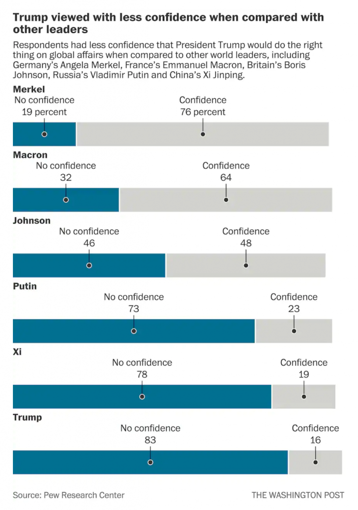
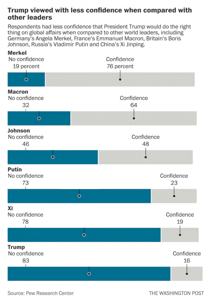
Yesterday Pew Research released the results of a survey of how the rest of the world views select countries throughout the world. The Washington Post covered it in an article and created some graphics to support the text. The text, of course, was no big surprise in that the rest of the world views the United States poorly compared to just several years ago and that, in particular, President Trump is a leader in whom the world has no confidence.
But that’s not what I want to talk about. Instead, I want to address a design element in the one of their graphics. (But you should go ahead and read about the survey results.)
The issue here is the positioning of the labels for each bar, representing a world leader. At the very top of the graphic, things are in a good way. We have Merkel with a small space beneath that text then another label, “No confidence, 19 percent”, and then a connecting line to a dot to the blue bar. We then have a small space and the label Macron, meaning we have moved on and are on the next world leader.
But what if the reader sees the title and starts towards the bottom? They want to see the leaders in whom the world has no confidence. Now look at the bottom of the chart and the positioning of the labels for Trump, and above him, Xi, Putin, and maybe even Johnson. Because the “No confidence, x percent” labels have moved further to the right, there is an enormous space between the leader’s name and their coloured bar. Visually, this creates a link between the leader’s name and the preceding bar. For example, Trump appears to have a no confidence value of 78 with an unlabelled bar chart beneath him.
I suggest that there are two easy fixes to better link the labels to the data. The first is to move the leaders’ labels down, once the “No confidence” label has moved sufficiently far to the right. Like so.
The leader is now very clearly attached to his or her data with little confusion.
My second option is to fix the “No confidence” labels permanently to the left of the chart so as not to create that visual space in the first place, like so.
Here, after seeing the first option, I wonder if there is enough visual space at all between the leaders. But, this is only a quick Photoshop exercise. If I wanted to really tweak this, I would consider putting the data point or number in bold to the right of the label.That would eliminate an entire line of type that could be repurposed as a visual buffer between leaders.
I think either option would be preferable because of increased clarity for the reader.
Credit for the piece goes to the Washington Post graphics department.
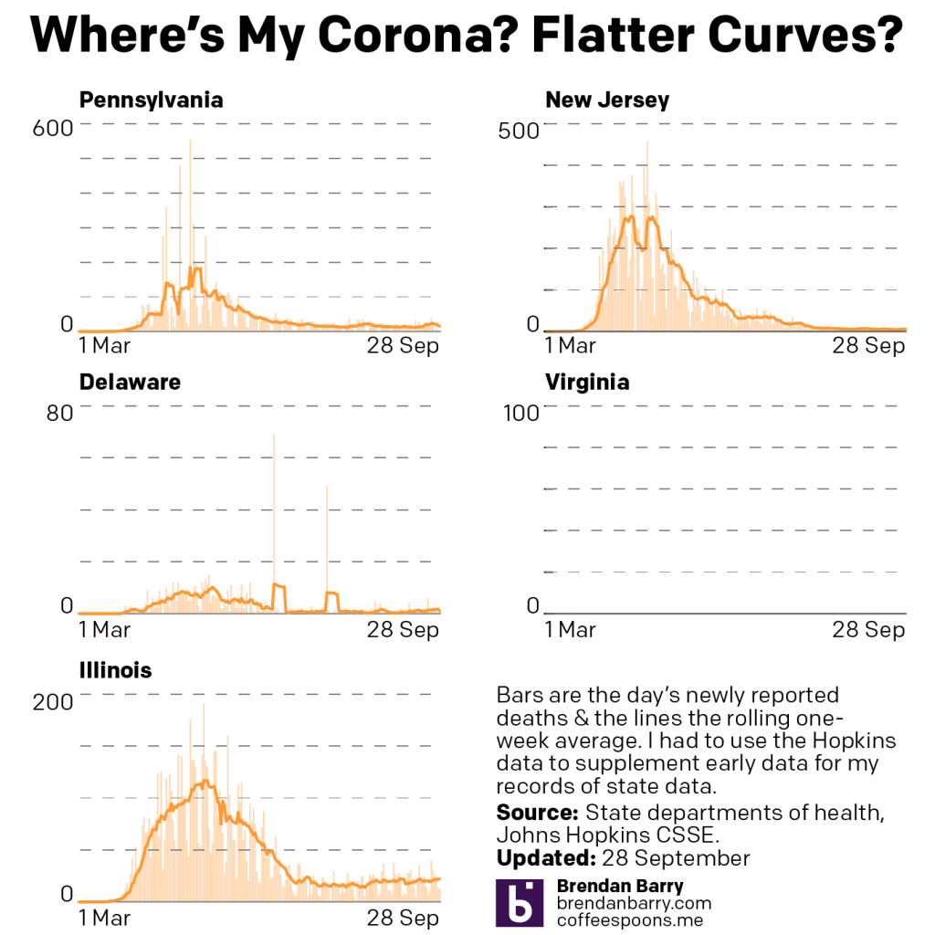
Apologies for the lack of posting last week. I’m on deadline for, well, today. Plus I had some technical difficulties on the server side of the blog. But it’s a Monday, so we’re back with Covid updates for Pennsylvania, New Jersey, Delaware, Virginia, and Illinois.
New cases curves for PA, NJ, DE, VA, & IL
The good news, such that it is during a global pandemic, is that in Pennsylvania, Delaware, and Illinois, the seven-day average appears to be lower than this time last week or, especially in Delaware’s situation, about to break. For the First State, I’m looking at those days prior to the weekend below the average line that, in combination with the weekend, will likely begin to push that trend downward, especially if we keep seeing fewer and fewer cases this week.
Unfortunately, some states like Virginia and New Jersey appear to be, not surging, but experiencing low and slow growth. Low and slow, while great for barbecue, is less than ideal during a pandemic. Granted, it’s better than the rapid infections we saw in March, April, and May, but it still means the virus is spreading in those communities.
Death curves in PA, NJ, DE, VA, & IL.
When we look at deaths from Covid-19 in these five states, the news is better. The only real significant level of deaths was in Virginia, but we can see that the latest little surge, which was at peak last week, has now all but abated, almost to a level not seen since the spring.
The other states remain low with, at most, deaths average about 20 per day. Again, not good, but better than hundreds per day.
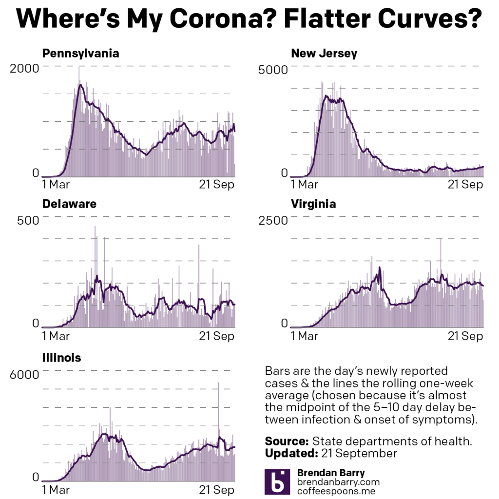
Yesterday was a holiday in the States, and so let’s begin this shortened week with a look at the Covid situation in Pennsylvania, New Jersey, Delaware, Virginia, and Illinois.
If we compare this morning’s charts of yesterday’s data to last Monday’s, we can see some concerning trends.
New case curves in PA, NJ, DE, VA, & IL.
In Pennsylvania, that includes a rising trend. Anecdotally, that might be tied to the outbreaks in and around universities. We see rising trends in Delaware and Virginia as well, though some of Delaware’s new numbers might be tied to some cases that failed to initially make into the state’s digital database. And so as the state begins to enter them now, it artificially inflates the new case numbers.
Illinois had an enormous spike of cases from a backlog that the state entered, over 5,000 new case in that one day. That’s going to mess with the average trend given the size of the anomaly. So we’ll need to wait until later this week to see where the trend really is.
Then in terms of deaths, the most worrying state was Virginia which last week was mid-peak. But that appears to maybe be trending back down. Though the data we have does include two day’s of weekend numbers and Tuesday’s numbers, instead of the usual “rebound” will be more of the usual weekend depressed numbers.
Monday was the trade deadline for this year’s attempt at a baseball season. The Red Sox actively sold off parts of their roster. You may remember that just two years ago, the Red Sox won the World Series, the sport’s national championship. One would imagine that two years later, most of that championship calibre roster would remain.
You would be wrong.
Well over half that roster is gone. And to prove it, I bought a t-shirt to celebrate. The t-shirt’s design featured the World Series roster on the reverse. (To be fair, there was a mistake as Brandon Workman, who had been on the ALDS and ALCS teams was removed for Drew Pomeranz. But Pomeranz is also gone and so what do you know, the math still works.) I simply crossed out who is no longer with the team.
Some people retired, like Steve Pearce, who, despite being World Series MVP, had his body simply give out and could no longer play the sport two years later. Others, like Blake Swihart, were really only on the roster so that they would not be lost to waiver claims. Still others, like Joe Kelly, understandably left in free agency for deals that were probably way overpriced. And others like Mitch Moreland were simply traded at the end of their contracts for potential prospects to build the next winning team.
And then there are the others.
Brock Holt, a fan favourite super utility, a verifiable Brockstar, who the Red Sox never really entertained any notion of retaining this past off-season. Jose Peraza is no Brock Holt.
And of course, last but certainly not least, we have the Mookie Betts situation. Because ownership has got to make its millions. A homegrown, fifth-round draft pick who was originally slotted into second base. As he began to rise through the system the thought was to trade him, because Dustin Pedroia blocked him in that position. Well someone, somewhere (probably no longer in the organisation) had the idea of let’s try him in the outfield. 2018 MVP much?
But he was traded to the Dodgers this off season because ownership wouldn’t agree to an extension, a pricey one to be fair, but one that an ownership group and a particular owner that includes (in whole or in part) the Red Sox, Fenway Park, NESN, Roush Fenway Racing (controls two NASCAR cars), and in the UK, Liverpool FC, and Anfield, home of Liverpool FC. So, you know, they have some money. But they wouldn’t commit to paying a homegrown star his due to have him play his entire career in Boston.
So they flipped him to the Dodgers for a few prospects and one player, Alex Verdugo, who has a checkered past with allegations of being present near a sexual assault (though he is not alleged to have assaulted the victim, being as he was reportedly in the other room) and then more directly recording on Snapchat the beating of aforementioned victim by two other women who were in the room. None of this has been proven in court, however, because none of it was thoroughly investigated, allegedly because the Dodgers and their director of player development, who would later go on to manage the Phillies and now the Giants, did not really want it fully investigated. And by all accounts, the incident will never be fully investigated and so we’ll never really know what happened in that hotel room.
They traded Mookie Betts, generally perceived in the media as all around nice and humble guy, and also a champion bowler, for saving some money, two minors prospects, and Alex Verdugo.
Credit for the original shirt goes to somebody on either the MLB or Red Sox design teams I would assume. The annotations are, of course, my own work.
Lately we have seen a few incidents of violence amid the large mass of peaceful protests in Kenosha, Wisconsin and other places across the United States. With death on both sides of the protest line, the situation risks devolving into chaos. Though the governor of Wisconsin has sent in National Guard troops (with some additional units later dispatched by the President) to tamp down on the violence, the threat of chaos remains. And sadly the President admitted during a television interview last night that his trip later today to Kenosha is meant to drive up the enthusiasm for one side of those protest line.
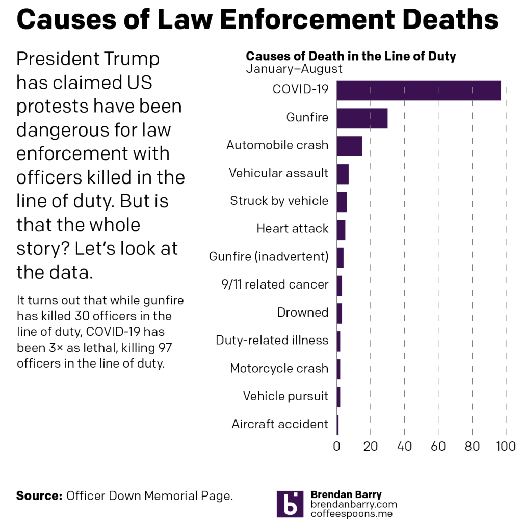
Another element that the President also adds when discussing this law and order theme is the threat to the rank and file law enforcement officers in the line of duty. And there have been incidents of violence. As Vice President noted in his acceptance speech at the Republican Convention last week, a federal law enforcement officer died in Oakland, California at the hands of a protestor. Interestingly, while Pence implied that the protestor was from the left, that particular alleged murderer was actually from a right-wing anti-government group. But the point here is to acknowledge that law enforcement officers in the line of duty to face certain threats.
However, is the threat of dying from a protest turned violent the most dangerous threat?
No, it isn’t.
Data from the Officer Down Memorial Page, which tracks the deaths in the line of duty for officers across the United States, shows that there is one threat that has killed more than 3-times as many LEOs as has gunfire. What is it? What else could it be? Covid-19.
So remember as the President speaks in Kenosha today about the dangers posed to law enforcement that yes, there have been a few incidents of violence directed at law enforcement in protests turned violent. But that the violence has not all been from the left, but also from the right.
And more importantly, the biggest threat to law enforcement remains that which is the biggest threat to all Americans: Covid-19.
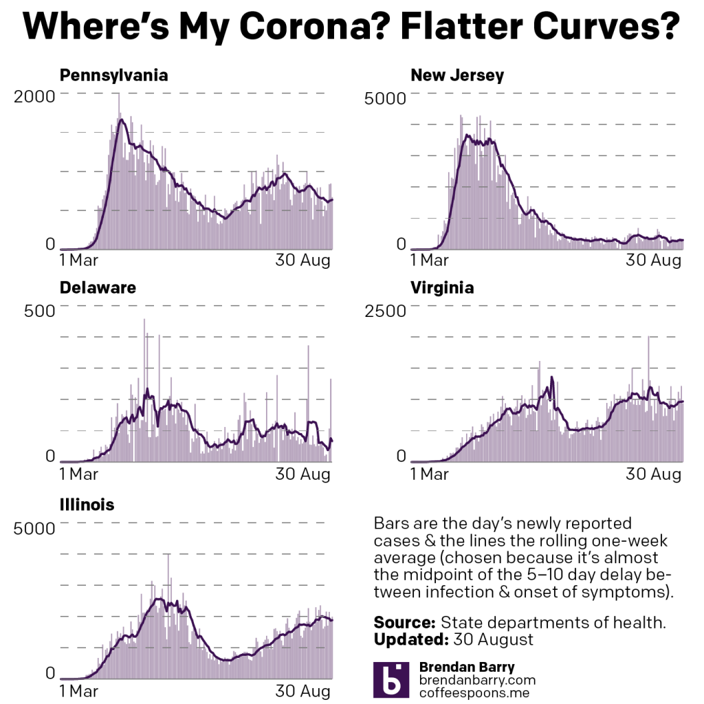
After dealing with hurricane forecast plots last Monday, we’re back to the nature-made, man-intensified disaster of Covid-19 in the United States. So in the five states we review, where are we with the pandemic?
Compared to the charts from two weeks, looking at daily new cases, in some places we are in a better spot, and in others not much has changed. In fact Illinois is the only place worse off with its seven-day average higher than it was two weeks ago, but not by dramatically much.
New cases curve in PA, NJ, DE, VA, & IL.
In fact we see in Pennsylvania, New Jersey, and Delaware that the average number of daily new cases is lower than it was two weeks ago. Virginia dipped lower, but has recently returned to approximately the same level and in that sense is in no different a place. Of course the key factor is how those trends all change over the coming week.
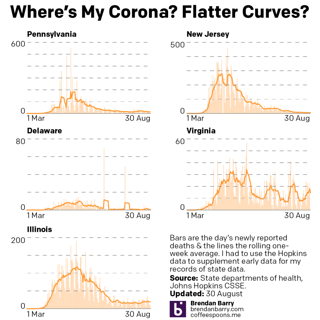
But what about in terms of deaths?
Deaths curve in PA, NJ, DE, VA, & IL.
Well here there is bad news in Virginia. Two weeks ago a spike in deaths there had largely subsided. Two weeks hence? We are in the middle of a third spike of deaths, reaching nearly 20 deaths per day.
Fortunately, the other four states remain largely the same, and that means few deaths per day. Indeed, for Pennsylvania and New Jersey that means deaths in the low double-digits or often in the single digits. Delaware has not reported a new death in four days. And Illinois, while up a little bit, is in the low single-digits, but generally just a few more deaths per day than Pennsylvania and New Jersey.
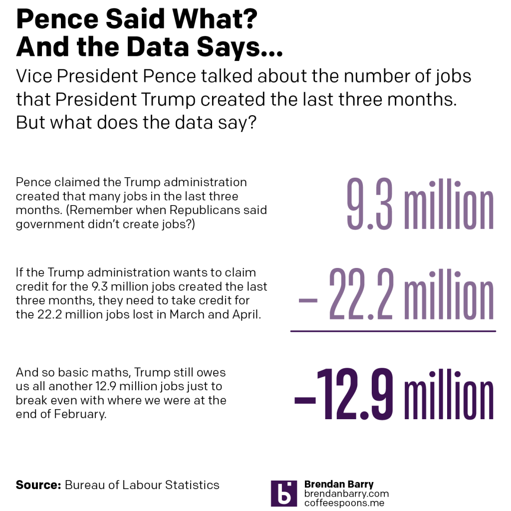
I watched Vice President Prence’s convention speech last night. He made several claims, including one about the Trump administration creating 9.3 million jobs over the last three months.
That’s a lot of jobs. So I wanted to check and see if that was true.
It is. over the last three months, the administration has created 9.3 million jobs.
But in the two months before that?
They lost 22.2 million jobs.
They have another 12.9 million jobs to create just to get back to where we were, and that doesn’t include the jobs required for the natural increase in population and immigration.