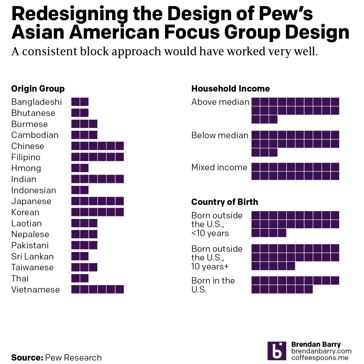
What It Is to be Asian American

Pew recently released a report into the Asian American experience. The report used 66 different focus groups to gather feedback and then summarised that with quotes, video bits, and lots of text. But at the beginning of the report was a nice little graphic that detailed the composition of the focus groups.

Lots of blocks and slices.

This is not a fancy graphic, nor need it be given its supplemental role to the overall piece. But I think it does a reasonable job of showing the construction of the overall focus group demographics, a key point to understanding the responses.

On the left we have a simple count of the number of focus groups by origin. For Indonesians we see there were two focus groups. And thus we have a number two besides the two blocks. Here the two is entirely extraneous and serves as a distracting visual sparkle at the end of the blocks. The advantage of using blocks as opposed to say a bar is that you can visualise the individual components or units, in this case there were two distinct focus groups of Indonesian origin. A user reading this chart should be able to count two blocks. And if they cannot count two blocks, I suspect they would be unable to grasp what the “2” means let alone the rest of the report.

To the right we have two pie charts. My…reticence…to use pies is well-known to long-time readers of Coffeespoons. But here we have the same type of data, counts of focus groups, and I have to wonder: why the designers did not stick with the same model of using individual blocks?

Here I chose to redesign the pie charts.

Nothing here is really new, I just removed the labels because people can count if they need to know the exact number. The labels add visual clutter to the design. And then of course I removed the pie charts and replaced them with blocks like on the left. I was even able to keep the layout roughly the same, albeit within my own graphics template.

Credit for the original goes to the Pew graphics department.

Credit for the redesign is mine.

Positioning Is Important

Yesterday Pew Research released the results of a survey of how the rest of the world views select countries throughout the world. The Washington Post covered it in an article and created some graphics to support the text. The text, of course, was no big surprise in that the rest of the world views the United States poorly compared to just several years ago and that, in particular, President Trump is a leader in whom the world has no confidence.

But that’s not what I want to talk about. Instead, I want to address a design element in the one of their graphics. (But you should go ahead and read about the survey results.)

The issue here is the positioning of the labels for each bar, representing a world leader. At the very top of the graphic, things are in a good way. We have Merkel with a small space beneath that text then another label, “No confidence, 19 percent”, and then a connecting line to a dot to the blue bar. We then have a small space and the label Macron, meaning we have moved on and are on the next world leader.

But what if the reader sees the title and starts towards the bottom? They want to see the leaders in whom the world has no confidence. Now look at the bottom of the chart and the positioning of the labels for Trump, and above him, Xi, Putin, and maybe even Johnson. Because the “No confidence, x percent” labels have moved further to the right, there is an enormous space between the leader’s name and their coloured bar. Visually, this creates a link between the leader’s name and the preceding bar. For example, Trump appears to have a no confidence value of 78 with an unlabelled bar chart beneath him.

I suggest that there are two easy fixes to better link the labels to the data. The first is to move the leaders’ labels down, once the “No confidence” label has moved sufficiently far to the right. Like so.

The leader is now very clearly attached to his or her data with little confusion.

My second option is to fix the “No confidence” labels permanently to the left of the chart so as not to create that visual space in the first place, like so.

Here, after seeing the first option, I wonder if there is enough visual space at all between the leaders. But, this is only a quick Photoshop exercise. If I wanted to really tweak this, I would consider putting the data point or number in bold to the right of the label.That would eliminate an entire line of type that could be repurposed as a visual buffer between leaders.

I think either option would be preferable because of increased clarity for the reader.

Credit for the piece goes to the Washington Post graphics department.

Mexican Immigration

So following on from my Wednesday post, let’s take another look at the “problem” of Mexican immigration. Because as these graphics from the Pew Research Center show, it’s not really a problem these days.

The unauthorised population is down

We're seeing more leave than enter
We’re seeing more leave than enter

Instead, immigration is down.

Credit for the piece goes to the Pew Research Center graphics department.

What is the Minimum Wage Worth

The minimum wage of $15 per hour does not necessarily mean the same thing to everyone all across the country. Based on where one lives, the purchasing power of a dollar might make minimum wage worth more or less than $15. The Pew Research Centre put together a map showing where $15 is worth more or less.

The purchasing power of minimum wage

Credit for the piece goes to the Pew Research Centre.

Presidents Day Popularity Contests

Yesterday was Presidents Day and I had the day off. So today’s post is a bit late, but it still works. Pew Research Centre pulled together data they had on presidential popularity from Eisenhower to Obama. The data point was job approval.

There has been a widening polarity gap

Credit for the piece goes to the graphics department of the Pew Research Centre.

Am I Your Type, Politically Speaking of Course?

Maybe? But thanks to Pew Research, you can see if we align politically. Today’s post comes via Pete, a coworker of mine, and it is basically a survey that works by asking you 23 political questions on topics from big/small government, immigration, climate change, gay rights, defence spending, &c. They crunch some numbers and spit you out on a results page, the image below a crop from the results for your humble author. (For better or worse revealing my political leanings.)

My type
My type

From a survey standpoint, I found it interesting the questions presented only binary responses. In general, I found that I never agreed with either statement entirely and was forced to choose the “closest” response. Since I never see myself on the conservative side of the spectrum, I was surprised to see my “type”, Young Outsiders, coloured with a tint of red. Regardless, I’m still thankful that according to Pew, I am still more in the centre than on the ends as it makes it a lot easier to compromise. I’ve heard that that is an adult thing to do.

By the way, if you want the results of the full survey upon which this quiz was based, you can check out that site here. It’s full of bar charts for those who like the data visualisation.

Credit for the piece goes to the Pew Research Center.

Ukrainian Unity

In the votes held this past weekend, the separatists in Donestk and Luhansk claim they received a mandate for independent states. However, according to polls conducted by Pew a few weeks back, most of Ukraine, with the notable exception of Crimea, wants to remain united as a single country. In fairness, this poll was conducted after Russia annexed Crimea but before the deaths of pro-Russian separatists in Odessa and Mariupol. (Anecdotally, those events have driven some to the separatist camp.) The map below is part of the Pew report. However, I have an issue with it that, again in fairness, might not be solvable given whatever raw data with which Pew was working.

Who wants secession? Only Crimea.

The map colours each oblast, roughly equivalent to a US state, according not to the results of the survey, but rather to which region the oblast belongs. For example, Kirovohrad is the same colour as Donetsk. Donetsk, however, is the epicentre of the unrest in Ukraine whereas I have at least seen no reports of unrest in Kirovohrad. Are they really reporting the same desire of unity or secession? Would the map not be clearer if each oblast was reported independently?

My guess is that results like these are clear to the Kremlin. And so I think while Donetsk and Luhansk will remain Ukrainian, Crimea will likely remain Russian.

Credit for the piece goes to the Pew Research Center’s graphics department.

There’s No Diversity in Baseball!

Well, okay, actually there is. But the cultural reference would have made even less sense if I omitted the negative. Anyway, in honour of the two baseball games I am seeing this week—last night’s and tonight’s Red Sox games—here comes this piece from Pew Research Center.

It’s a simple but fairly clear graphic. We are looking at the ethnic breakdown of baseball since 1947, when Jackie Robinson broke the colour barrier. My only qualm, as ever, with this stacked area chart is that while you can see the clear trend upward in white share, it is a bit more difficult to see the directions the other ethnicities are moving.

Diversity in baseball

Credit for the piece goes to Pew Research Council.