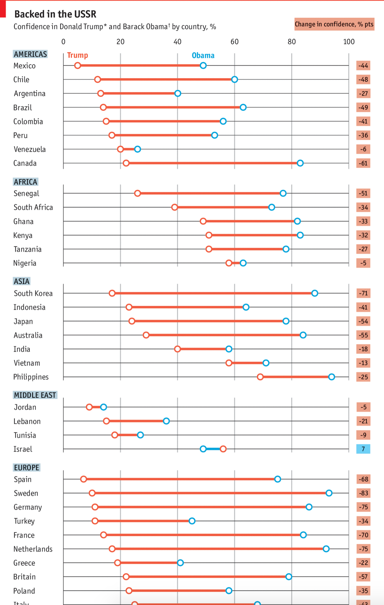
The Pew Research Centre surveyed international respondents about their confidence in Donald Trump vs. Barack Obama. The Economist took those results and visualised them. And the results, well they kind of speak for themselves. But make sure to click through the link for the rest of the graphic.
That’s a lot of declining values
Credit for the piece goes to the Economist graphics department.
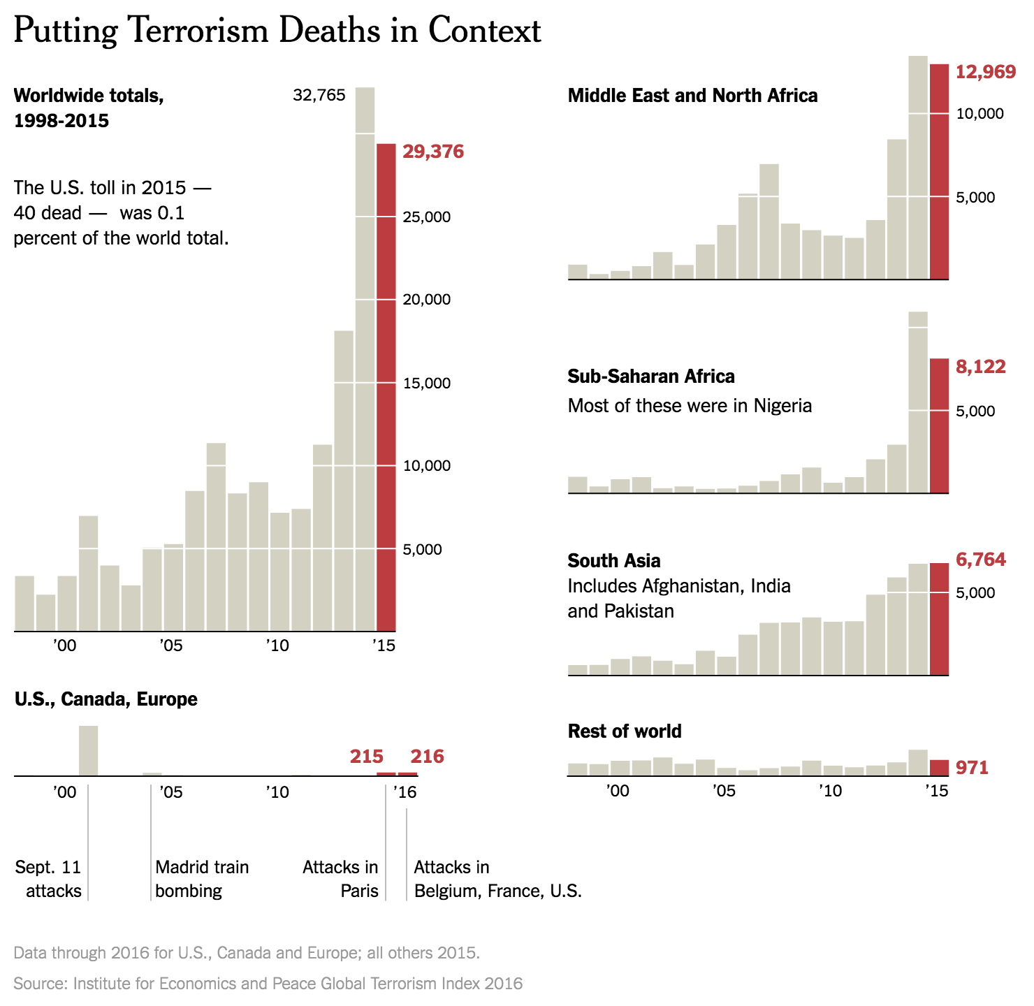
Well, we are one day away now. And I’ve been saving this piece from the New York Times for today. They call it simply 2016 in Charts, but parts of it look further back while other parts try to look ahead to new policies. But all of it is well done.
I chose the below set of bar charts depicting deaths by terrorism to show how well the designers paid attention to their content and its placement. Look how the scale for each chart matches up so that the total can fit neatly to the left, along with the totals for the United States, Canada, and the EU. What it goes to show you is best summarised by the author, whom I quote “those 63 [American] deaths, while tragic, are about the same as the number of Americans killed annually by lawn mowers.”
Deaths by terrorism
I propose a War on Lawn Mowers.
The rest of the piece goes on to talk about the economy—it’s doing well; healthcare—not perfect, but reasonably well; stock market—also well; proposed tax cuts—good for the already wealthy; proposed spending—bad for public debt; and other things.
The commonality is that the charts work really well for communicating the stories. And it does all through a simple, limited, and consistent palette.
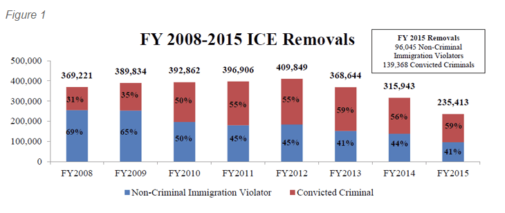
Donald Trump announced how he wants to deport 2–3 million undocumented immigrants that have criminal convictions or that belong to gangs. I read up on the issue at FiveThirtyEight and came across the following graphic from the US Immigration and Customs Enforcement (ICE).
The government’s chart on deportations
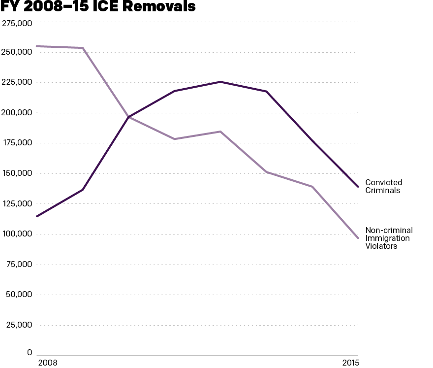
However, when I review the graphic, I found it difficult to understand the FiveThirtyEight article’s point that President Obama has lessened the focus on deportation, but those deported are those convicted of serious criminal offences. So I expanded the size of the y-axis and broke apart the stacked bar chart to show the convicted criminals vs. the non-criminal immigration violators. This graphic more clearly shows the dramatic falloff in deportations, and the emphasis on those with criminal convictions.
A general decline in deportations has also seen a focus on convicted criminals over non-criminal immigration violators
Credit for the original goes to the graphics department of the US Immigration and Customs Enforcement. The other one is mine.