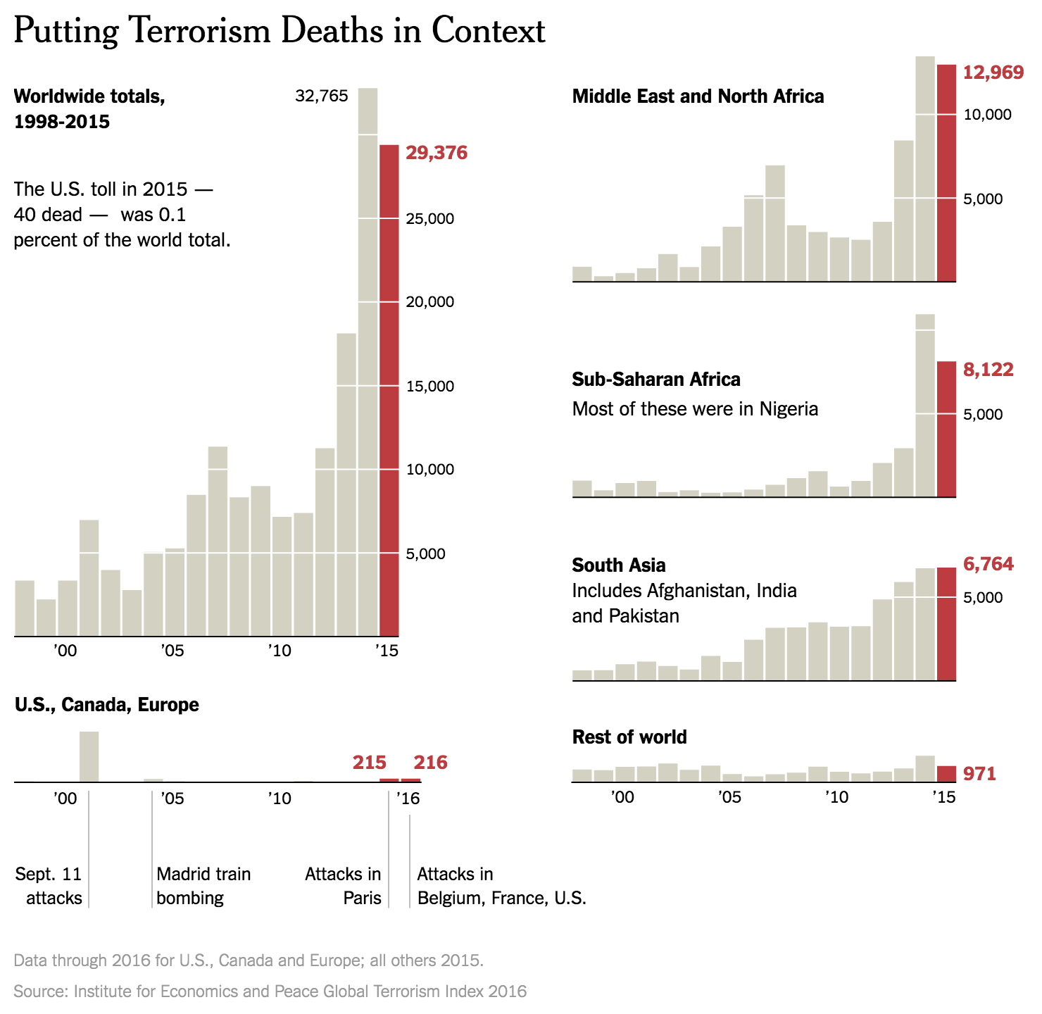
Well, we are one day away now. And I’ve been saving this piece from the New York Times for today. They call it simply 2016 in Charts, but parts of it look further back while other parts try to look ahead to new policies. But all of it is well done.
I chose the below set of bar charts depicting deaths by terrorism to show how well the designers paid attention to their content and its placement. Look how the scale for each chart matches up so that the total can fit neatly to the left, along with the totals for the United States, Canada, and the EU. What it goes to show you is best summarised by the author, whom I quote “those 63 [American] deaths, while tragic, are about the same as the number of Americans killed annually by lawn mowers.”

I propose a War on Lawn Mowers.
The rest of the piece goes on to talk about the economy—it’s doing well; healthcare—not perfect, but reasonably well; stock market—also well; proposed tax cuts—good for the already wealthy; proposed spending—bad for public debt; and other things.
The commonality is that the charts work really well for communicating the stories. And it does all through a simple, limited, and consistent palette.
But yeah, one day away now.
Credit for the piece goes to Steven Rattner.
Leave a Reply
You must be logged in to post a comment.