Yesterday I wrote my usual weekly piece about the progress of the Covid-19 pandemic in the five states I cover. At the end I discussed the progress of vaccinations and how Pennsylvania, Virginia, and Illinois all sit around 25% fully vaccinated. Of course, I leave my write-up at that. But not everyone does.
This past weekend, the New York Times published an article looking at the correlation between Biden–Trump support and rates of vaccination. Perhaps I should not be surprised this kind of piece exists, let alone the premise.
From a design standpoint, the piece makes use of a number of different formats: bars, lines, choropleth maps, and scatter plots. I want to talk about the latter in this piece. The article begins with two side by side scatter plots, this being the first.
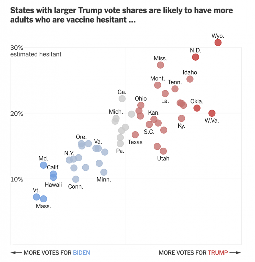
The header ends in an ellipsis, but that makes sense because the next graphic, which I’ll get to shortly, continues the sentence. But let’s look at the rest of the plot.
Starting with the x-axis, we have a fairly simple plot here: votes for the candidates. But note that there is no scale. The header provides the necessary definition of being a share of the vote, but the lack of minimum and maximum makes an accurate assessment a bit tricky. We can’t even be certain that the scales are consistent. If you recall our choropleth maps from the other day, the scale of the orange was inconsistent with the scale of the blue-greys. Though, given this is produced by the Times, I would give them the benefit of the doubt.
Furthermore, we have five different colours. I presume that the darkest blues and reds represent the greatest share. But without a scale let alone a legend, it’s difficult to say for certain. The grey is presumably in the mixed/nearly even bin, again similar to what I described in the first post about choropleths from my recent string.
Finally, if we look at the y-axis, we see a few interesting decisions. The first? The placement of the axis labels. Typically we would see the labelling on the outside of the plot, but here, it’s all aligned on the inside of the plot. Intriguingly, the designers took care for the placement—or have their paragraph/character styles well set—as the text interrupts the axis and grid lines, i.e. the text does not interfere with the grey lines.
The second? Wyoming. I don’t always think that every single chart needs to have all the outliers within the bounds of the plot. I’ve definitely taken the same approach and so I won’t criticise it, but I wonder what the chart would have looked like if the maximum had been 35% and the grid lines were set at intervals of 5%. The tradeoff is likely increased difficulty in labelling the dots. And that too is a decision I’ve made.
Third, the lack of a zero. I feel fairly comfortable assuming the bottom of the y-axis is zero. But I would have gone ahead and labelled it all the same, especially because of how the minimum value for the axis is handled in the next graphic.
Speaking of, moving on to the second graphic we can see the ellipsis completes the sentence.
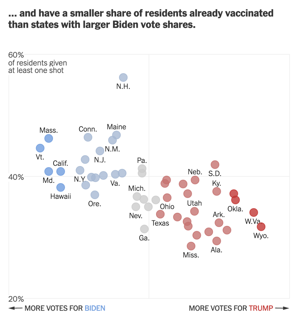
We otherwise run into similar issues. Again, there is a lack of labelling on the x-axis. This makes it difficult to assess whether we are looking at the same scale. I am fairly certain we are, because when I overlap the graphics I can see that the two extremes, Wyoming and Vermont, look to exist on the same places on the axis.
We also still see the same issues for the y-axis. This time the axis represents vaccination rates. I wish this graphic made a little clearer the distinction between partial and full vaccination rates. Partial is good, but full vaccination is what really matters. And while this chart shows Pennsylvania, for example, at over 40% vaccinated, that’s misleading. Full vaccination is 15 points lower, at about 25%. And that’s the number that needs to be up in the 75% range for herd immunity.
But back to the labelling, here the minimum value, 20%, is labelled. I can’t really understand the rationale for labelling the one chart but not the other. It’s clearly not a spacing issue.
I have some concerns about the numbers chosen for the minimum and maximum values of the y-axis. However, towards the middle of the article, this basic construct is used to build a small multiples matrix looking at all 50 states and their rates of vaccination. More on that in a moment.
My last point about this graphic is on the super picky side. Look at the letter g in “of residents given”. It gets clipped. You can still largely read it as a g, but I noticed it. Not sure why it’s happening, though.
So that small multiples graphic I mentioned, well, see below.
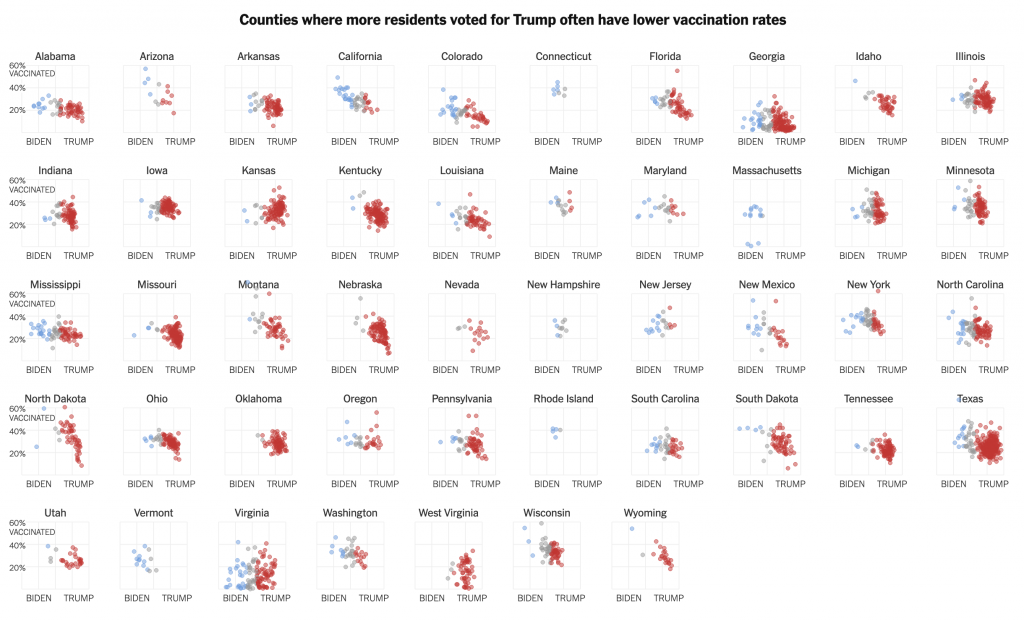
Note how these use an expanded version of the larger chart. The y-minimum appears to be 0%, but again, it would be very helpful if that were labelled.
Also for the x-axis in all the charts, I’m not sure every one needs the Biden–Trump label. After all, not every chart has the 0–60% range labelled, but the beginning of each row makes that clear.
In the super picky, I wish that final row were aligned with the four above it. I find it super distracting, but that’s probably just me.
Overall, this is a strong piece that makes good use of a number of the standard data visualisation forms. But I wish the graphics were a bit tighter to make the graphics just a little clearer.
Credit for the piece goes to Danielle Ivory, Lauren Leatherby and Robert Gebeloff.
Leave a Reply
You must be logged in to post a comment.