Tag: rail
-
Tarnished Linings
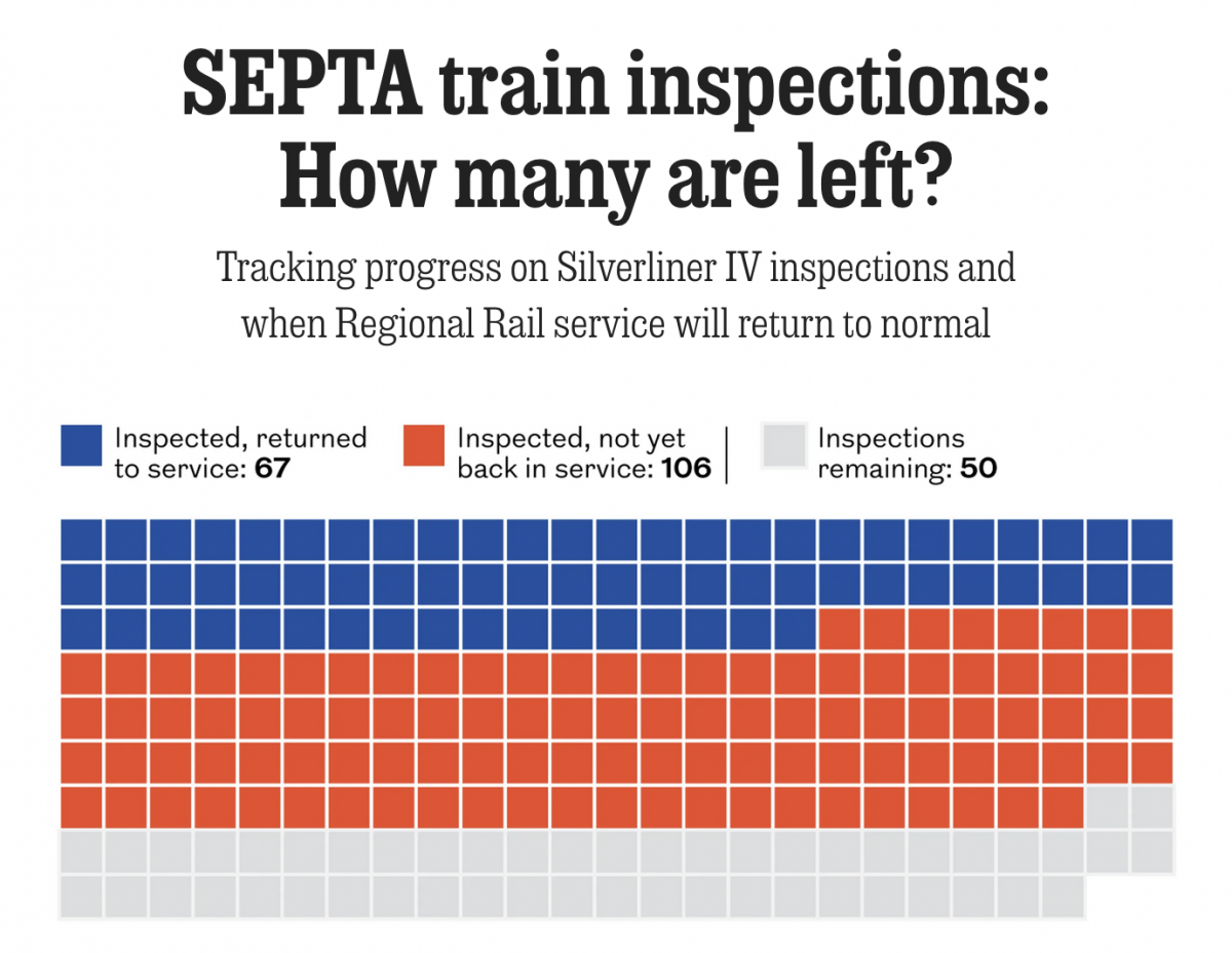
Last month the National Transportation Safety Board (NTSB) ordered Philadelphia’s public transit system, SEPTA, to inspect the backbone of its commuter rail service, Regional Rail: all 225 Silverliner IV railcars. The Silverliner IV fleet, aged over 50 years, suffered a series of fires this summer and the NTSB investigators wanted them inspected by the end…
-
Truly Transcontinental
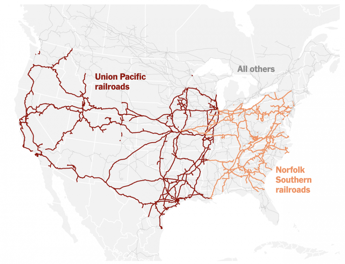
Last week two of the largest American freight railroads agreed to a merger with Union Pacific purchasing Norfolk Southern. Railroads have long played an important part in the history of the United States, from the Second Industrial Revolution to settlement and development of the West, through to the time zones in which we live and…
-
Europe By Rail
Many of us have pent up travel demand. Covid-19 remains with us, lingering in the background, but it’s largely from our front-of-mind. For those of my readers in Europe, or just curious how superior European rail infrastructure is over American, this piece from Benjamin Td provides some useful information. It uses isochrones to map out…
-
Choo Choo
I took two weeks off as work was pretty crazy, but we’re back to covering data visualisation and design with a graphic about trains. And anybody who knows me knows how I love trains. One of the early acts of the Biden administration was funding a proper expansion of rail service in the United States.…
-
Septa’s Silverliner Service Shutdown
Two weeks ago Philadelphia regional rail commuters, a large group to which I belonged for a number of years, experienced a week from hell. On 2 July a yard inspector for Septa, the Philadelphia region’s transit agency, discovered a Silverliner V railcar tilting. For those not familiar with Septa, the Silverliner Vs have been in…
-
Hudson River Tunnels
Readers of this blog know that I am a fan of rail travel. And in particular, how the rail system on the East Coast is brilliant when compared to anywhere else in the States. Unfortunately, the railway system on the East Coast is also old and in need of serious capital investment. The tunnels linking…