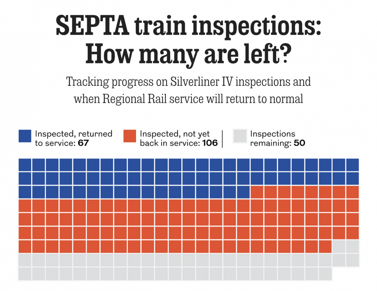
What Is Infrastructure?

This morning I read a piece in Politico Playbook that broke down President Biden’s $2.25 trillion proposal for infrastructure spending. A thing generally regarded as the United States sorely needs. $2.25 trillion is a lot of money and it’s a fair question to ask whether all that money is really money for infrastructure.

Because, it turns out, it’s not.

Please, sir, may I have more train money?

That isn’t to say money spent on job retraining or home care services wouldn’t be money well spent. Rather, it’s just not infrastructure.

But politics and the English language is a topic for another day. Oh wait, somebody already did write about that.

Credit for the piece is mine.

Baby You Can Drive My Non-automobile Personal Mode of Transportation

Last week was the climate summit in New York, and the science continues to get worse. Any real substantive progress in fighting climate change will require sacrifices and changes to the way our societies function and are organised, including spatially. Because one area that needs to be addressed is the use of personal automobiles that consume oil and emit, among other things, carbon dioxide. But living without cars is not easy in a society largely designed where they are a necessity.

But over at CityLab, Richard Florida and Charlotta Mellander created an index trying to capture the ability to live without a car. The overall piece is worth a read, but as usual I want to focus on the graphic.

The Northeast is where it's at with its dense cities designed for a pre-automobile era
The Northeast is where it’s at with its dense cities designed for a pre-automobile era

It’s nothing crazy, but it really does shine as a good example of when to use a map. First, I enjoy seeing metro maps of the United States used as choropleths, which is why I’ve made them as part of job at the Philly Fed. CityLab’s map does a good job showing there is a geographic pattern to the location of cities best situated for those trying to live a car-free life. Perhaps not surprisingly, one of the big clusters is the Northeast Corridor, including Philadelphia, which ranks as the 17th best (out of 398) and the 7th best of large metro areas (defined as more than one million people), beating out Chicago, ranked 23rd and 8th, respectively.

Design wise I have two small issues. First, I might quibble with the colour scheme. I’m not sure there is enough differentiation between the pink and light orange. A very light orange could have perhaps been a better choice. Though I am sympathetic to the need to keep that lowest bin separate from the grey.

Secondly, with the legend, because the index is a construct, I might have included some secondary labelling to help the reader understand what the numbers mean. Perhaps an arrow and some text saying something like “Easier car-free living”. Once you have read the text, it makes sense. However, viewing the graphic in isolation might not be as clear as it could be with that labelling.

Credit for the piece goes to David Montgomery.

A Very Loud Tube

As all my readers probably know, I love London. And in loving London, I love the Tube and the Oyster Card and all that goes along with Transport for London. But, I have noticed that sometimes when I take the Underground, there are segments where it gets a bit loud, especially with the windows open. The Economist covered this in a recent article where they looked at some data from a London-based design firm that makes noise protective gear. (For purposes of bias, that seems important to mention here.)

The data looks at decibels in a few Underground lines and when the levels reach potentially harmful levels. I took a screenshot of the Bakerloo line, with which I am familiar. (At least from Paddington to Lambeth.) Not surprisingly, there are a few segments that are quite loud.

I definitely recall it being loud

I like this graphic—but like I said about bias, I’m biased. The graphic does a good job of using the above the 85-decibel line area fill to show the regions where it gets loud. And in general it works. However, if you look at the beginning of the Bakerloo line noise levels the jumps up in down in noise levels, because they happen so quickly in succession, begin to appear as a solid fill. It masks the importance of those periods where the noise levels are, in fact, potentially dangerous.

I have had to deal with this problem often in my work at the Fed, where some data over decades is available on a weekly basis. One trick that works, besides averaging the data, is thinning out the stroke of the line so the overlaps do not appear so thick. It could make it difficult to read, but it avoids the density issues at the beginning of that chart.

All in all, though, I would love a London-like transport system here in Philly. I’d rather some loud noises than polluting cars on the road.

Credit for the piece goes to the Economist Data Team.

Baby, It’s Hot Outside

Those of you living on the East Coast, specifically the Mid-Atlantic, know that presently the weather is quite warm outside. As in levels of dangerous heat and humidity. Personally, your author has not left his flat in a few days now because it is so bad.

Alas, not everyone has access to air conditioning in his or her abode. Consequently, they need to look to public spaces with air conditioning. Usually that means libraries or public buildings. But here in Philadelphia, have people considered the subway?

Billy Penn investigated the temperatures in Philadelphia’s subsurface stations along the Broad Street and Market–Frankford Lines—Philadelphia’s third and oft-forgot line, the Patco, was untested. What they found is that temperatures in the stations were significantly below the temperatures above ground. The Market–Frankford stations, for example, were less than 100ºF.

Just explore the rails…

Of course that misses the 2nd Street station in Old City, but otherwise picks up all the Market–Frankford stations situated underground.

Then there is the Broad Street Line.

More rail riding…
More rail riding…

Here, I do have a question about why the line wasn’t investigated from north to south. It ran only as far north as Girard, stopping well short of north Philadelphia neighbourhoods, and then as far south as Snyder, missing both Oregon and Pattison (sorry, corporately branded AT&T) stations. The robustness of the dataset is a bit worrying.

The colours here too mean nothing. Instead blue is used for the blue-coloured Market–Frankford line and orange for the orange-coloured Broad Street line. (The Patco line would have been red.) Here was a missed opportunity to encode temperature data along the route.

Finally, if the sidewalk temperatures were measured at each station, I would want to see that data alongside and perhaps run some comparisons.

This is an interesting story, but some more exploration and visualisation of the data could have taken it to the next level.

Credit for the piece goes to Danya Henninger.

Public Transit of Yesteryear

For my frequent readers, it will be no big surprise that I am avid supporter of public transit, especially the railways. Consequently I was delighted when I read a non-Brexit piece in the Guardian yesterday that looked at public transit systems in several cities.

But it did so by comparing earlier plans or systems to those in existence today.

That's definitely one time I'd like to live in the past.
That’s definitely one time I’d like to live in the past.

Each design is slightly different and reflects the source material for the various cities. But I naturally selected the Philadelphia map. One of the biggest things to notice are the lack of trams/trolleys north of Girard and the addition of the River Line.

Credit for the piece goes to Jake Berman.

Bus Transit in Philadelphia

I have lived in Philadelphia for almost ten months now and that time can be split into two different residences. For the first, I took the El to and from Centre City. For the second, I walk to and from work. I look for living spaces near transit lines. In Chicago I took the El for eight years to get home. But to get to work, I often used the 143 express bus. Personally, I prefer trains and subways to busses—faster, dedicated right-of-way, Amtrak even has WiFi. But, busses are an integral part of a dense city’s transit network. You can cram dozens of people into one vehicle and remove several cars from the road. Here in Philadelphia, however, as the Inquirer reports, bus ridership is down over the last two years at the same time as ride-hailing apps are growing in usage.

For those interested in urban planning and transit, the article is well worth the read. But let’s look at one of the graphics for the article.

Lots of red in Centre City

The map uses narrow lines for bus routes and the designer wisely chose to alternate between only two shades of a colour: high and low values of either growth (green) or decline (red). But, and this is where it might be tricky given the map, I would probably dropdown all the greys in the map to be more of an even colour. And I would ditch the heavy black lines representing borders. They draw more attention and grab the eye first, well before the movement to the green and red lines.

And the piece did a good job with the Uber time wait map comparison as well. It uses the same colour pattern and map, small multiple style, and then you can see quite clearly the loss of the entire dark purple data bin. It is a simple, but very effective graphic. My favourite kind.

Still haven't used Uber yet. Unless you count the times I'm being put into one by a friend…
Still haven’t used Uber yet. Unless you count the times I’m being put into one by a friend…

Anyway, from the data side, I would be really curious to see the breakout for trolleys versus busses—yes, folks, Philly still has several trolley lines. If only because, by looking at the map, those routes seem to be in the green and growing category. So as I complain to everyone here in Philly, Philly, build more subways (and trolleys). But, as the article shows, don’t forget about the bus network either.

Credit for the piece goes to the Inquirer graphics department.

Septa’s Silverliner Service Shutdown

Two weeks ago Philadelphia regional rail commuters, a large group to which I belonged for a number of years, experienced a week from hell. On 2 July a yard inspector for Septa, the Philadelphia region’s transit agency, discovered a Silverliner V railcar tilting. For those not familiar with Septa, the Silverliner Vs have been in service for only three years and have been long touted as the future of the Philadelphia commuter rail service. After inspection Septa discovered the tilting railcar suffered from a fatigue crack on the equaliser beam, specifically where it was welded to connect to the wheel bearings. The beam forms part of the truck, which is what connects the railcar to the rails, and any failure at speed could have resulted in an accident, possibly a derailment. The transit agency then quickly inspected the remainder of its fleet of 120 Silverliner Vs. It found the same fatigue crack in a total of 115 cars. By 4 July, Septa pulled all 120 Silverliner Vs from service.

The equaliser beam connects the wheels to the passenger car

So what happened? At this point, we do not know. Septa continues tests to discover just what happened and just what can be done to repair the cars. Because, with a fleet of approximately 400 cars, the Silverliner Vs represent 1/3 of the fleet. And with fewer seats and fewer trains, commuters attempting to ride into the city, particularly from nearer-in suburbs, find trains bypassing stations because they quickly reach capacity.

The additional passenger railcars from other regional transit agencies will make little difference

Consequently, Septa has instituted a reduced service—a modification of the Saturday service—with additional service on subways and other high-speed lines. Additionally, Septa has agreed to lease additional trainsets, i.e. locomotives with passenger cars, from other regional transit agencies: Amtrak, New Jersey Transit (NJ Transit), and the Maryland Area Regional Commuter Train Service (MARC).

Hudson River Tunnels

Readers of this blog know that I am a fan of rail travel. And in particular, how the rail system on the East Coast is brilliant when compared to anywhere else in the States. Unfortunately, the railway system on the East Coast is also old and in need of serious capital investment. The tunnels linking New York and New Jersey beneath the Hudson River are a prime example. But a few years ago, Governor Christie of New Jersey killed Amtrak’s plans to build new tunnels to provide a backup to the existing infrastructure and increase overall capacity. The Wall Street Journal takes a look at Amtrak’s new plan to cross the Hudson. Let’s hope this venture is a bit more successful.

The new project
The new project

Credit for the piece goes to the Wall Street Journal graphics department.

The Link Between Work and Transit

The Wall Street Journal recently published an interesting article about the link between work and access to transit. They included a graphic that looked at the link between the two.

Linking the two together

Credit for the piece goes to the Wall Street Journal graphics department.

Understanding the Boston Subway System

Today’s post is the graduate work of Michael Barry and Brian Card of Worcester Polytechnic Institute. The two looked at the available public data of the Massachusetts Bay Transportation Authority (MBTA)—the T to those that know—to better understand the Boston area subway system. Here the subway system refers to the heavy rail lines, i.e. the Blue, Orange, and Red lines.

T stations
T stations

In short, the piece has a lot to look at that is worth looking at. This particular screenshot is an analysis of the stations across all times on average weekdays and weekends. You can see how in this particular selection, the size of the station markers pulse depending upon the time of day and the number of turnstile entries. Meanwhile the charts to the right show you the density through time of said entries and then compares the average number of turnstiles entries per day. Text beneath the system map to the left provides a short analysis of the data, highlighting work vs. home stations.

Credit for the piece goes to Michael Barry and Brian Card.