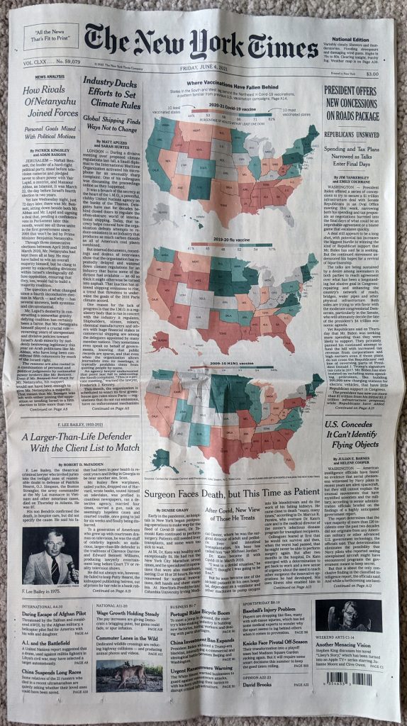
Today I want to highlight a print article from the New York Times I received about two weeks ago. It’s been sitting in a pile of print pieces I want to sit down, photograph, and then write up. But as we begin to return to normal, I need my second dining room chair back because at some point I’ll have guests over.
The article in question examined the rates of Covid-19 vaccination across the United States. And on the front page, above the fold no less, we can compare the vaccination rates for Covid-19 to those of the 2019–2020 flu and if you unfold it to its full-length glory we can add in the 2009–2010 H1N1 swine flu outbreak.
First thing I want to address is the obvious. Look at those colours. Who loves a green-to-red scale on a choropleth? Not this guy. They are a pretty bad choice because of green-to-red colour blindness. (There’s two different types as well as other types of colour blindness, but I’m simplifying here.) But here’s what happen when I pull the photo into Photoshop and test for it. (This is a screenshot, because I’m not aware of a means of exporting a proof image.)
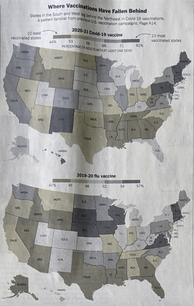
You can still see the difference between the reds and greens. That’s good. And it’s because colour is complicated. In red-green colour blindness, the issue is sensitivity to picking up reds and greens. (Again, oversimplifying for the sake of a blog post.) Between those two colours in the spectrum we have yellow. To the other side of green we have blue.
So if a designer needs to use a red-green colour scheme—and any designer who has worked in data visualisation will have undoubtedly have had a client asking for the map/chart/whatever to be in red and green—there’s a trick to making it work.
I don’t know if this is true, but growing up, I learned that green was the one colour the human eye evolved to distinguish the most. Now for a print piece like this, you are working in what we call CMYK space (cyan, magenta, yellow, and black). Red is a mixture of magenta and yellow. Green a mixture of cyan and yellow. If you remember your school days, it’s similar to—but not the same as—mixing your primary colours. So if you need to make red and green work, what can you do? First, you can subtract a bit of yellow from your green, because that exists between red and green. But then, and this is why CMYK is different from your primary school primary colours, we can adjust the amount of magenta. Magenta is not a “pure” red, instead it’s kind of purplish and that means has some blue in it. Adding a little bit of magenta, while it does add “red” into the green, it’s also adding more blue to the blue present in the cyan. Now you can spend quite a bit of time tweaking these colours, but very quickly I can get these two options.
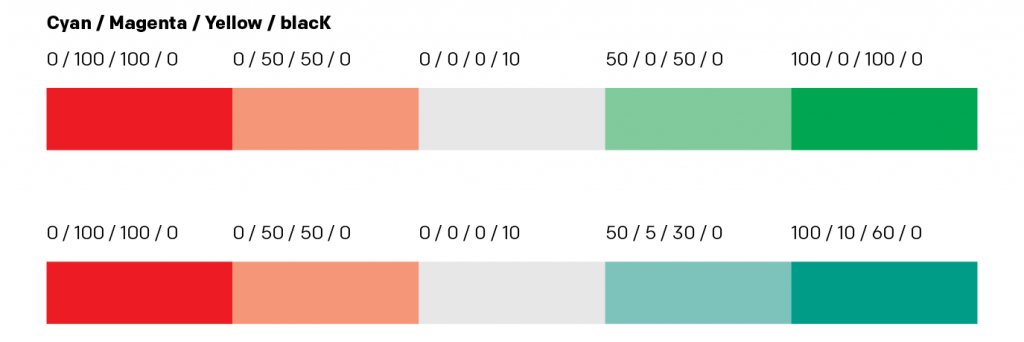
Great, you can still see them as both red and green. Your client is probably happy and probably accepts this greenish-blue as green, because we have that ability to distinguish so many types of green. But what about those with red-green colour blindness? Again, I can’t quite do a straight export, so the best is a screenshot, but we can compare those two options like so.
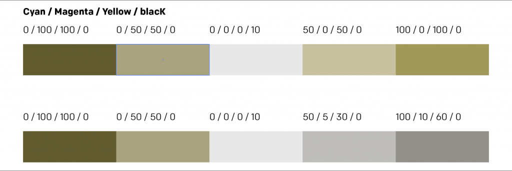
You can probably still tweak the green, but by going for that simple tweak, you can make the client happy—even though it’s still just better to avoid the red and green altogether—and still make the graphic work.
There’s a bit more to say about the rest of the article, which has some additional graphics inside. But that’ll have to wait for another day. As will clearing down the pile of print pieces to share, because that keeps on growing.
Credit for the piece goes to Lazaro Gamio and Amy Schoenfield Walker.
Leave a Reply
You must be logged in to post a comment.