Two weeks ago I posted about an article from the BBC that used graphics about which I was less than thrilled. Inconsistent use of axis lines, centring the graphic were two of the things that irked me. Two weeks hence, I do want to draw some positive attention to another article in the BBC. This one discusses the, for many of us, impending return to the office. (I’ve also heard the phrase “return to work”, although a coworker of mine pointed out that’s not a great phrase because many of us never stopped working when we decamped for our flats and houses.)
The article discusses why some think the return to a five-day office week will occur within the next few years. There is some sound logic to the idea and for those like your author who are closely following the issue, I recommend the article.
But that’s not why we’re here, instead I wanted to focus on the one data visualisation graphic in the piece. It displays the amount of office space used in the city centres of six different UK cities outside London.
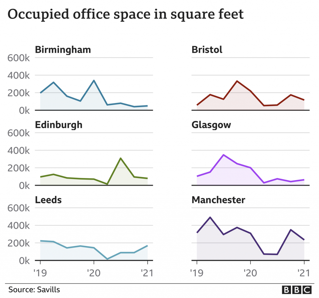
Here we have small multiples with the same fixed y-axis display. Axis lines are present and consistent and the baseline is distinct from the other lines. Solid improvement over what we discussed two weeks ago.
My only quibble? The colours here are not necessary. A single colour would work because each city’s graphic exists apart from the rest. The charts also all represent the same type of data, occupied office space. If the chart were doubling or tripling up cities somehow—though I wouldn’t want to see this as a stacked area chart—I would buy the need for colours to differentiate the cities. This, however, represents an opportunity to use a single, BBC-branded colour to define the experience whilst not negatively impacting the communication from the data visualisation standpoint.
Again, though, that’s a minor quibble. Of course, the BBC puts out copious amounts of content daily and I see only a fraction, but it is nice to see an improvement. Furthermore, at the end of the article I also spotted a graphic credit, which I don’t often see—and honestly cannot recall when I last saw period—from the BBC.
I wonder if moving forward the BBC intends to highlight the contributors to articles who are not solely the writers, i.e. the people creating the graphics? Of course, if we did that, we should also probably take a look at the copy editors who also play a role. Especially for an online article as opposed to say a print newspaper or magazine where space is money.
Credit for the piece goes to Daniele Palumbo.
Leave a Reply
You must be logged in to post a comment.