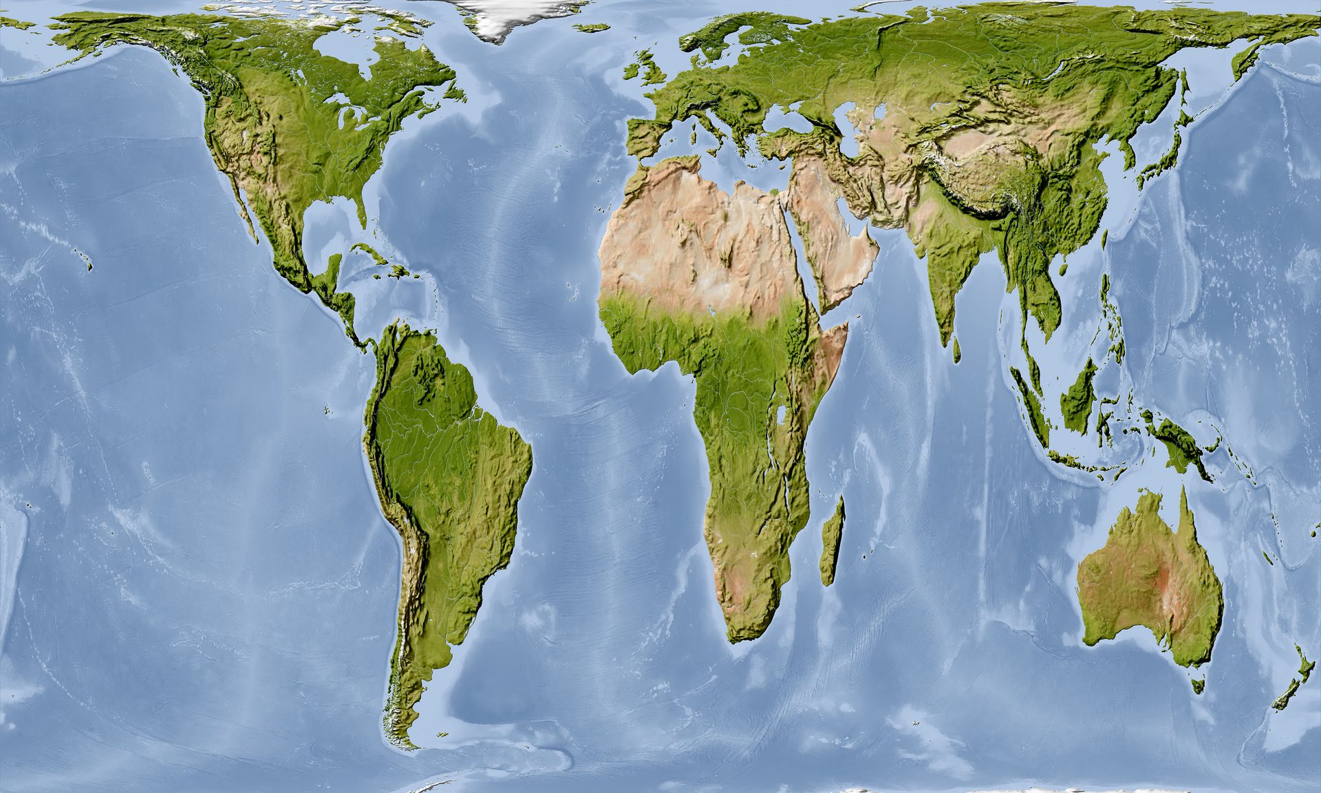
Today’s post is not so much about a graphic per se, instead I read an article in the Guardian about how Boston’s public school system has decided to switch from the Mercator map projection system to the Gall-Peters projection system.
The article is worth a read if only for the embedded clip of the episode of the West Wing where they talk about the Gall-Peters. But for those of you not familiar with map projection systems, the problem is it is impossible to perfectly reproduce a three-dimensional spheroid onto a two-dimensional flat plane. Some maps sacrifice proportions for straight lines, others sacrifice shape for area, and so on and so forth.
Seriously, where is France?
Credit for the map image goes to Alamy Stock Photo via the Guardian.
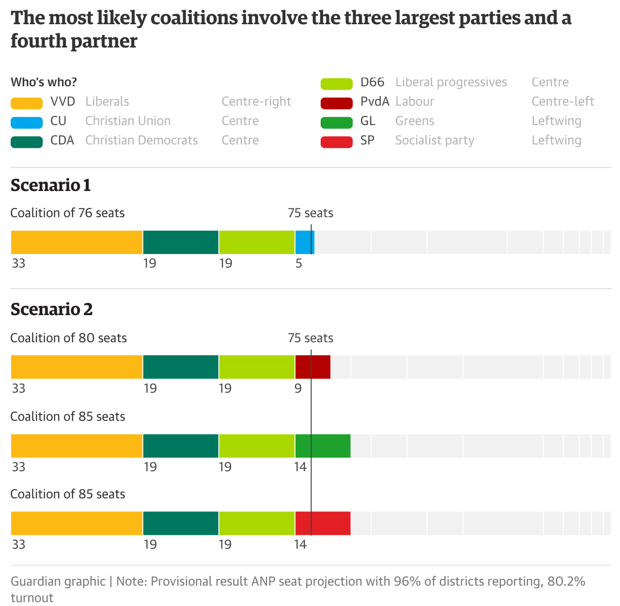
It’s a tulip joke, get it? Because the Netherlands.
The point of today’s piece is that Geert Wilders, the anti-EU, anti-Muslim, populist leader of the Dutch Freedom Party did not upset Prime Minister Rutte’s People’s Party for Freedom and Democracy (VVD), a centre-right party. Wilders had threatened to upset the status quo in the Netherlands earlier in the electoral season, but had come under pressure in recent weeks and days. He did, however, manage to come in second. Although its radical platform makes it highly unlikely to enter into any coalition government.
And speaking of coalition government, that is the Dutch way. With over a dozen parties competing for 150 seats, Rutte’s VVD looks to have won 33 seats—final results are expected in a few days’ time. Consequently, he will need the support of other parties to govern. And that gets us to today’s piece from the Guardian, a look at a few potential coalition scenarios. (As you probably know, I’m a huge fan of coalition governments.)
Which collection of colours will cross the finish line?
As you know I’m not a huge fan of stacked bar charts, but in this case the form works well. After all the point in this graphic is not to compare the number of seats held by each party—if it were, this fails—but to show the order needed to cross the 75 seat line. The table of who’s who above also is a great help to those not so familiar with Dutch politics who are trying to ascertain which coalition partnerships are more likely. After all, it’s highly unlikely a rightwing and leftwing party would come together to govern.
Credit for the piece goes to the Guardian’s graphics department.
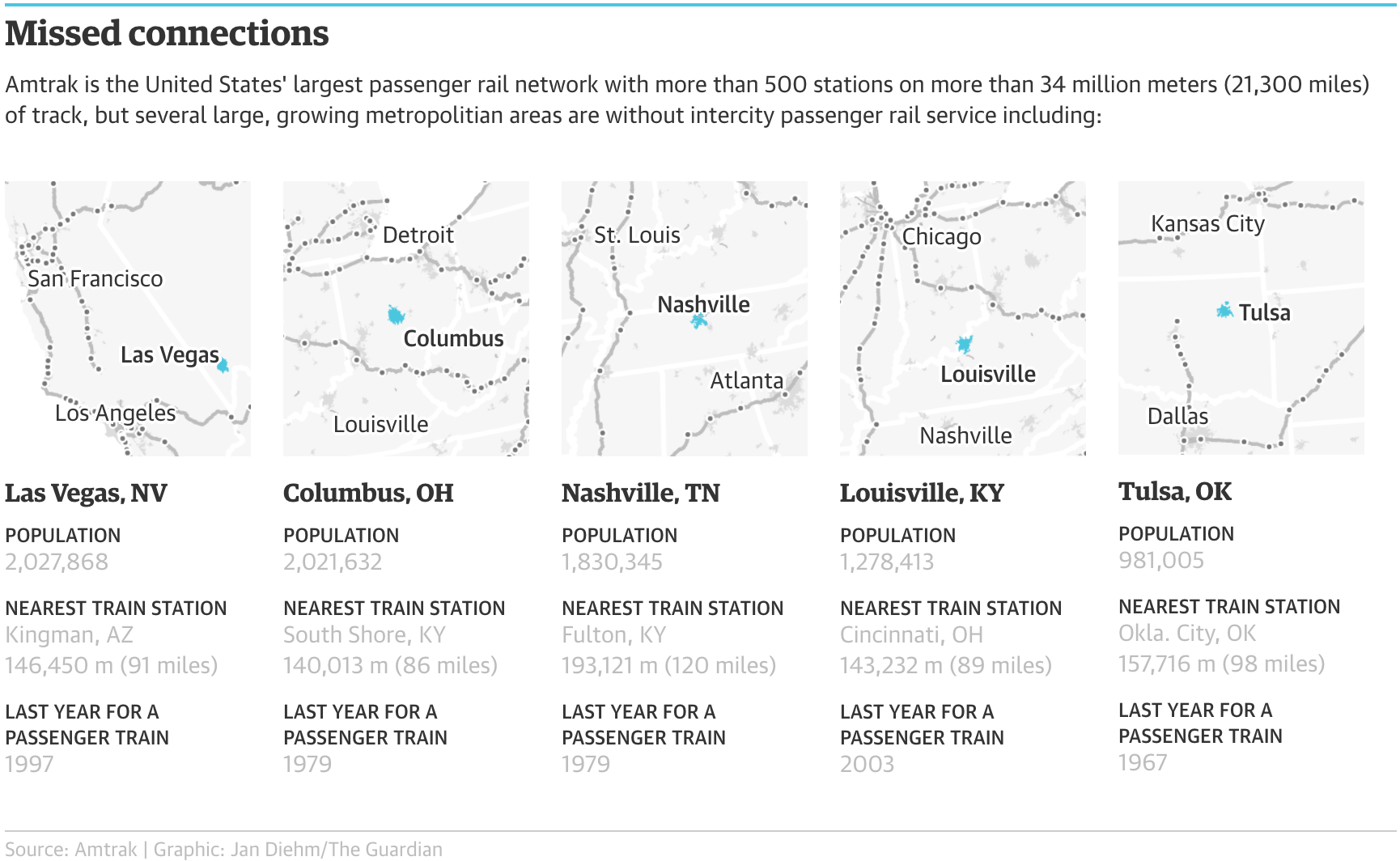
I wasn’t expecting this piece to fall into the queue for today, but you all know me as a sucker for trains. So today we have this nice set of small multiples from the Guardian. It looks at…I guess we could call it train deserts. They’re like food deserts, except we’re talking about trains.
Some of the US train deserts
What strikes me is that in a perfect world at least three of these could be on one direct line. You can almost draw a straight line from Columbus, Ohio to Nashville, Tennessee and hit Louisville, Kentucky. Obviously things like property get in the way, but it is something to note.
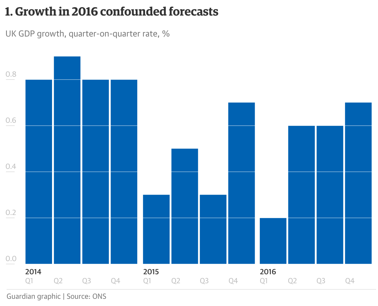
The British government is delivering its budget statement today. So as a teaser, the Guardian published this article with six charts to help understand where things are at. Chart-wise there is nothing radical or revolutionary here, but I have a soft spot for articles driven by data visualisation.
Quarterly growth
Credit for the piece goes to the Guardian graphics department.
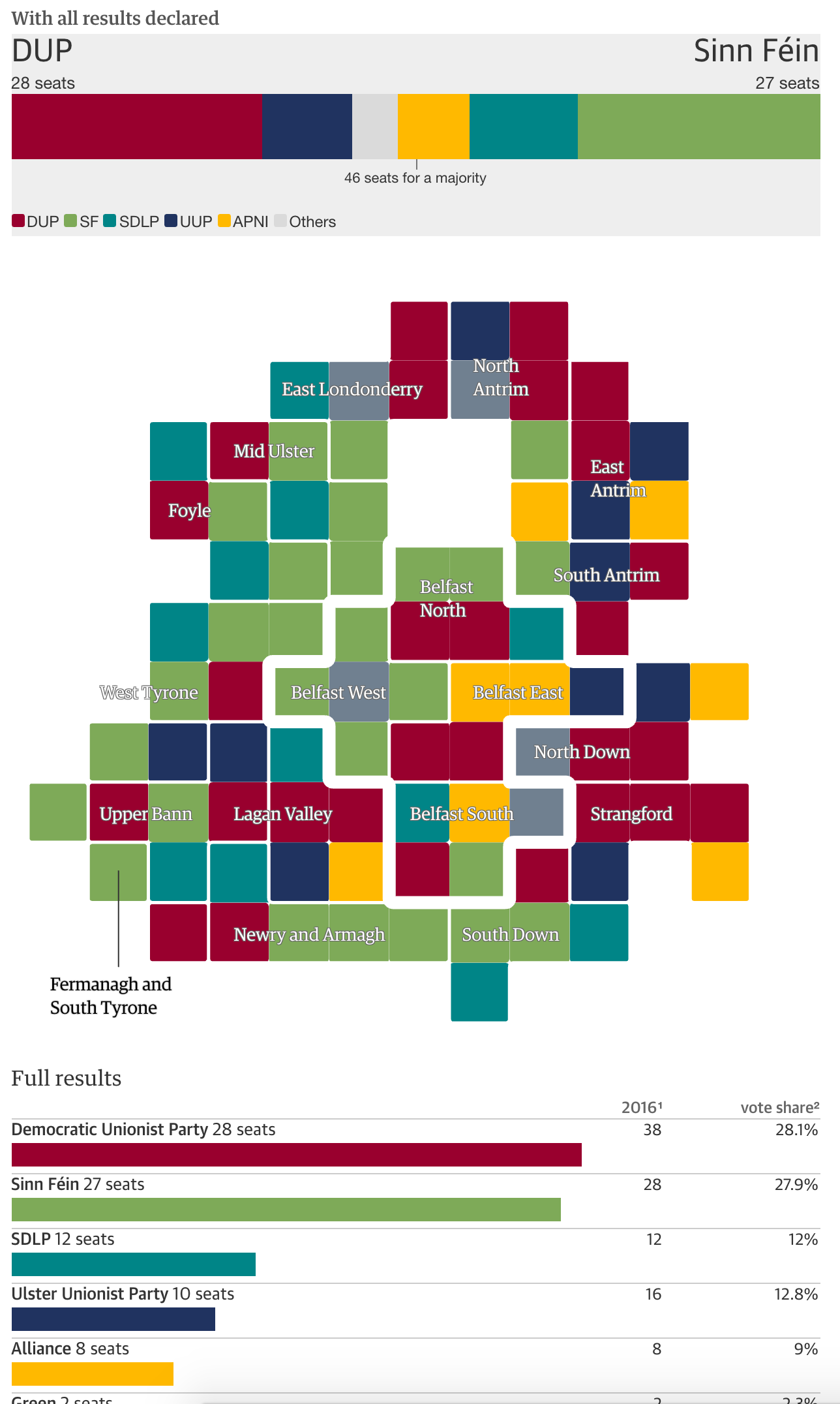
Friday was election day across Northern Ireland as voters elected their representatives for the assembly at Stormont. The headline results: the Nationalists have gained significant ground on the Unionists. The Guardian captured the tallies in this results page.
An almost even split
Credit for the piece goes to the Guardian’s graphics department.
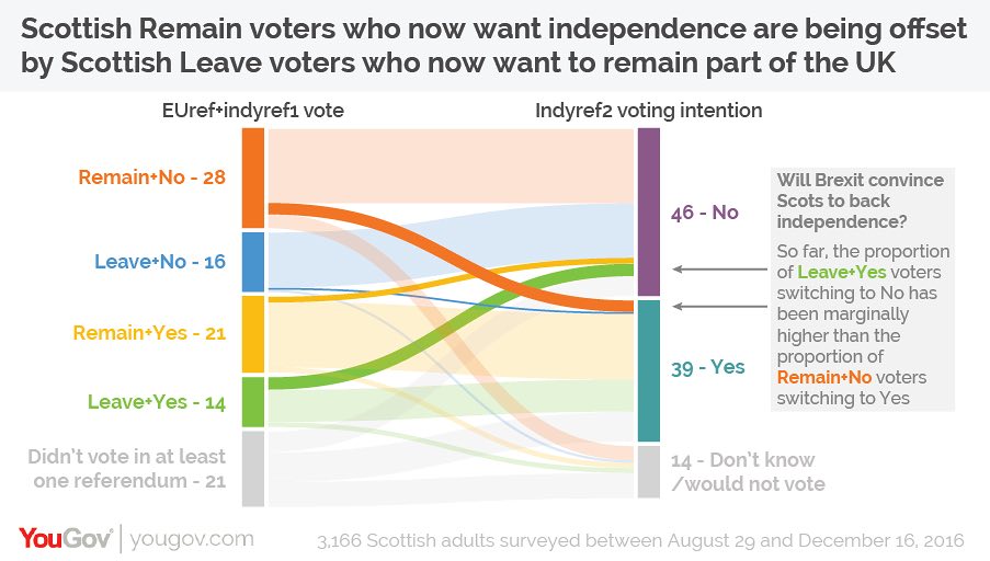
I was having a conversation with a mate the other night about what Brexit means for Scottish independence. This mate, however, is an American. Because when American politics are depressing and nonsensical, we turn to British pol—wait, never mind.
Despite the overall UK vote to leave the European Union, Scotland (and London, and Northern Ireland) voted overwhelmingly to remain. But since part of the whole vote no to independence thing was remaining part of the EU thing, shouldn’t Scotland now be well positioned for IndyRef2?
I read this article from the Guardian back in January and meant to share it with you all, but I somehow forgot about it. So at long last, it turns out no, not so much. The whole thing is worth a read; it uses YouGov survey data to break out voters into different camps. And what sort of nails the argument is this graphic.
About that independence…
There are four/five groups of Brexit/IndyRef1 voters that then get sorted into two/three IndyRef2 results (yes, no, maybe I don’t know?). And what you can see is that yes, a significant number of those who voted to Remain in the EU, but voted no to Scottish independence would now vote for independence. But, an almost equal number of those who voted to Remain and also voted for Scottish independence would now vote against Scottish independence. In effect, these two voter movements are cancelling out any potential gains for a future Scottish independence vote.
Credit for the piece goes to the YouGov graphics department.
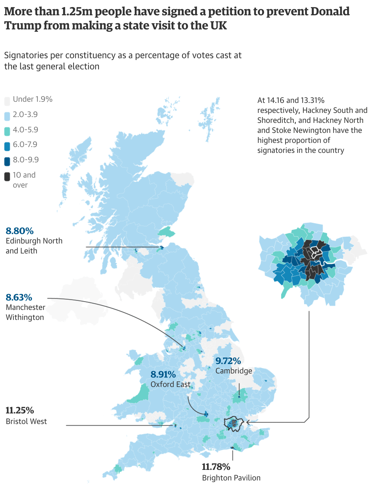
Well we’re less than a full two weeks into the Trump administration and oh how he has upset people. So much so that after being offered a state visit to the United Kingdom, the people of the UK drafted and are signing a petition to attempt to prevent Trump from visiting the UK.
This map from the Guardian, screenshot below, looks at how the signatures are distributed across the UK.
Who would prefer him not to visit?
Credit for the piece goes to the Guardian’s graphic department.
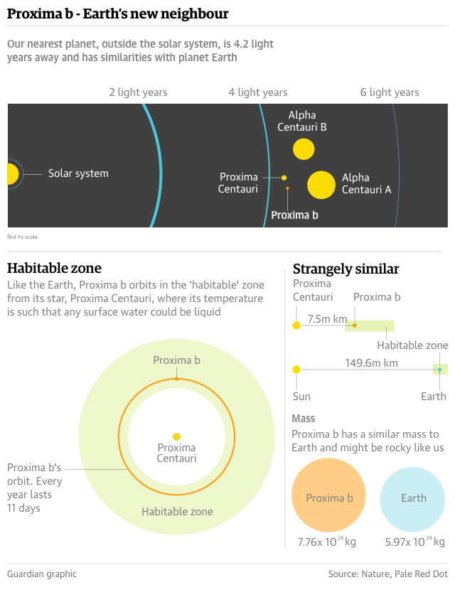
Among the many, many stories that broke during my month-long radio silence, I got fairly excited about the discovery of a planet orbiting Proxima Centauri. And not just any planet, but a likely rocky planet within the star’s habitable zone. Put that all together and there is the possibility that the planet could host life as we know it. How can that not be exciting? Thankfully the Guardian put together a graphic to support an article detailing the discovery.
Our newest neighbour
Credit for the piece goes to the Guardian’s graphics department.
Apologies for the lack of posts the last two days. I visited Wisconsin to trace some of the courthouse records of the Spellacys. And while I will try to return to them later next week, today we go to China.
During my recent holidays, the media made much ado about a new straddling bus in China. Except that it’s not that new. And now it might not be real or at least really viable. I recalled this graphic from 2012 via the Guardian and decided it would be relevant to try and explain how the bus should work.
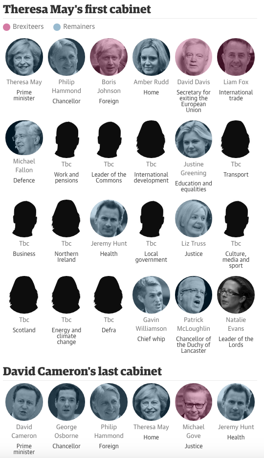
Who said British politics are boring? With David Cameron out and Theresa May in as Prime Minister, it is time to reshuffle the cabinet. And the Guardian is reusing the style they had for the Jeremy Corbyn shadow cabinet mass resignation. Except in this case, the colours reflect the Tory’s position on Brexit.
The cabinet as of this morning
Credit for the piece goes to the Guardian graphics department.