Tag: space
-
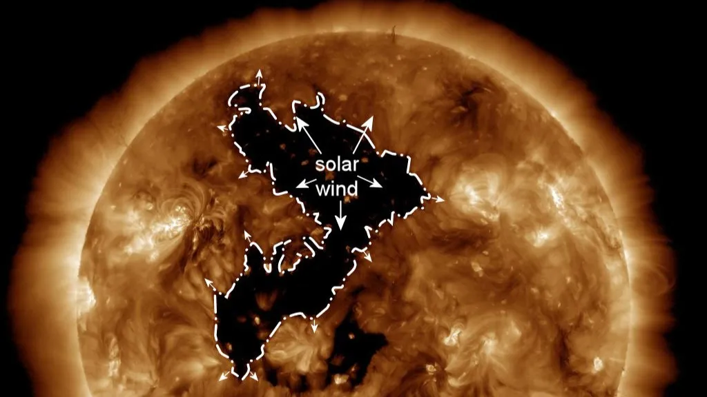
Here Came the Sun
Sorry, George, had to change the verb tense. As I alluded to on Friday, today we are looking at some space weather news. This past weekend, the Sun put on a light show over Canada and northern US states with the aurora borealis. Of course the grandeur and spectacle is not a thing that comes…
-
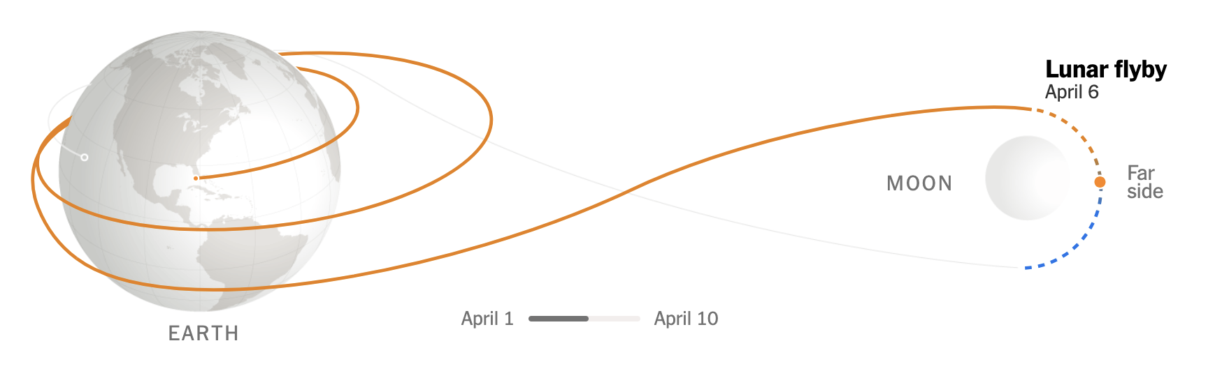
To the Moon and Beyond 2: Just Passing By
Today’s post was what I alluded to on Friday, thinking it was a fit then but realising perhaps it fit better here because of what a lot of graphics show when it comes to Artemis II and mankind’s return to (the orbit of) the Moon. Most graphics typically show the elongated eight track with the…
-
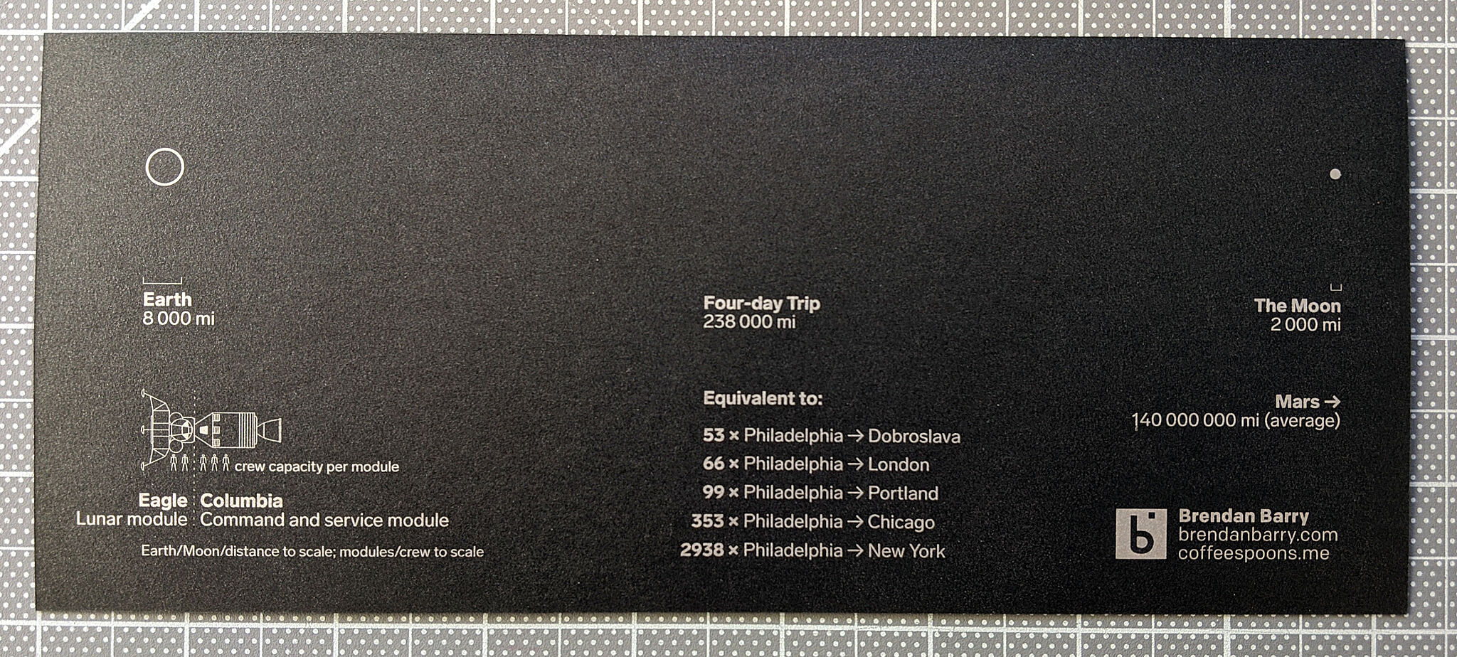
To the Moon, and Beyond!
At least a little beyond. Like the orbital height beyond. For those unaware, if the weather holds, later this evening East Coast time, NASA will launch the Artemis II mission from Cape Canaveral with the intention of sending a crew of four astronauts—three Americans, one Canadian—to the Moon. The last man on the Moon was…
-
Space Is Cool
Well we made it to Friday. One of my longtime goals is to see the aurora borealis, or Northern Lights. My plan for the winter of 2020 was to travel to Norway, maybe visit a friend, and then head north to Tromsø and take in the Polar Night and, fingers crossed, catch the show. Then…
-
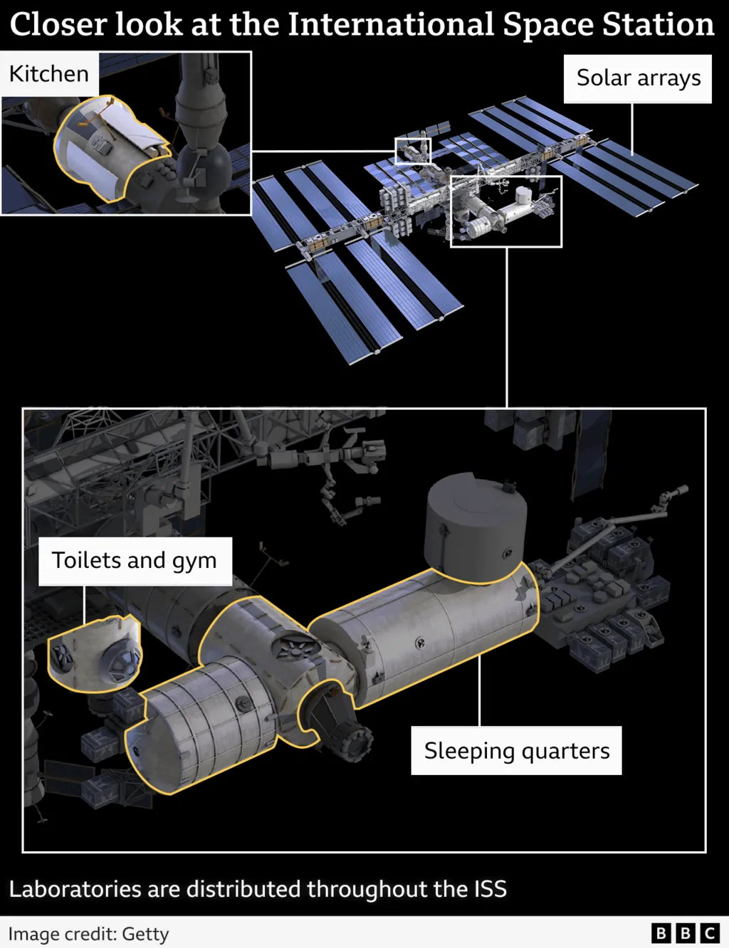
Life Aboard the International Space Station
This weekend I read a neat little article from the BBC about astronauts’ lives aboard the International Space Station (ISS). This comes on the heels of two NASA astronauts being left on the station due to some uncertainty about their Boeing spacecraft’s safety. The article featured a number of annotated photographs and illustrations, but this…
-
James Webb
It’s cool. In the darkness of space. We made it to the end of the week, a big week for space news. So with that, enjoy this illustration from xkcd about the James Webb Space Telescope. Credit for the piece goes to Randall Munroe.
-
L2 Halo for JWST
Yesterday I received a question about where the new James Webb Space Telescope is located. Is it in orbit of the Earth, like Hubble? Is it out in deep space? The answer is no, not really. Now I spent this morning trying to illustrate the answer to that question myself. However, it’s taking me too…
-
Black Holes and Revelations: Remastered
Two years ago I posted about how the Event Horizon Telescope Collaboration managed to take the first photograph of a black hole, in particular a supermassive black hole at the centre of the M87 galaxy, one of those galaxies far, far away that we see at a long time ago. This morning, the same group…
-
Keeping Things in Scale
Another week of amazing, happy, awesome news. So let’s keep it all in perspective with this graphic from xkcd. We all made it to Friday, so enjoy your weekend, everyone. Credit for the piece goes to Randall Munroe.
-
Sunshield
Happy Friday, everyone. At the beginning of the week, we looked at the launch and deployment of the new James Webb telescope. If you recall, one of the key elements of the satellite’s design is its sunshield. As the name says, it shields the satellite from the sun, thus keeping the equipment super cold, which…