Canada vs. the United States

Last week I was asked what was the population of Canada. I first said 30 million. I then figured that was too small so I said more like 50–60 million. Turns out I was closer to being correct the first time. A Google search that cites the World Bank among its sources listed the population as nearer to 35 million. But what does that mean?

Over at I Love Charts, the United States was broken down into units shaped by the size of the population of Canada. Roughly, the United States = 10 Canadas.

How many Canadas in the US?

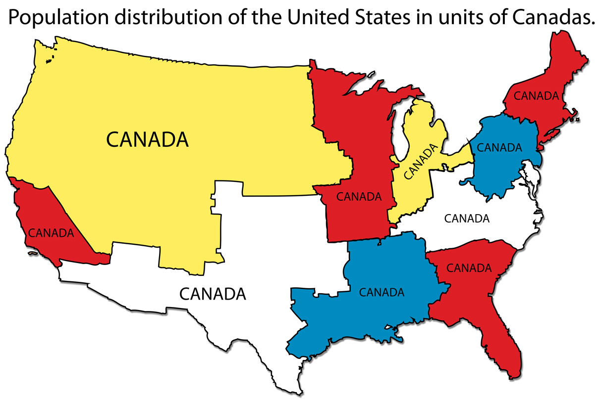
Credit for the piece goes to an unknown individual. If discovered, I would appreciate being informed.

The Best and Worst States for [Insert Topic]

It’s Friday, and mercifully this is a Friday before a three-day weekend. (For all of those who, like me, have a day off coming up on Monday.) So before everyone starts travelling to places here and there and everywhere in between, you best check this series of maps. Why? Because Business Insider has polled us, well 1600 of us, to find the best and worst states for a number of metrics. My personal favourite:

“Most likely due to the fact that most Americans have never been to Philadelphia, the rest of the country believes New York also has the worst sports fans. I blame John Rocker.”

Worst sports fans
Worst sports fans

Credit for the piece goes to Walter Hickey.

Chicago Covered in Ice

I should be returning to Chicago this weekend. And if I were returning 21,000 years ago, that would be I would have been returning to a massive ice sheet covering the city. Would have been way worse in Montreal, though.

Ice Sheets
Ice Sheets

Credit for the piece goes to Randall Munroe.

Nice Work, Bro

Bro. You have surely heard the term exchanged by young men to each other as a sign of friendship, greeting, &c. If you are like me, you are probably confused as to just what constitutes a bro. Thankfully the folks over an NPR analysed broness and compiled their findings into a Venn diagram that maps out the different types of bros. You should definitely head over to the piece and read up on the methodology, it’s worth the read. (And check out the video that epitomises the essence of bro-ness if for nothing else than a Philly news crew’s reaction to an interview with said essence.)

Bro-ness
Bro-ness

Credit for the piece goes to Alyson Hurt.

What to Eat at a Ball Game

Today’s Friday. So maybe at this point, after a week of baseball-related posts, you are ready to go see a game yourself. If you go, here is a flow chart from SB Nation to help you choose your foods and drinks for the game.

Flow chart for concession stand purchases

Credit for the piece goes to Eric Wayne.

Your State’s Highest Paid Public Employee

This choropleth map comes from Deadspin and it looks at each state’s highest paid public employee. As you can probably imagine since the graphic comes from Deadspin, most states pay their highest wages to sports coaches. Ten states pay somebody other than a sports coach. And five of those are in the Mid-Atlantic/New England area.

Highest Paid Public Employees

Credit for the piece goes to Reuben Fischer-Baum.