We made it to the end of the week, everybody. And that’s saying something.
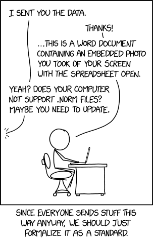
Part of my jobs over the last several years has been to work with context experts and help them tell their stories. Sometimes I have to do it through charts and graphics. When that happens, I often need data files to help me create the final piece. I cannot tell you how many times this has happened.
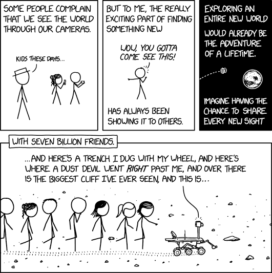
Last summer NASA’s Martian exploration rover Opportunity went dark as its solar panels, needed to power the golf-cart sized explorer, were covered in dust from a planet-wide dust storm. Everyone hoped that over the following months the light Martian winds and dust devils would wipe clean the dust from the solar panels and the rover could recharge its batteries, turn on its heaters, and resume contact with Earth. It hasn’t. Consequently, on Wednesday NASA called Opportunity’s mission complete. And thanks to xkcd we have a proper little farewell.
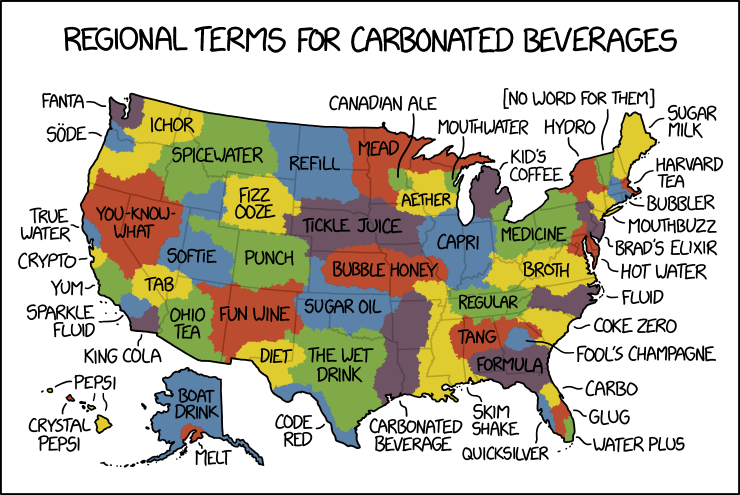
We made it to the end of the week, everybody. And so now we get a look an xkcd take on one of my favourite little pieces: regionalisms. We all use terms that are specific to the areas where we live or grew up. For example, here in Philadelphia we call a cured meat, cheese, lettuce, and tomato on a long roll a hoagie. In other places, they are called a sub.
xkcd’s piece looks at regionalisms for a carbonated beverage.
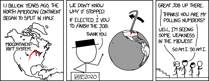
We made it to the end of the week, everybody. And to help celebrate, xkcd posted a little comic that contains two of my favourite subjects: geography and politics. In particular, the piece looks at the 2020 election and plate tectonics.
Break it all apart
One doesn’t often hear of the Midcontinent Rift System.
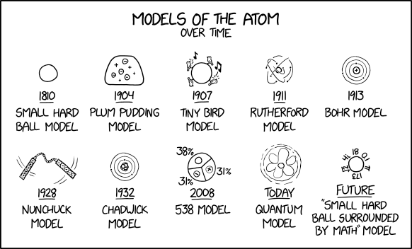
We made it to the end of the week, everyone. And that is worth celebrating. Today’s post is for all the scientists out there and anyone who has ever been interested in the atom. You know, the little things that make up matter. xkcd put together a chronological history of several different models of the atom that attempt to explain its structure.
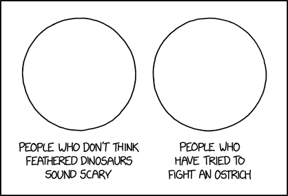
Well we made it to Friday. Admittedly, for many of us it was a short week. But we can end it all the same with this piece from xkcd. It asks the question, are feathered dinosaurs scary? Back when they made the first Jurassic Park, we didn’t know how prevalent feathers were and so the dinosaurs were scaly. Now the Jurassic World films keep the dinosaurs scaly because, well, anti-science?
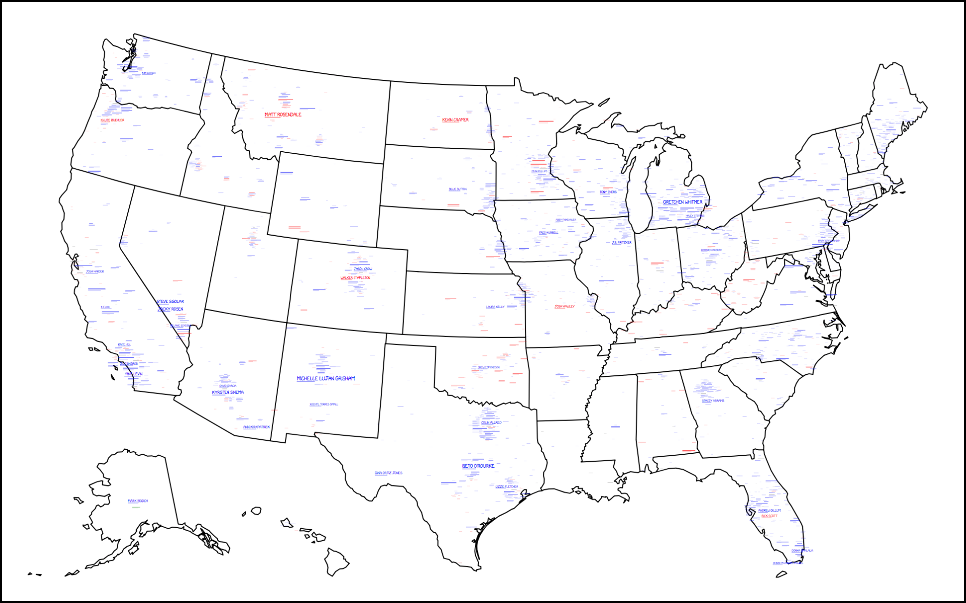
My initial plan for today was that I was not going to run anything light-hearted and focus instead on next week’s elections. But I still love xkcd so I checked that out and…well, here we go.
Your 2018 midterm challengers
At the broadest view, much is unintelligible on the map. But, you can see a lot of blue, or in other words, there are a lot of Democratic challengers to a Republican House, Senate, and state governments. That’s right, it’s also covering state races, e.g. gubernatorial races. But at this level, the difficulty is in seeing any of the details.
The one problem I had with the map was the zoom. On a computer you can double-click or mouse scroll for the zoom, but I was looking for little buttons. Admittedly it took me a few moments to figure it out until I moused over the map to get the tooltip, which of course provided the instructions.
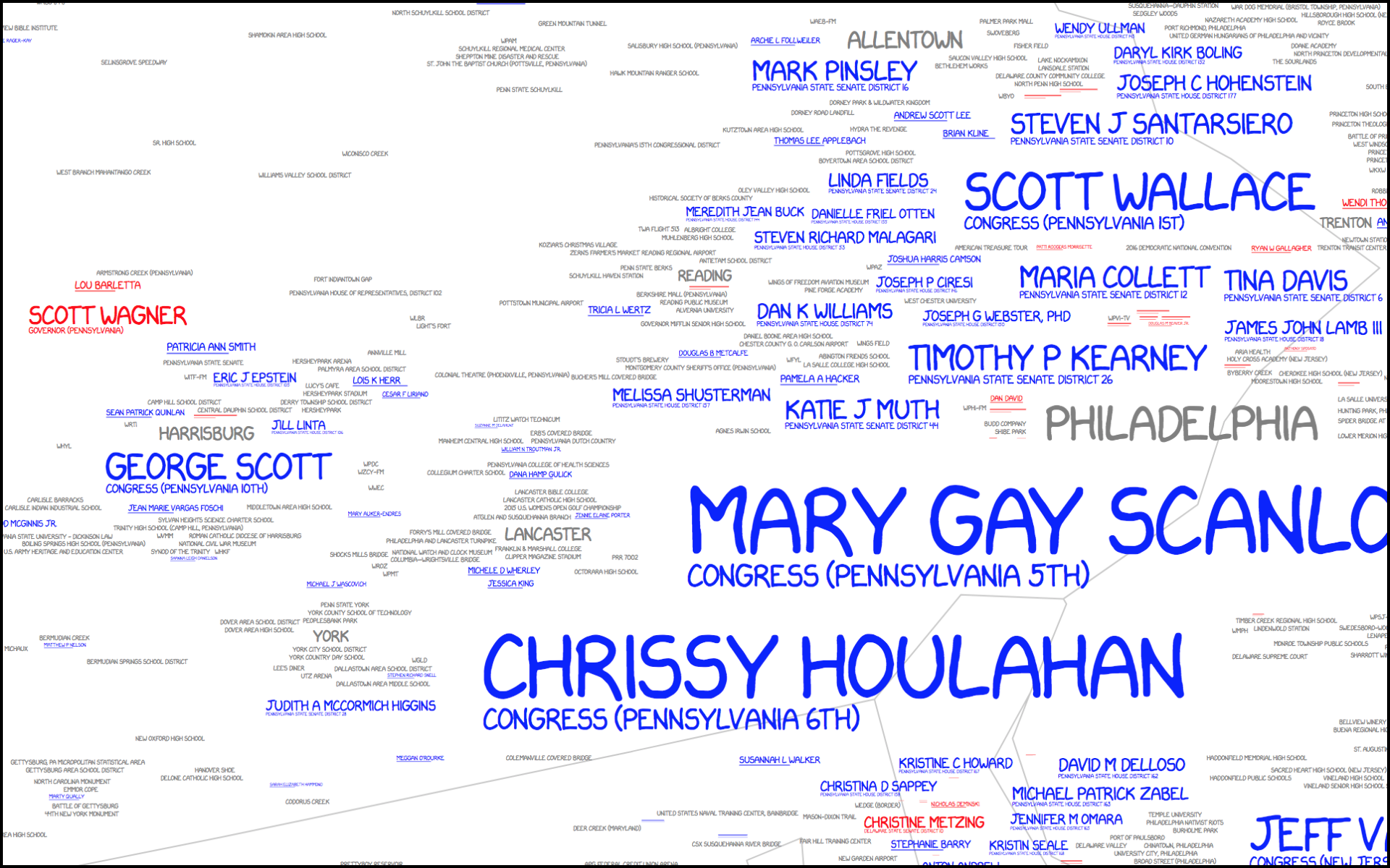
Once you zoom in, however, you can see the details of the map. This here is focused on southeastern Pennsylvania.
Lot of Democratic challengers here in southeastern Pennsylvania
The key to the map is an interesting mix of values as the typographic size of the candidate is related to both their odds of success as well as the importance of their office. So in this view we can see an interesting juxtaposition. Chrissy Houlahan and Mary Gay Scanlon, for example, are running for suburban Philadelphia congressional districts. However, Scott Wagner is running for the arguably higher office of Pennsylvania governor. But his name is fairly small compared to the two women. And just above Scott? Lou Barletta. He is running for one of Pennsylvania’s two senate seats, challenging incumbent Bob Casey Jr. Clearly neither is forecasted to have great success whereas Houlahan and Scanlon are.
Of course the map lacks a scale to say what represents breakeven odds. It is also difficult to isolate the degree to which a level of office influences the size of a challenger’s name. That makes the map less useful as a tool for looking at potential outcomes for Tuesday.
The tooltip that revealed the instructions, however, also had one more big tip. If you found the map needed an update, the instructions were to submit your ballot on 6 November.
Anyway, this is just a reminder to find your polling place over the weekend and get prepared to vote on Tuesday. In the meantime, have a good weekend.
Credit for the piece goes to Randall Munroe, Kelsey Harris, and Max Goodman.
It’s Friday, everybody, and that means we all made it to the end of the week.
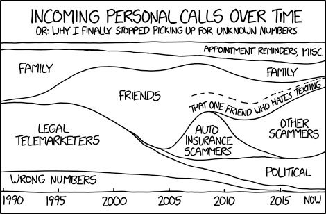
As a millennial, I was surprised to learn that my mobile can actually be used to make telephonic calls. Phone calls, as they are often known, are like direct messages or text messages, but made without cat gifs or memes. And your voice cannot be filtered. It seems a #primitive way of communicating.
But thanks to xkcd, we can see how, using one person as a sample, the types of these phone calls have varied over the years.
I was initially going to ignore this one graphic, but the absolute craziness of this past week’s Bret Kavanaugh nomination hearings/process made this feel at least somewhat relevant. But hey, at least it’s Friday?
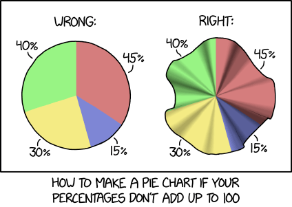
Today is my Friday, everyone, as I am going away on holiday for a little bit. (You can expect me back mid-next week.) So, enjoy this design tip from xkcd on my favourite form of data visualisation: the pie chart.